Name tattoos on the hand range from cursive script with roses or stars to vertical text along the side of the hand, each approach sized to fit the narrow canvas without losing legibility over time.
Fine-line cursive fades faster than bold strokes and typically needs a touch-up every few years.
1. Cursive Name Tattoo with Roses
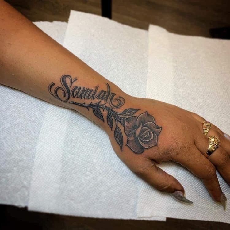
A name in script with a rose attached. The flower sits where the hand meets the wrist, stem trailing down from the last letter.
Roses soften the hard geometry of the hand without cluttering it. A single bloom works well here, and black ink holds better than color, which fades faster on skin that moves and washes as much as this does.
This spot hurts more than the forearm. Skin over bone always does, and the hand has almost no padding.
2. Name Tattoo with Stars
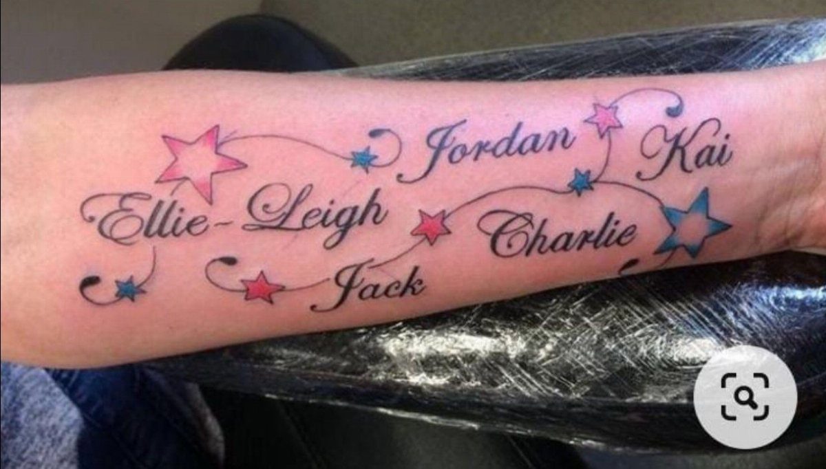
Multiple names arranged across the hand and wrist, each one separated by small stars in alternating colors. The stars add rhythm without taking over, and the mix of pink and blue makes the piece feel personal rather than generic.
This layout works when you’re commemorating several people at once. Spacing the names with symbols keeps them legible, and the color gives each one a slight visual marker if the names correspond to different people or roles.
Colored ink on hands fades noticeably within a year or two. Touch-ups will be part of the maintenance if you want the stars to stay bright.
3. Name with Heart Accent
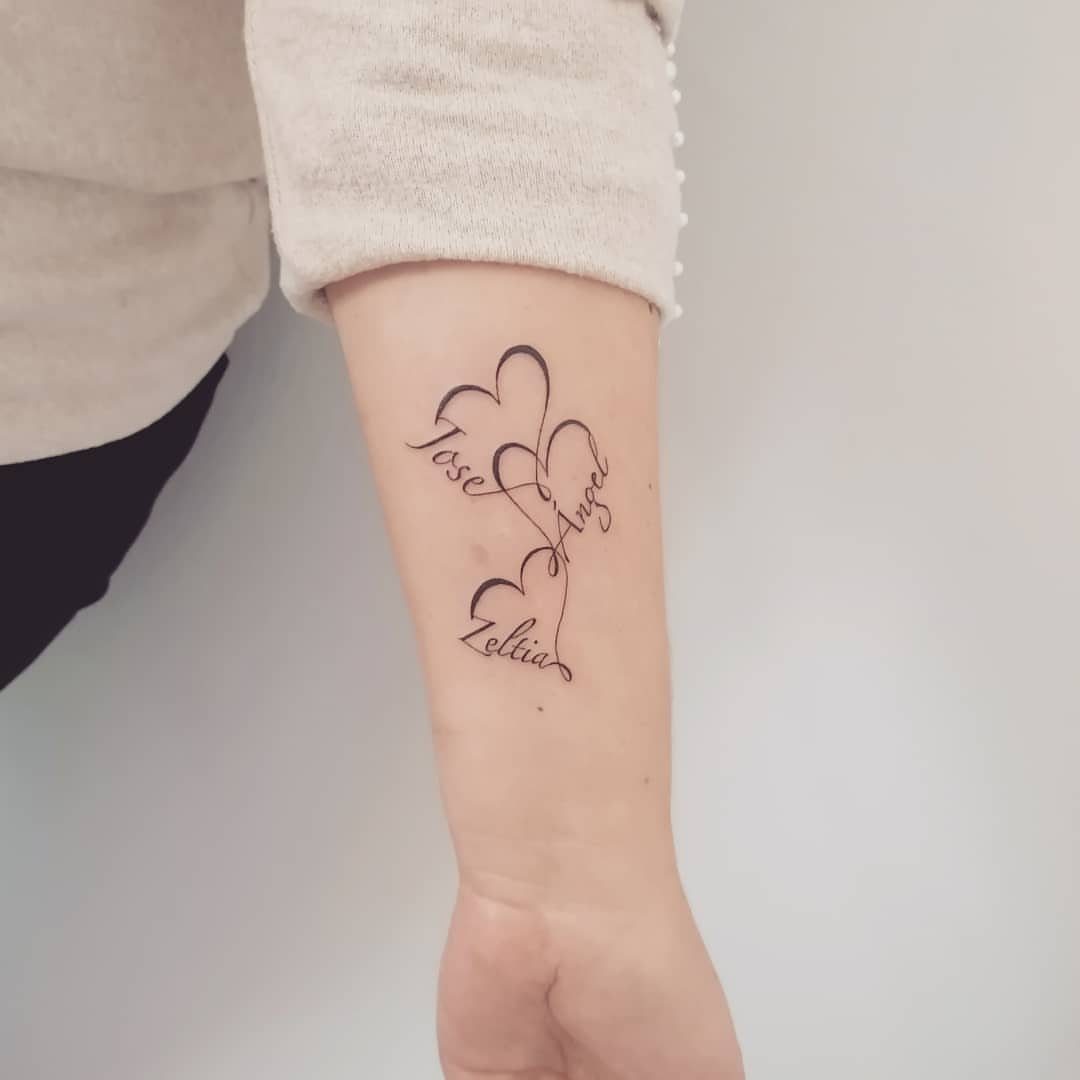
Each name sits inside its own heart outline, the letters forming the bottom curve of the shape. The heart becomes the frame, not an add-on, and the result feels integrated rather than busy.
This approach works well when you’re listing family members or close relationships. The repeating motif unifies the design, and the compact size of each heart keeps the tattoo from sprawling.
Placement on the inner forearm gives more room than the hand itself and hurts less. Skin here is softer, easier to tattoo, and the ink tends to hold better over time.
4. Vertical Name Tattoo on Side of Hand
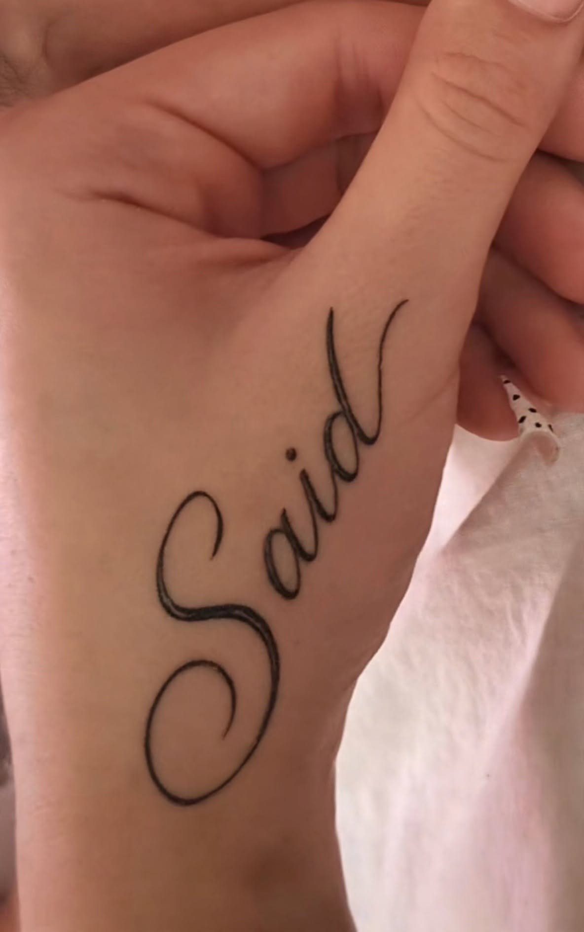
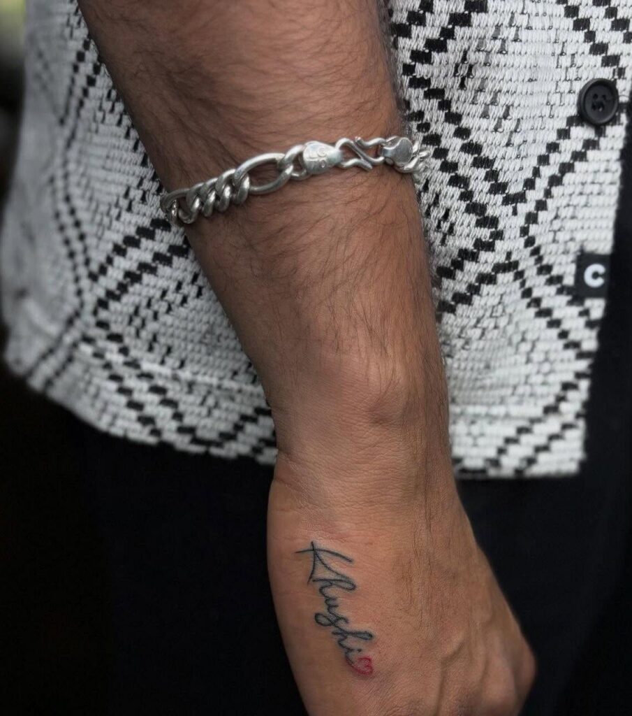
A name running vertically along the outer edge of the hand, from the base of the pinky down toward the wrist.
This orientation fits the narrow real estate of the hand’s side and reads clearly when your hand is at rest.
Vertical text suits shorter names. Too many letters will either shrink too small to read well or run past the hand onto the wrist, which changes the balance of the design.
This spot is bony and sensitive. Expect sharper pain than the top of the hand, and know that swelling can make your hand stiff for a day or two after.
5. Fine-line Cursive Name Tattoo on Hand
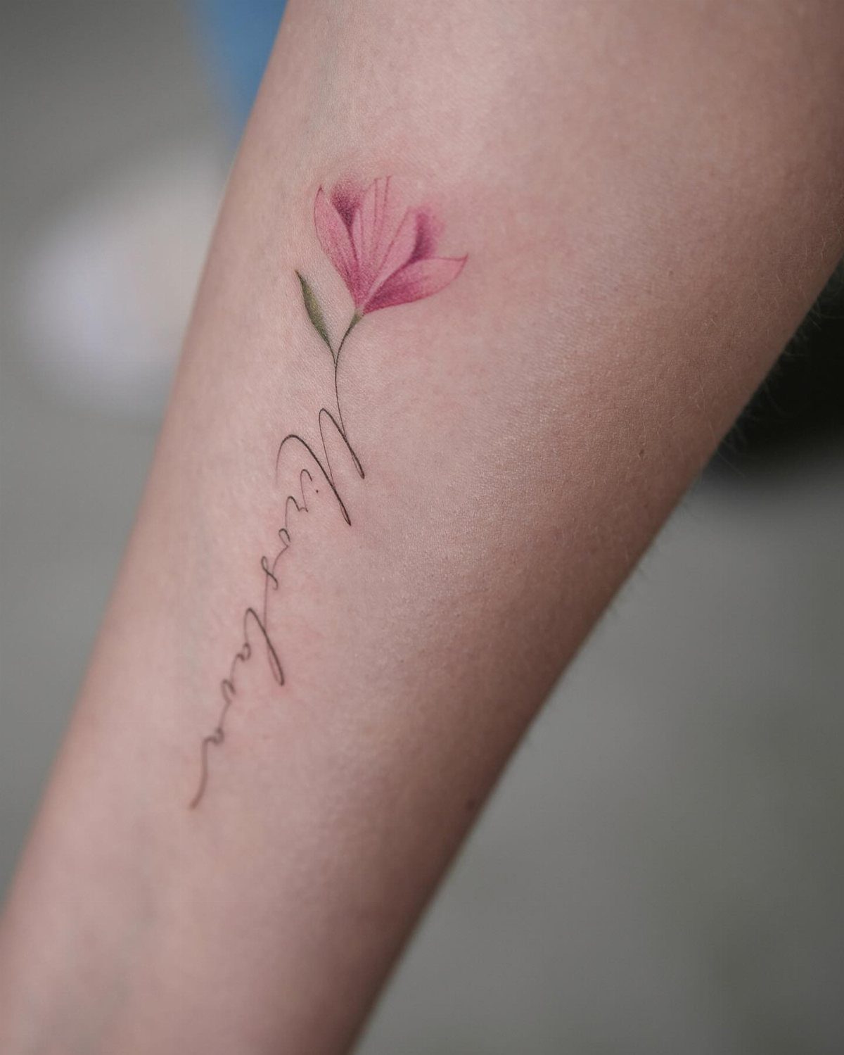
Fine-line cursive keeps a name tattoo delicate, especially when paired with a small floral accent. The thin strokes suit hands and wrists, where bold lines can overwhelm the narrow canvas.
This style shows every wobble, so choose an artist who specializes in it. The technique requires steadier hands and more precise needle control than traditional tattooing, and not every shop does it well.
Fine lines fade faster than bold ones. A touch-up every few years is standard, particularly on high-movement areas like the hand and wrist, where friction wears ink down more quickly.
6. Name with Date
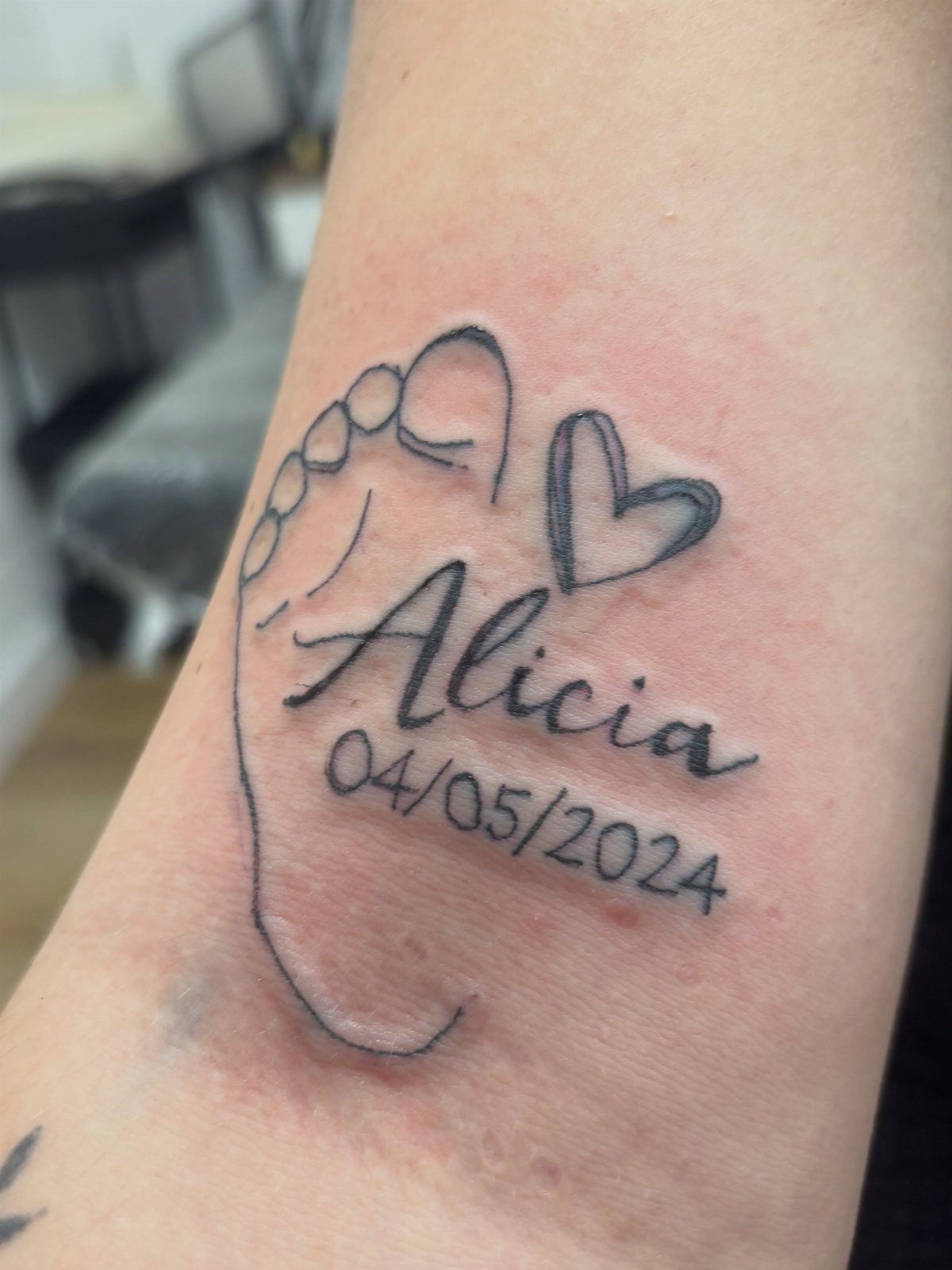
A name paired with a date and a small symbol, often a footprint or heart. The date anchors the tattoo to a specific moment, and the combination turns a simple name into a memorial or birth announcement.
This suits parents commemorating a child’s birth or anyone marking a significant life event tied to a specific person.
The date format is up to you, but keep it legible: small numbers in script can blur together over time, so block numerals often read better long-term.
Adding a symbol gives the design visual weight and balances the text. A single icon keeps the piece from feeling too text-heavy.
Choosing the Right Font
Cursive and script fonts suit name tattoos on hands because they read as personal rather than printed. The strokes follow the natural movement of handwriting, which feels closer to something written for one person than block letters do.
Script works best when the letters connect smoothly. A good cursive font spaces evenly, keeps the baseline consistent, and avoids loops that tangle when sized down to fit a hand.
Fonts with tall ascenders or deep descenders can look elegant at larger sizes but lose clarity on a narrow surface.
Black ink is standard. If you want decoration, keep it minimal: a small heart or star separates cleanly from the text without crowding it.
Ask to see the font at actual size before committing. What looks refined on paper can blur or lose definition once tattooed.
Symbolism of Hand Tattoos
A name tattoo on the hand puts someone in constant view. It sits where you see it every time you reach for something, sign your name, or hold a phone, and that visibility is part of the point.
Hands represent action and connection.
Tattooing a name here ties the person to what you do and how you move through the world. The placement reads as deliberate: this is someone you want present in your daily life, not hidden under clothing.
The commitment goes beyond sentiment.
Hand tattoos are visible in most professional and social settings, and removing or covering one later is harder than on the arm or torso. Placement here means you’re comfortable with that permanence and public display.
The design itself matters less than the decision to put it where everyone else will see it too.
Tattoo Placement Considerations
Hand tattoos sit in plain sight, which makes them bold but also harder to ignore if you change your mind later.
Placement on the hand means the tattoo is visible in most situations, from job interviews to family dinners, and not everyone is ready for that level of exposure.
The side of the hand fits shorter names or single words cleanly. The space between thumb and index finger is narrow, so text here needs to be compact.
Skin on the hand ages and moves more than skin on the arm or back. Ink can spread slightly over time, so designs here need to start with enough spacing and line weight to stay legible years later.
Frequently Asked Questions
What font is best for tattoos?
Cursive and script fonts work best for name tattoos on hands because they read as personal rather than printed.
The letters should connect smoothly with consistent spacing and avoid tall loops that lose clarity when sized down to fit the narrow surface.
What is the two hands touching tattoo?
2 hands touching is a separate design motif, often paired with text like a name or word placed on the back of the hand or wrist.
The clasped hands represent connection or partnership, and script text centered between them completes the memorial or relationship theme.