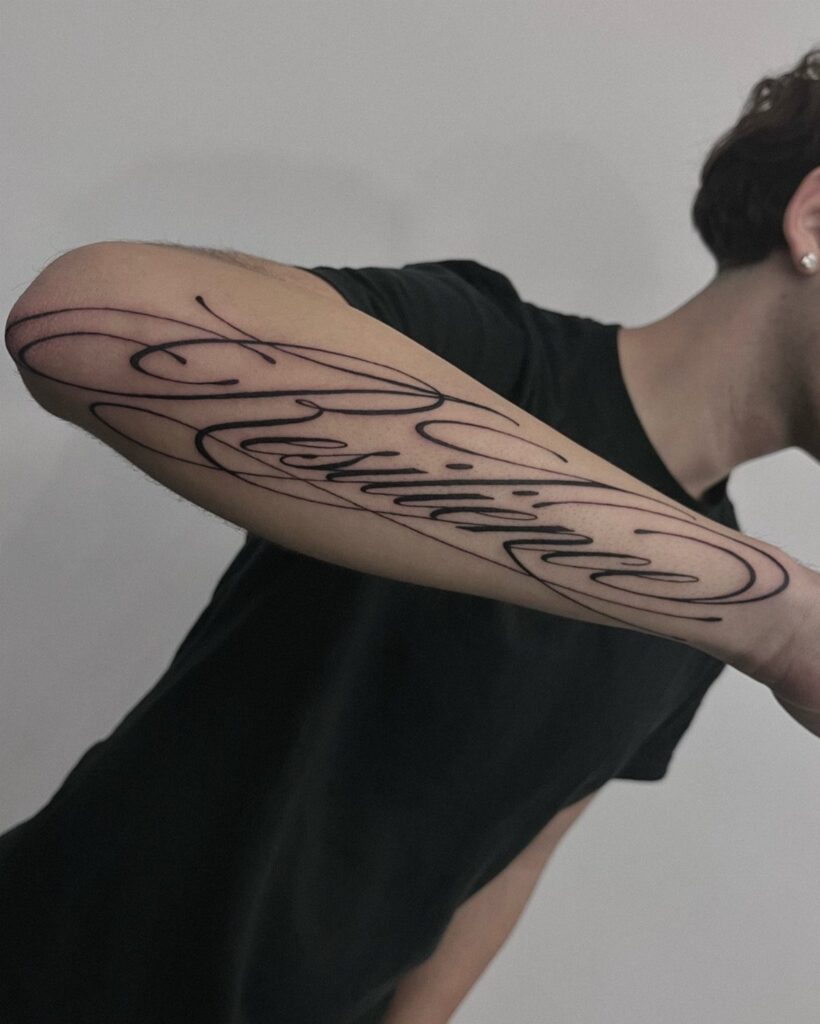
Cursive lettering runs from single-word reminders to full sentences, and size decides whether the tattoo stays readable or blurs after a few years.
Small cursive can soften and merge as the ink spreads, but a piece with enough room holds its legibility even as the lines age.
If you want something you’ll see daily, forearms show the tattoo to you as much as to anyone else, and pain stays mild for most people.
1. Wrists and Forearms Cursive Tattoos
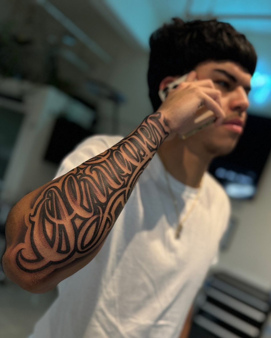
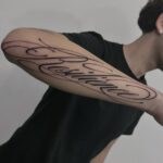
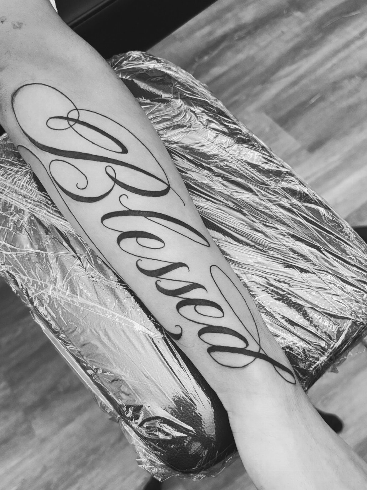
Large cursive lettering fills the entire forearm, from wrist to elbow, in solid black ink.
The scale matters here: small cursive can look blurry after a few years, but a piece this size holds its readability even as the lines soften.
Forearms show the tattoo to you as much as to anyone else, which suits a reminder or a motto you want to see daily.
Pain is mild for most people, and healing goes smoothly if you keep it clean and out of the sun.
2. Modern Brush Scripts Cursive Tattoo
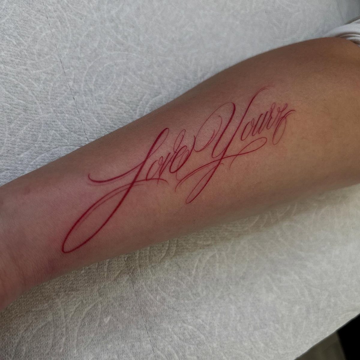
Red ink makes the tattoo stand out in a way black never will. The color pulls attention, and brush script lettering adds movement that feels less formal than classic cursive.
Red ink loses its punch over time and will need a touch-up sooner than black to stay bright. Some skin tones hold red better than others, so ask your artist to show you healed examples on clients with similar skin.
Placement on the forearm keeps it visible and easy to care for during healing.
3. Cursive Tattoo with Proper Spacing
Spacing between letters prevents the ink from bleeding together as the tattoo ages. Tight cursive looks elegant fresh, but letters can merge into an unreadable smudge as the ink spreads.
A good artist will add extra space between each letterform, especially in longer words. The tattoo might look slightly looser than a handwritten signature, but that breathing room keeps it legible for decades.
Forearm placement gives the artist a flat, stable surface to work on, which helps with consistent spacing.
4. Foot Cursive Script Tattoo
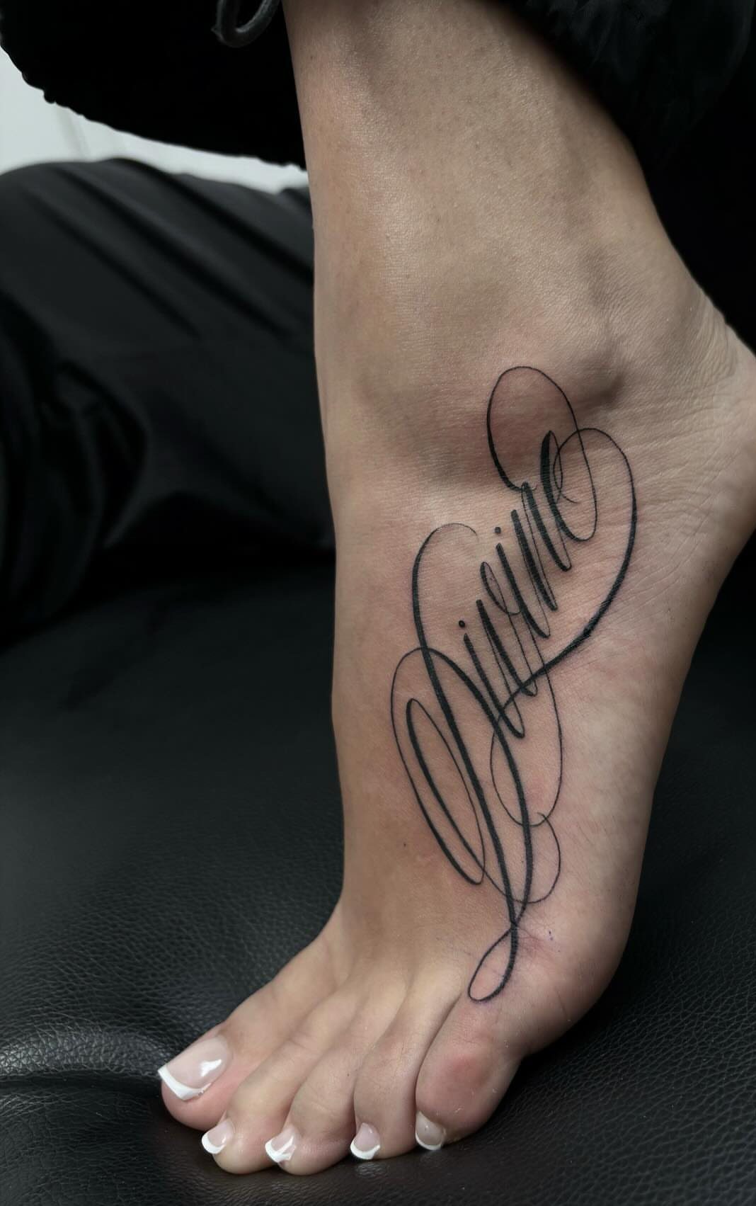
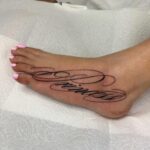
Foot tattoos sit where you see them but most people don’t, which works for something personal. The outer edge of the foot gives just enough flat surface for a single word in looping script.
Pain varies wildly: thin skin and proximity to bone make the foot a sensitive spot for most people. The tattoo will blur slightly faster here than on your arm because feet flex constantly and the skin regenerates quickly.
Healing takes longer on the foot, and you’ll need to avoid tight shoes during that time.
5. Cursive Tattoo Font Flash Sheet
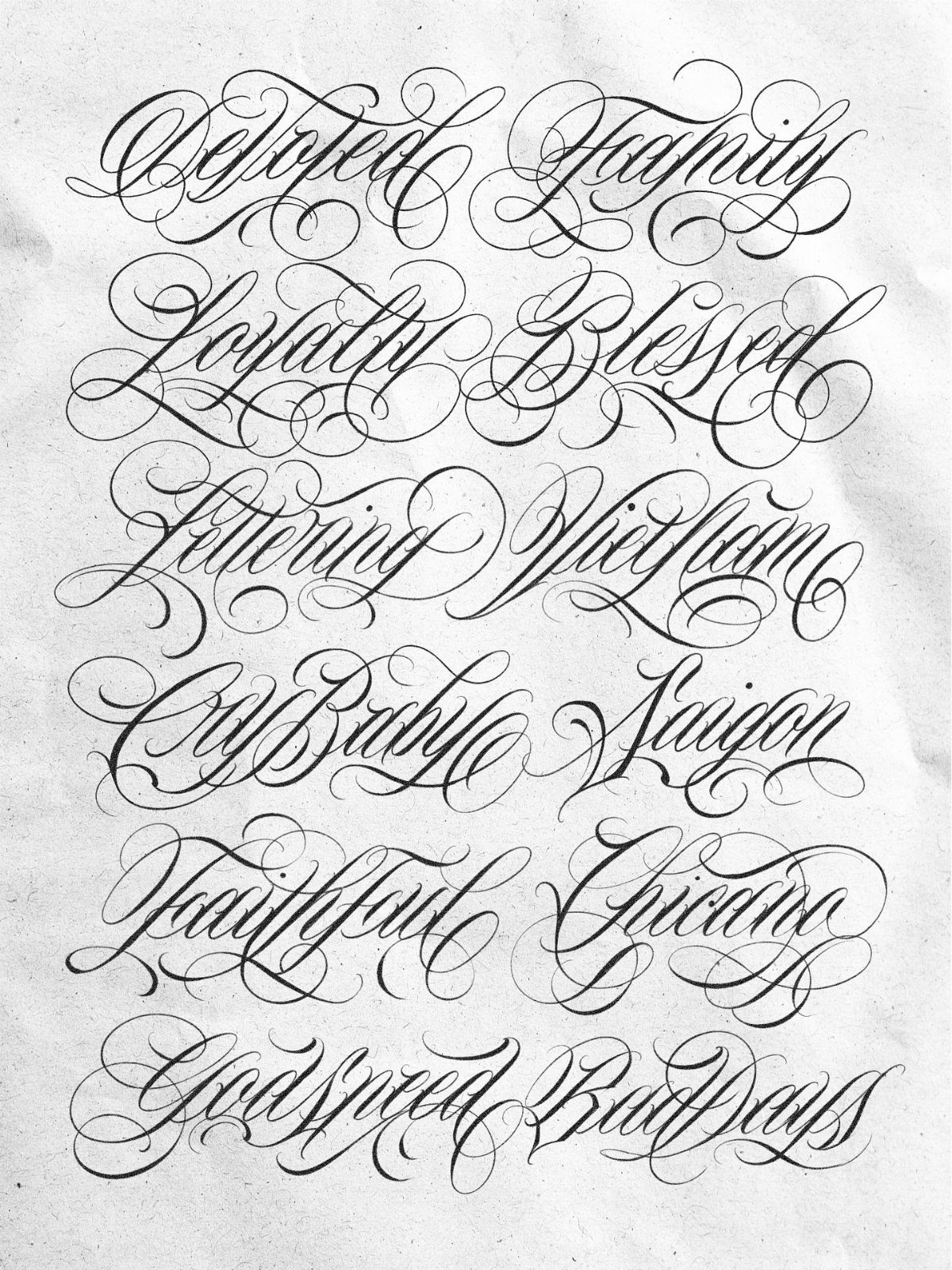
A flash sheet shows multiple cursive words and styles in one place, letting you compare how different flourishes and weights change the feel of the same idea. Artists use these as references or as ready-made designs clients can choose from.
If you’re working with an artist to develop your own lettering, ask to see their flash sheets. The sketches show their range and which decorative elements they favor: heavy swashes, tight loops, or minimal connectors.
Some shops sell flash sheets as prints, and I think they make better reference material than saving random Pinterest images. You get a sense of what actually tattoos well at readable sizes.
6. Minimalist Single-word Cursive Tattoo
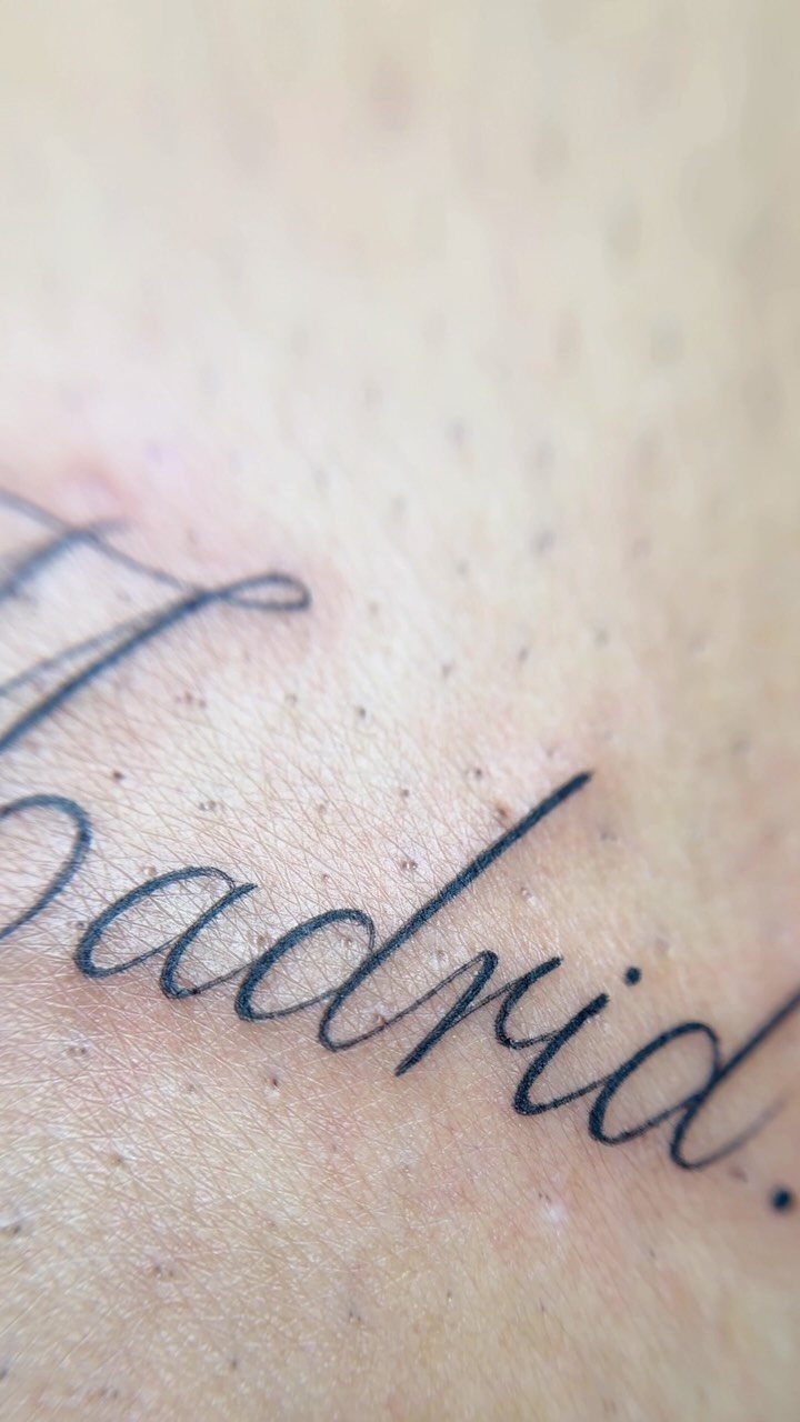
A single word in small cursive reads instantly and stays uncluttered. The trailing period turns it into a statement rather than a label, which adds finality to names, places, or short affirmations.
Placement matters: areas with less movement, like the inner forearm or ribs, hold fine lines longer than spots like fingers or ankles.
I prefer this approach for meaningful words that don’t need decoration. The simplicity reads as intentional, and there’s less risk of the design looking busy or dated.
Frequently Asked Questions
What is a cursive writing tattoo?
A cursive writing tattoo uses flowing, connected script to spell out words, names, or phrases.
The style can range from formal calligraphy to loose brush lettering, but all cursive designs rely on the looping, continuous strokes that mimic handwriting. Black ink is most common, though color work appears in modern variations.
How do I choose a cursive tattoo font?
Pick a font that stays readable after years of wear while still matching the feeling you want. Heavier weights with good spacing between letters hold up better than delicate scripts with tight loops.
If your artist has photos of that style a year or two out, ask to see them; delicate scripts can lose their crispness as the ink settles.