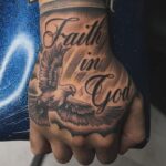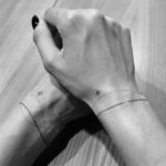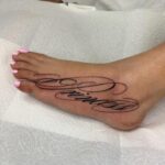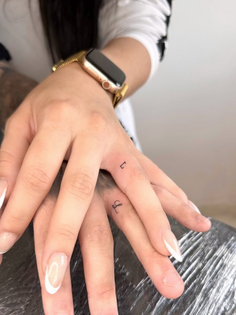
Ring finger initials sit where a wedding band would, while a forearm sentence gives script room to breathe and a wrist airplane or crescent moon stays small enough to hide under a watch.
1. Matching Initials
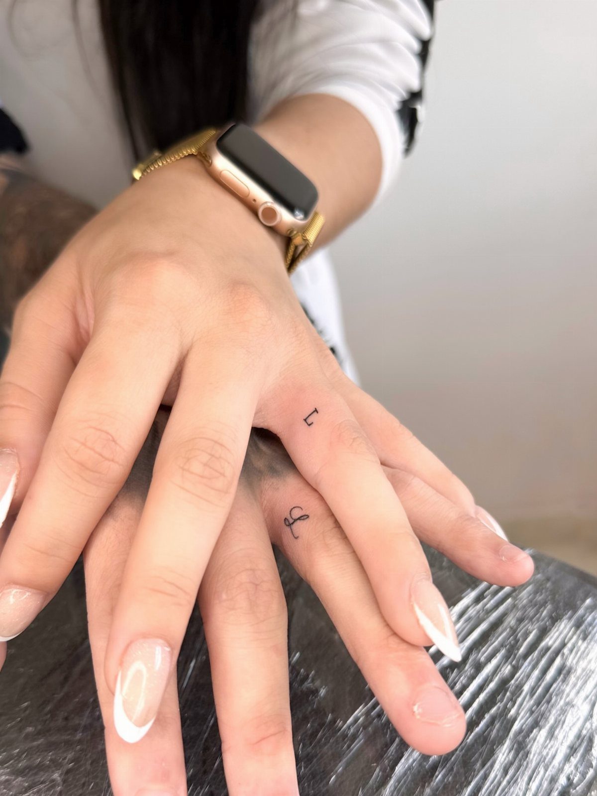
Matching initials let each partner wear the other’s letter, usually on the ring finger or the side of the hand.
The ring finger is the most popular spot because it sits where a wedding band would, but the side of the finger or the space between thumb and index finger also work for something easier to hide at work.
2. Hand-Drawn Hearts
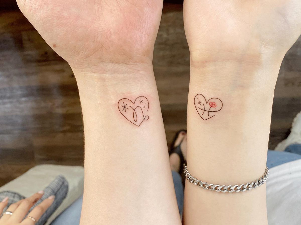
A hand-drawn heart keeps the sketch lines visible instead of filling the shape with solid black. The rough, unfinished look makes it feel personal, like something one of you drew on a napkin and decided to make permanent.
You can add small details inside the outline, stars or a tiny flower, without making the design bigger or harder to read as it ages.
3. Butterflies
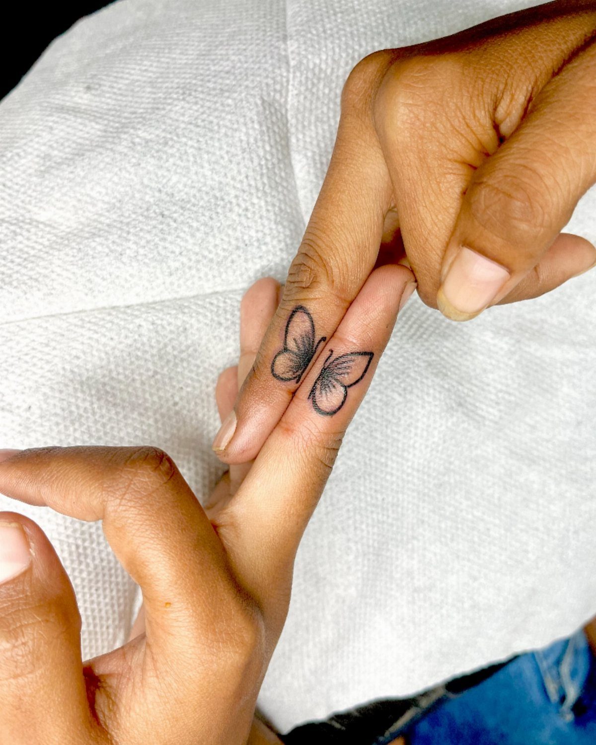
Butterflies split across two hands or fingers form one complete insect when you hold them together.
The split works best on fingers or the sides of the hands where you can press them close without awkward positioning.
Fine-line butterfly wings fade faster than bolder linework, so going this small means planning on a touch-up down the road to keep the detail crisp.
4. King and Queen
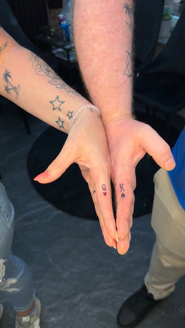
King and queen tattoos pair a "K" with a "Q," often dressed up with a small crown, heart, spade or diamond. The card suit adds a playful edge without turning the design into something overly romantic or formal.
Ring finger placements put the letters where they are easy to show off but small and discreet.
Black ink on fingers lasts longer than color, and simple letters hold up better over time than heavily decorated script that can blur as the skin ages.
5. Lightning Strikes
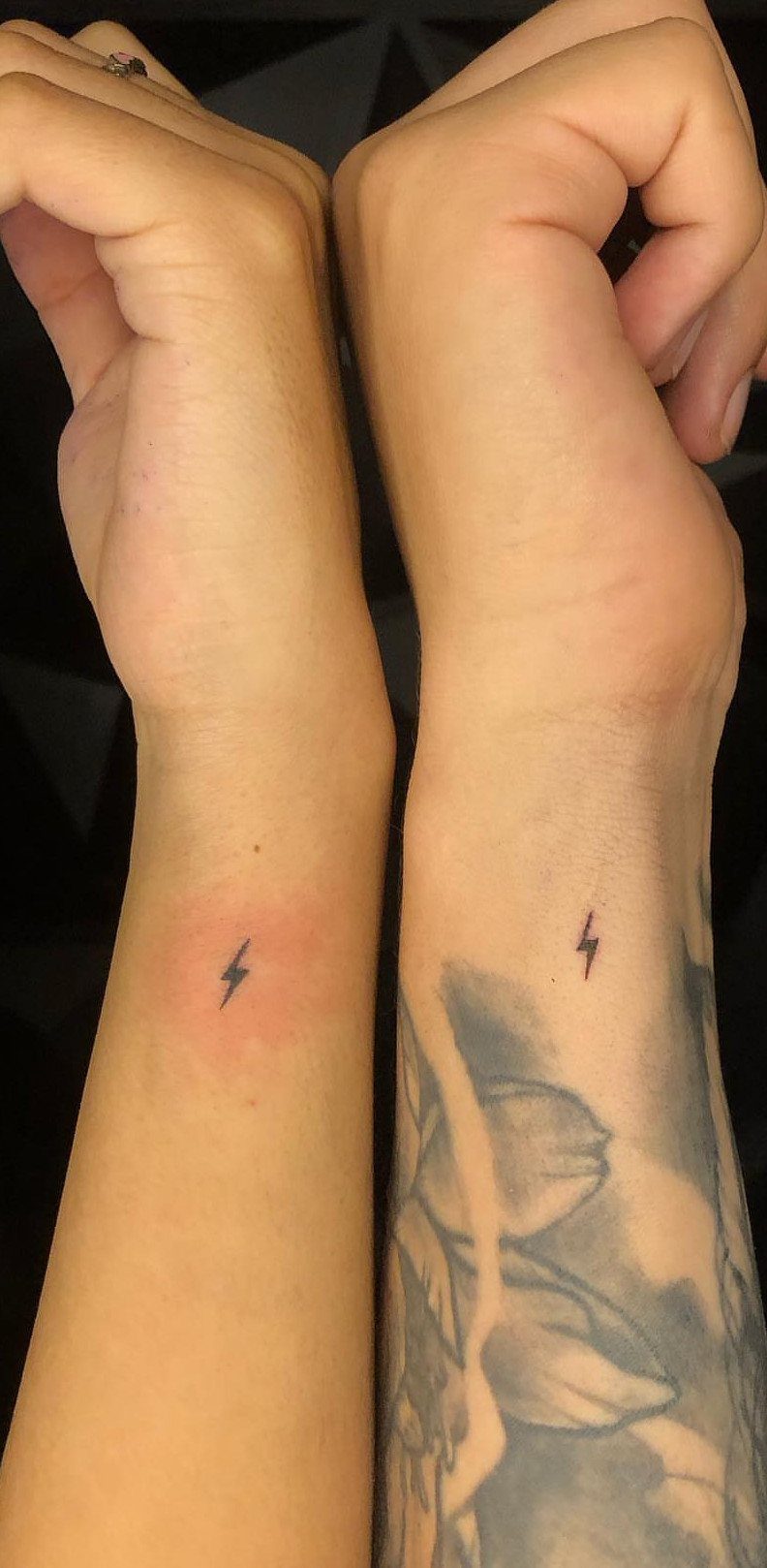
Lightning bolts signal energy and spark, the kind of attraction that feels sudden and electric. A single bolt in black ink stays readable when small and ages well because there are no fine details to lose.
Inner wrist placements heal faster than spots that rub against clothing, and the thin skin there makes the process quick but sharper than fleshier areas. Keep the line weight bold so it does not fade into a smudge over time.
6. Crescent Moons
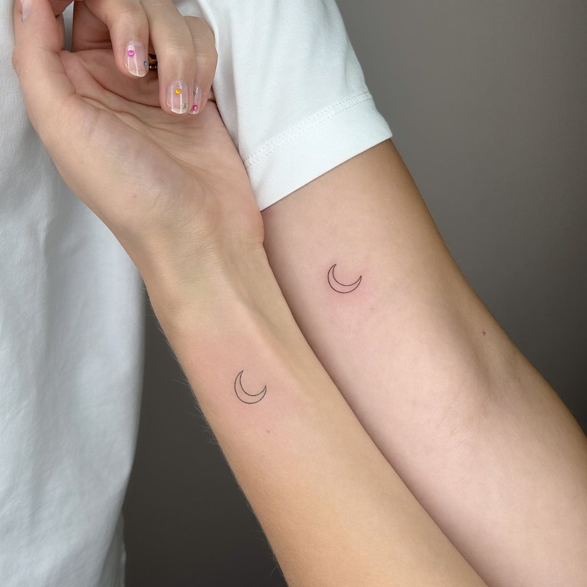
Crescent moons represent cycles, change and the idea that relationships grow in phases.
Inner forearm placements hurt less than bony spots like the ribs or collarbone, and the flat surface gives the artist a clean canvas for symmetrical curves.
Black ink crescent moons need almost no touch-up work because the shape is bold and holds its edges as the ink sets.
7. Puzzle Pieces
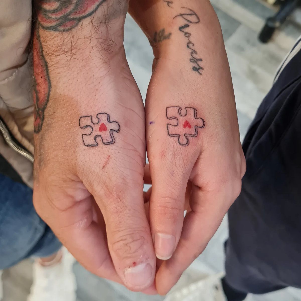
Puzzle pieces show that each person fits the other, with matching shapes that lock together when you bring them close.
Adding a small heart or initial inside each piece personalizes it without making the tattoo bigger, and bold outlines hold up better than fine linework as the ink settles into the skin.
8. Infinity Symbols
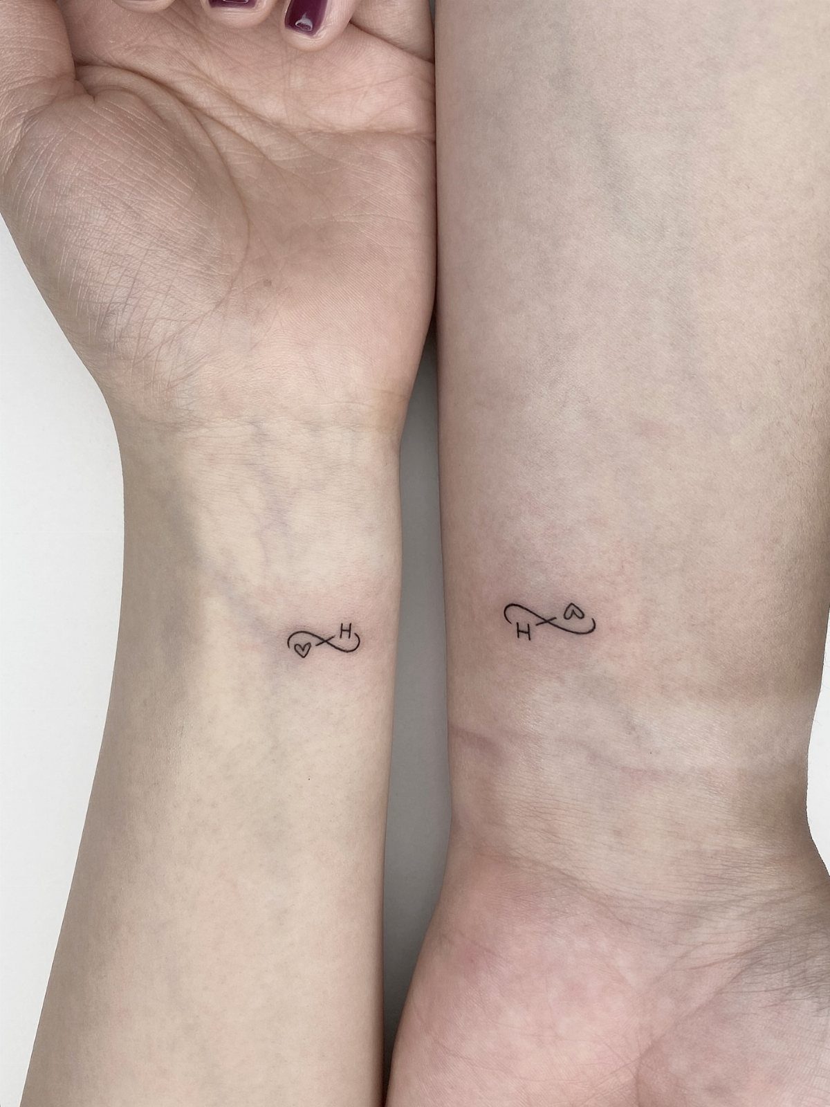
An infinity symbol wrapped around a heart or a letter says the bond has no end.
Wrist placement shows it off easily and heals faster than spots that rub against clothing all day.
The continuous loop shape holds its edges well over time, even at small sizes, because there are no tight curves or delicate details to fade out.
Adding one shared initial keeps it personal without turning the design into something overly complicated.
9. Airplanes
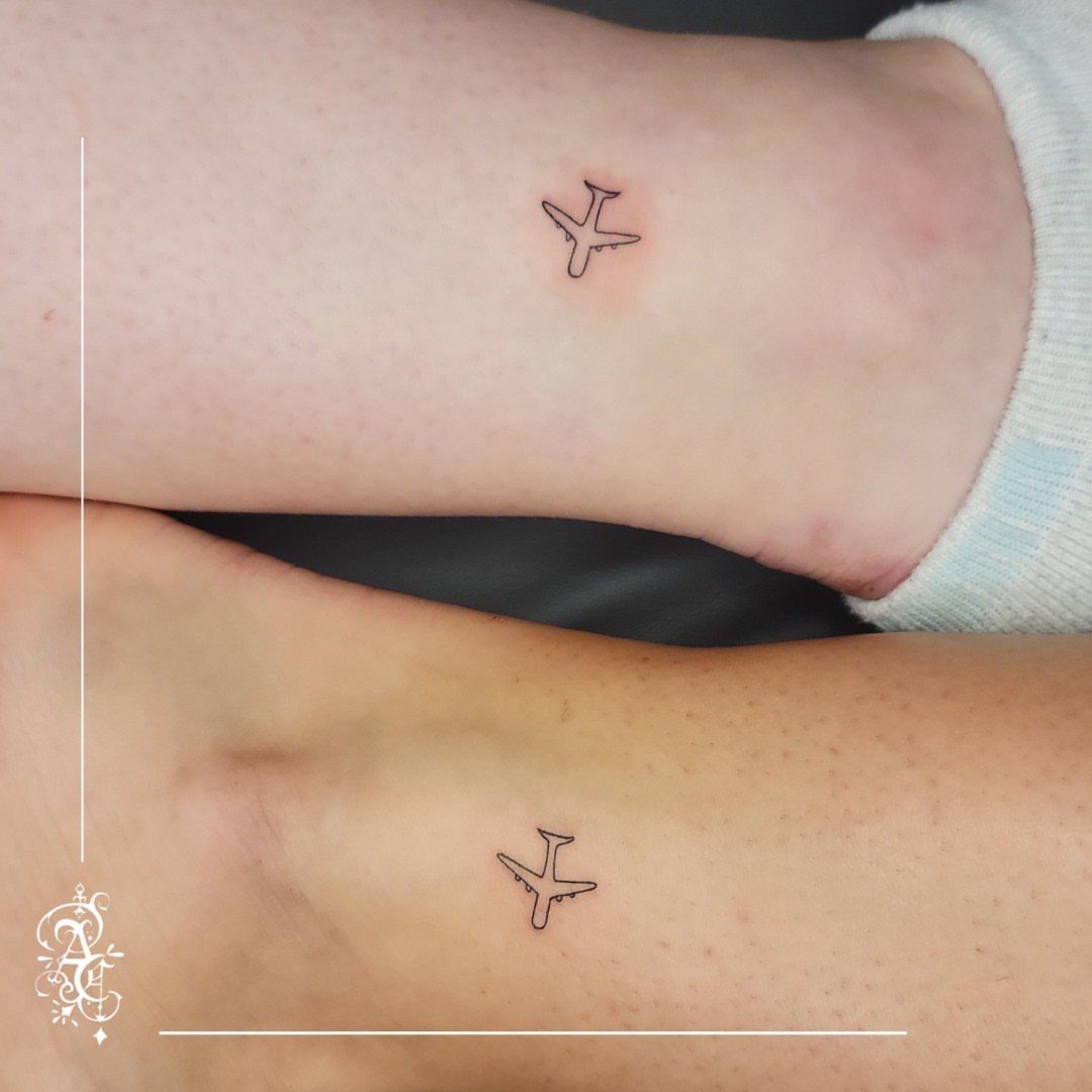
Airplanes stand in for couples who spend time apart, whether that distance is a few states or a few continents.
Ankle placement keeps the design small and easy to hide when needed, though the thin skin and proximity to bone make the process sharper than fleshier spots like the forearm.
Simple line-art planes age better than heavily shaded designs because there is less detail to blur as the tattoo settles.
10. Together Forever
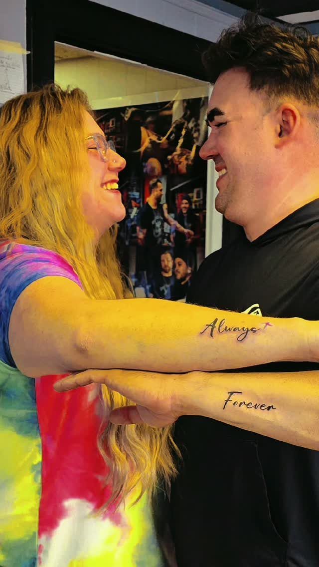
One person gets "Always," the other gets "Forever," and the two words form a complete promise when you read them together.
Script fonts need enough size to stay legible as the ink spreads slightly over the years, so forearm placements give the artist room to work without cramming letters too close.
Black ink lasts longer than colored script, and simple lettering without heavy flourishes holds up better on skin that moves and stretches daily.
11. Waves Couple Tattoos
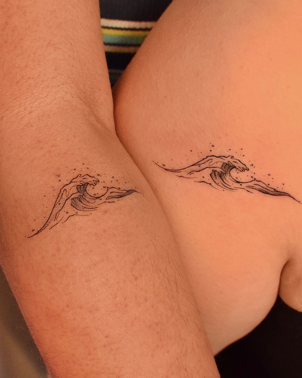
Matching waves represent the highs and lows you ride out together, with each person carrying the same curve in black ink.
The design reads clearly at small sizes because the shape is bold and simple, with no fine details to lose over time.
Different placements, one on an arm and one on a hip, let each person choose a spot that fits their pain tolerance and how visible they want the tattoo to be day-to-day.
12. Music Couple Tattoos
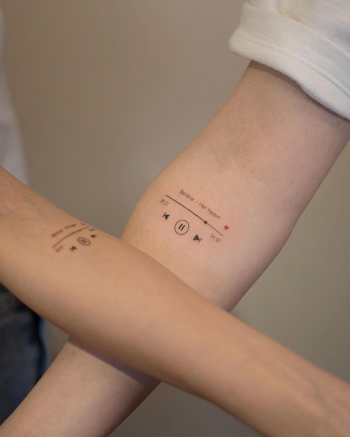
A music player interface splits the controls, with one getting the play button and the other getting pause, or both carrying matching screens that show a song title and timestamp.
The flat surface of the forearm gives the artist space for small text and buttons without distortion, and the design stays readable because the shapes are geometric and the lines are clean.
Black ink holds up better than gray shading for tiny details like song titles, and adding a date or lyric that matters to both of you makes it specific to your story.
13. Sentences Couple Tattoos
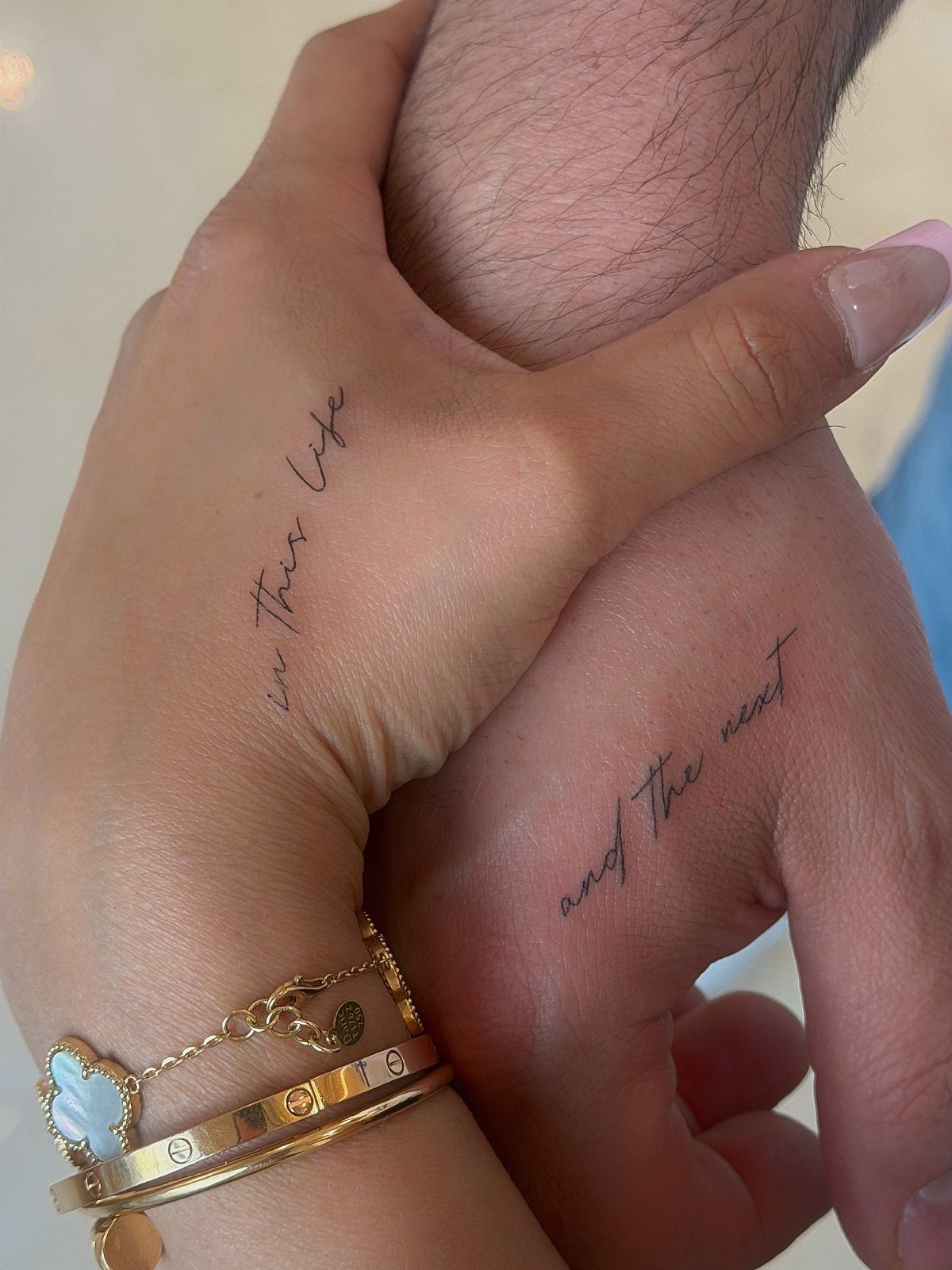
Split sentences let each partner carry half of one statement, usually something about connection that only makes sense when read together.
Forearm real estate lets script breathe, and a clean sans-serif or simple serif will still read when the edges soften years from now.
Stick with black if you want the words to stay sharp, and size the letters so they survive the skin’s natural spread.
14. Small Minimalist Tattoos
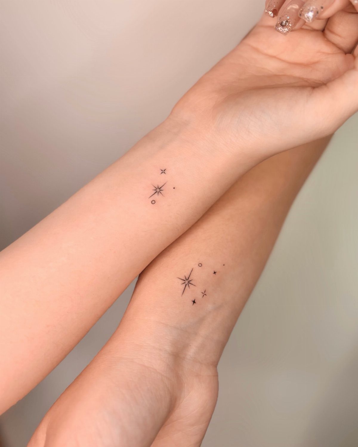
Small dots, stars or geometric shapes keep the design abstract and open to interpretation. A design this stripped down won’t lose anything as it ages, and you can tuck it under a sleeve when you need to.
The wrist is flat enough for even spacing, and you’re not dealing with constant fabric friction during the healing window. Black ink on simple shapes needs almost no touch-up work over time.
15. Sun and Moon
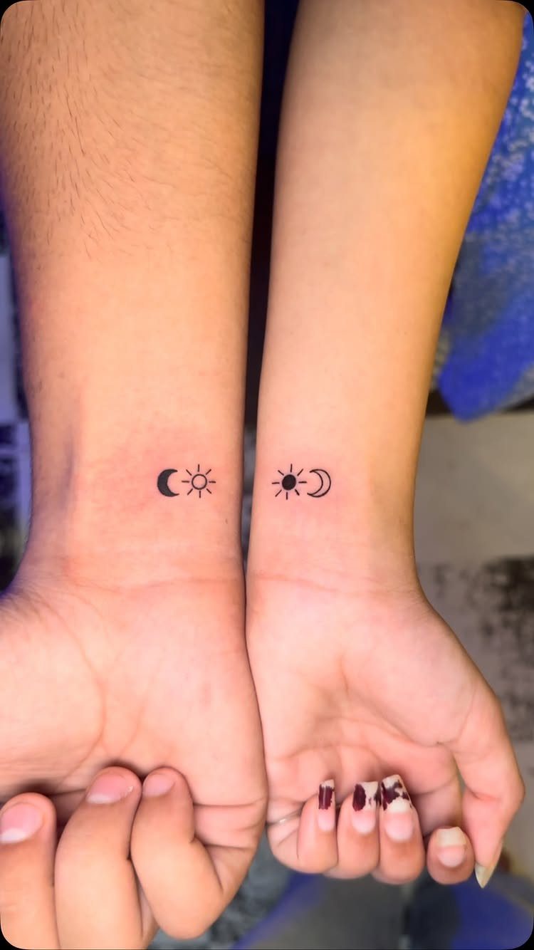
One person gets the sun, the other gets the moon, and the pair represents balance between opposites.
Inner wrist sits where you can see it easily, and you skip the nerve-heavy zones that take longer to calm down.
The simple shapes hold their edges well at small sizes because there are no tight curves or delicate shading to fade out, and black ink stays crisp longer than colored fills that can soften as the tattoo settles.
16. Avocado Tattoos
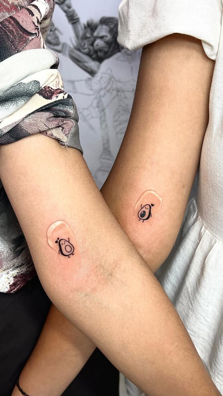
Matching avocado halves show that each person completes the other, with one carrying the pit and the other getting the empty side.
The cartoon approach reads funny instead of sentimental, and thick outlines stay intact when the ink migrates slightly into surrounding tissue.
Forearm placements give enough flat space for the details to stay clear, and the protective bandage visible here stays on for the first few days while the tattoo heals.
17. Roman Numerals
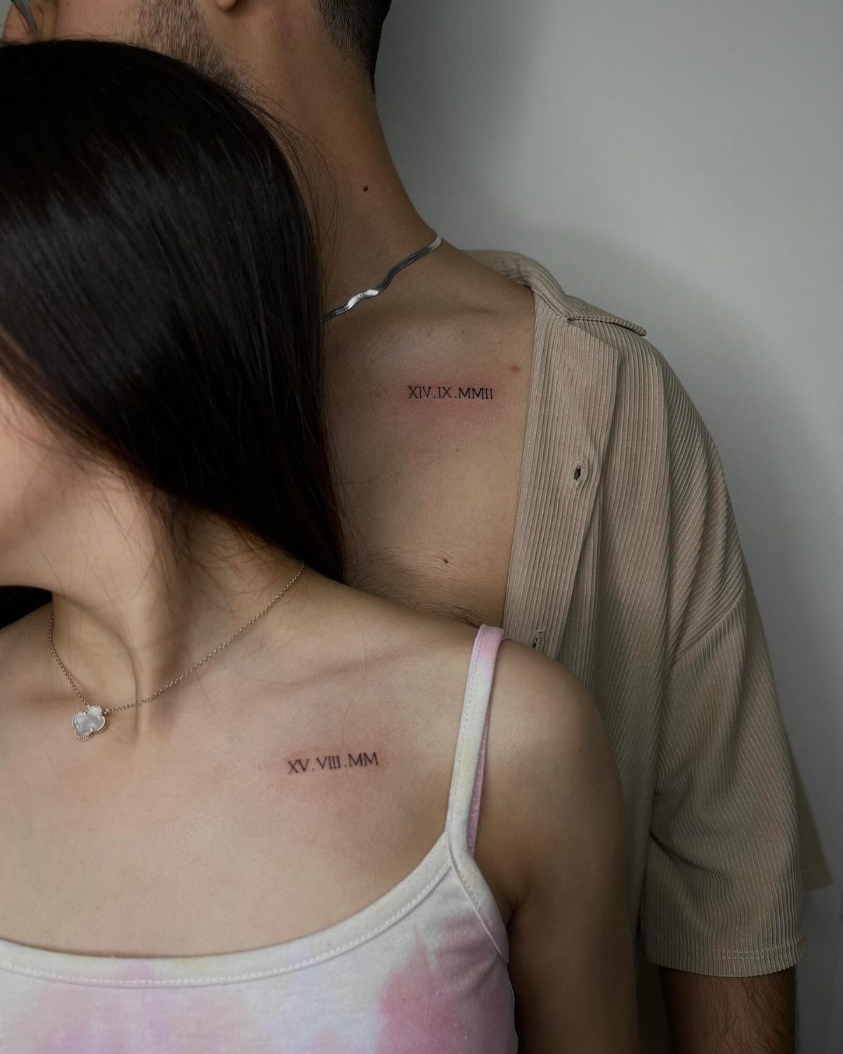
Roman numerals mark a date that matters to both of you, usually an anniversary or the day you met, in a format that reads more formal than standard numbers.
Collarbone placement keeps the design visible in open shirts or dresses but easy to cover with a collar, and the flat surface gives the artist room to space the numerals evenly.
The numerals visible here show different dates, one for each partner’s version of the story, which personalizes the design without making it perfectly symmetrical.
18. Heart and Brain
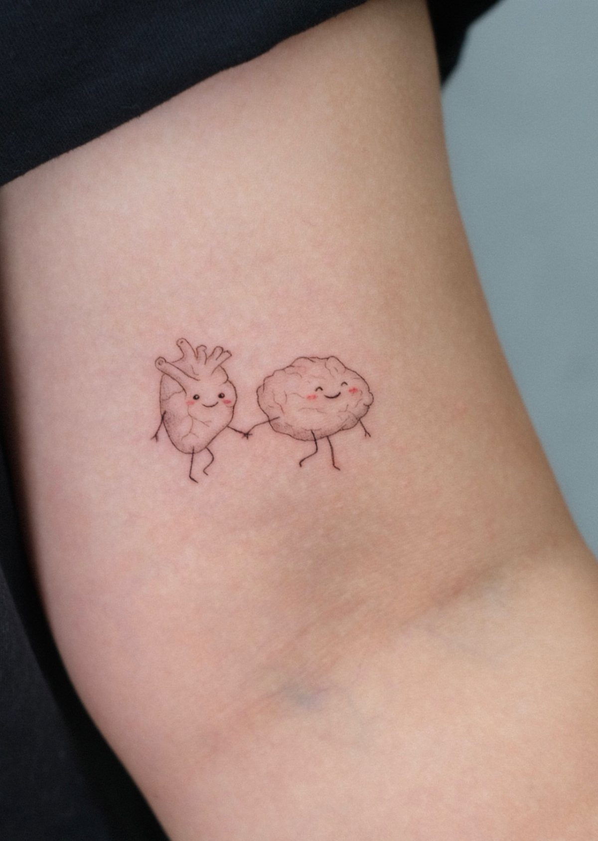
A cartoon heart holding hands with a cartoon brain shows the balance between feeling and thinking, with the idea that a relationship needs both.
Bold geometry at this scale won’t blur out, and tiny facial features give it personality without pushing it into heavy symbolism. Inner arm sits still during healing, unlike joints that crease and stretch with every movement.
19. Socket and Plug
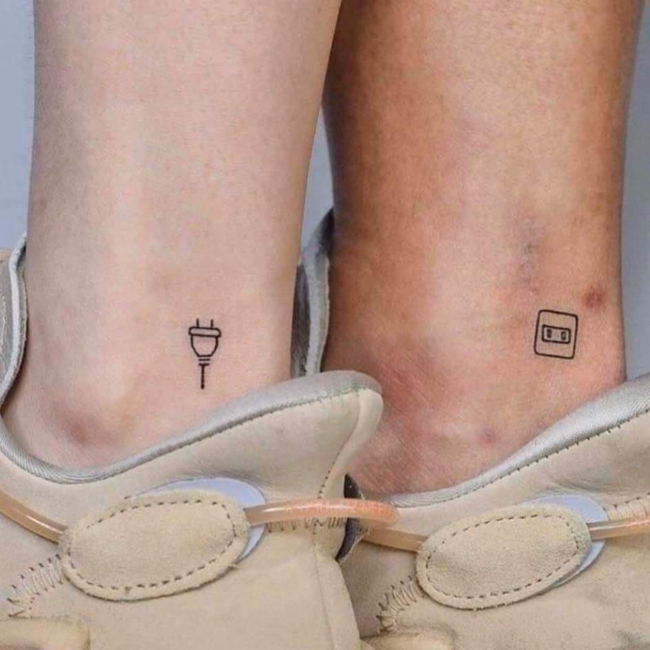
A plug and socket split the idea of connection into 2 pieces that only work together.
The ankle spot works for hiding under clothing, though expect more sting than you would on a fleshier area. The simple geometric shapes hold up well over time because there are no fine details to blur as the ink settles.
20. You Are My Sunshine
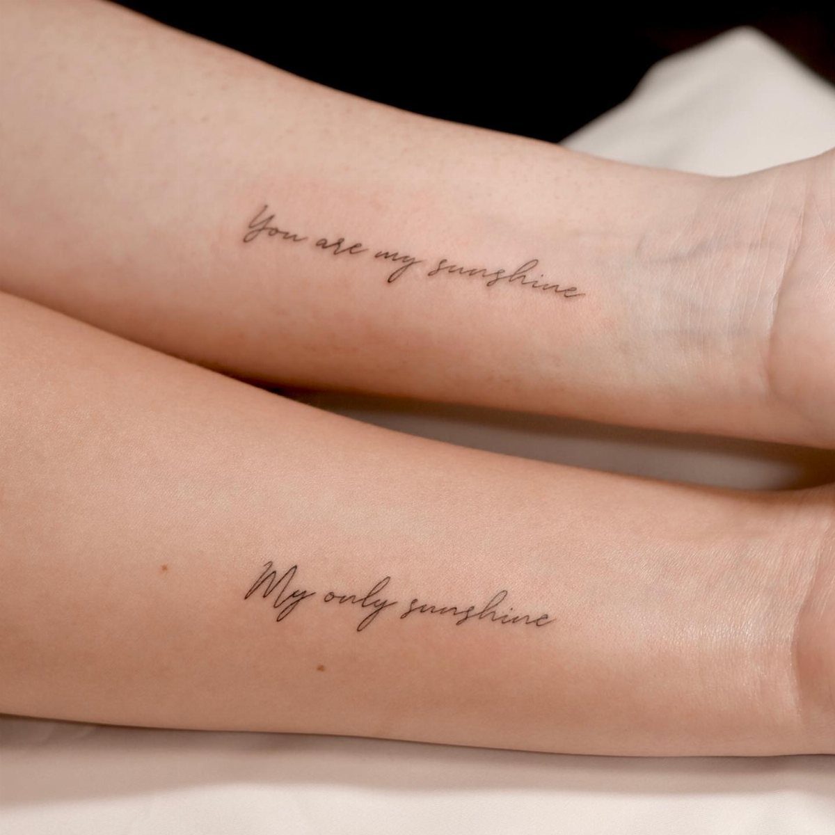
Split lyrics from a song both people know turn the design into something that feels private, even when the words themselves are familiar.
Black script on the forearm stays readable longer than colored ink, and the surface gives you enough length to keep the letters clear.
Size the font so each letter has enough space to keep its shape, and stick with a clean script that won’t lose its edges when the skin moves and stretches daily.
21. Matching Seahorses
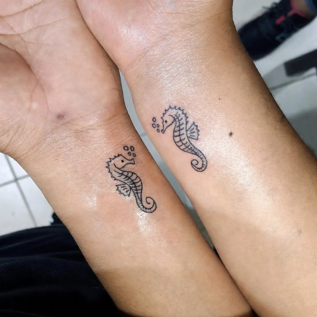
Matching seahorses keep the design symmetrical and recognizable at small sizes, with bold black linework that holds its shape as the tattoo ages.
The bubbles add a playful detail without making the design bigger, and simple shapes like this need almost no touch-up work because the lines are thick enough to stay crisp.
22. Nut and Bolt Characters
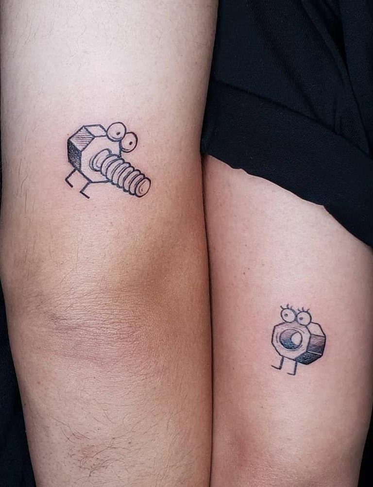
Cartoon nut and bolt characters with faces turn the matching hardware into something playful instead of purely symbolic.
Thick lines and uncomplicated geometry resist fading at this scale. The lower leg hides easily and lies flat enough that the character faces stay recognizable.
23. Manta Rays in Bubbles
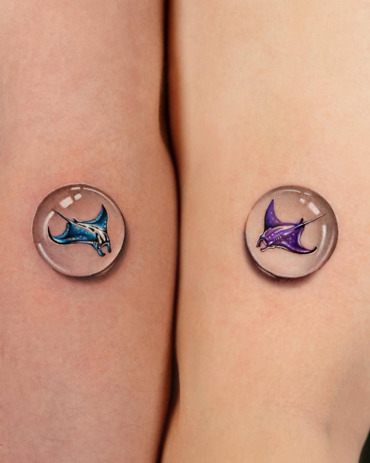
Manta rays inside bubble-like circles add depth and color while keeping the design compact, with the 3D effect making each tattoo look like it’s floating under glass.
The shading and color require more upkeep than solid black linework because colored ink fades faster, especially in small doses.
The arm gives the artist a smooth canvas for fine detail, and the bubbles do the framing work on their own.
24. Split Soulmate and Year Tattoos
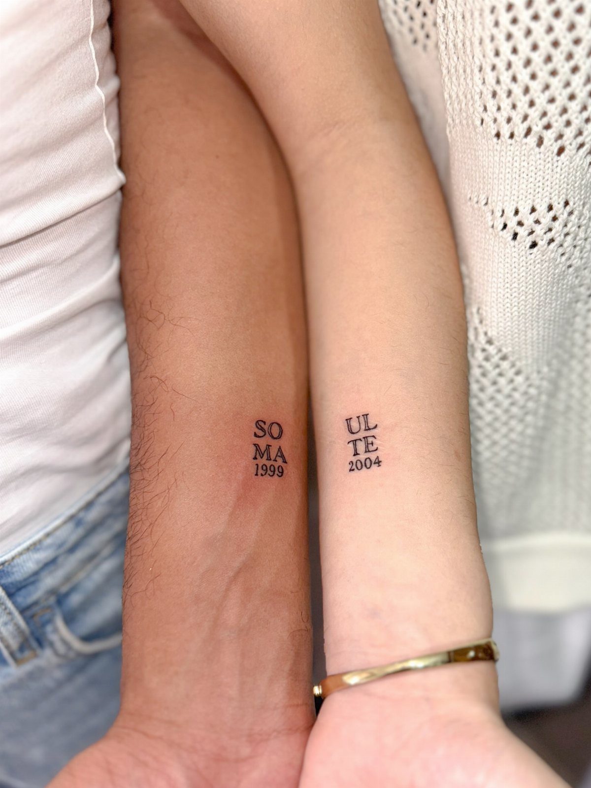
Split words and birth years let each person carry half of "soulmate" along with their own year, so the full message only appears when you read both tattoos together.
Inner wrist placement keeps the text visible but small enough to hide under a watch or bracelet.
The serif font holds up better than script because each letter has clean edges that won’t blur as the ink settles, and black ink on text this size lasts longer than gray or colored lettering.
Choosing the Right Tattoo
Pick a design both of you connect with, not one person’s favorite that the other agrees to.
Sit down together and talk through what actually represents the relationship: a place you keep going back to, an inside joke, something you built together.
Generic symbols work when they map to something real between you, but a design that only makes sense to the two of you will age better than something you picked because it looked good in a portfolio.
Book time with an artist once you know the direction you want. A good artist will refine the idea and flag problems early, like a script font that will blur or a placement that rubs against clothing all day.
If one of you is hesitant, that is worth listening to. A tattoo you both love beats one you rushed into.
According to Rachel Wright, MA, LMFT, a licensed psychotherapist specializing in sex and relationships, matching tattoos can serve as a physical and permanent reminder of a person, commitment, care, experience, feeling, or moment.
— Glamour
Temporary Tattoos
Test the design and the spot with a temporary version before you book the appointment.
Temporary tattoos let you see how the size reads on your actual skin, whether the placement works with your wardrobe, and if you still like it after a week of looking at it every day.
Inking a full name carries the most risk. Initials or a design tied to your story hold up better if things change, and a symbol that reads as abstract to everyone else keeps the meaning between you without broadcasting it.
If the design feels forced or like something you picked because you thought you should, keep looking.
Tattoo Aftercare
Use mild soap and warm water to clean the area, then dab it dry instead of rubbing.
Smooth on a light coat of whatever balm or lotion your artist gave you, enough to keep it from drying out but not so thick it can’t breathe.
Stay out of the tub, the pool and any hot water soak for 2 weeks minimum.
Direct sunlight will fade the ink, so keep it covered or use sunscreen once the skin closes. Picking at them can pull out ink and leave gaps that need a touch-up later.
Frequently Asked Questions
What is a good couple’s tattoo?
A good couple’s tattoo reflects something specific to your relationship, whether that’s a date, a place you return to, or an inside joke that only makes sense to the two of you.
A design that connects to something specific between you, whether it’s matching initials, a split phrase, or a symbol like puzzle pieces, reads more honest than one borrowed from someone else’s story.
Symbols like hearts, infinity signs, or lock and key stay recognizable without dating themselves, and when the image ties back to your actual relationship it holds up better than something generic you saw and liked.
What do matching tattoos represent?
Matching tattoos show that each person carries a piece of the same idea, whether that’s a shared date, a symbol that completes when you hold them together, or a design that says you fit.
They act as a physical reminder of commitment and connection, something you can look at when you’re apart. The best designs look abstract to anyone else while carrying the full weight of what it means to the two of you.
What should I consider before getting a matching tattoo?
Make sure both of you care about the design for the same reason, not because one talked the other into it or because it ranked well on Pinterest.
Ask yourself how you’ll feel about it in a few years if the relationship changes, and test the design and placement with a temporary version to see if you still like it after a week.
If one of you is hesitant, that’s worth listening to, and initials or abstract symbols hold up better than full names if things shift down the road.