One of you wears the sun while the other carries the moon, or you split a phrase so the full line only reads when you stand together.
I prefer designs that mean something beyond the relationship itself, so if things change you’re still carrying ink you stand by.
1. Sun and Moon Tattoos
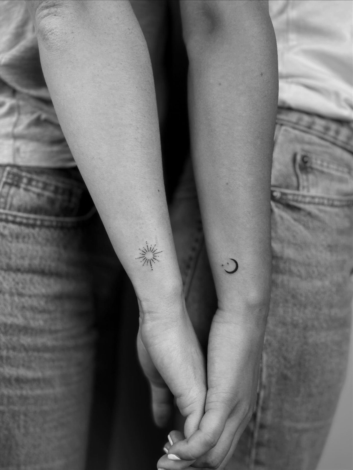
One of you wears the sun, the other the moon, each marking half of a pair that circles back to the other.
The split works because the shapes stay clear at small sizes and read instantly as opposites that belong together.
Wrists keep them visible without taking prime real estate on your forearm or shoulder. Black ink holds the detail and skips the fade risk that comes with color.
The design scales down to half an inch and still reads, so you can tuck it somewhere subtle if you want matching ink that doesn’t announce itself from across a room.
2. Matching Phrase Tattoos
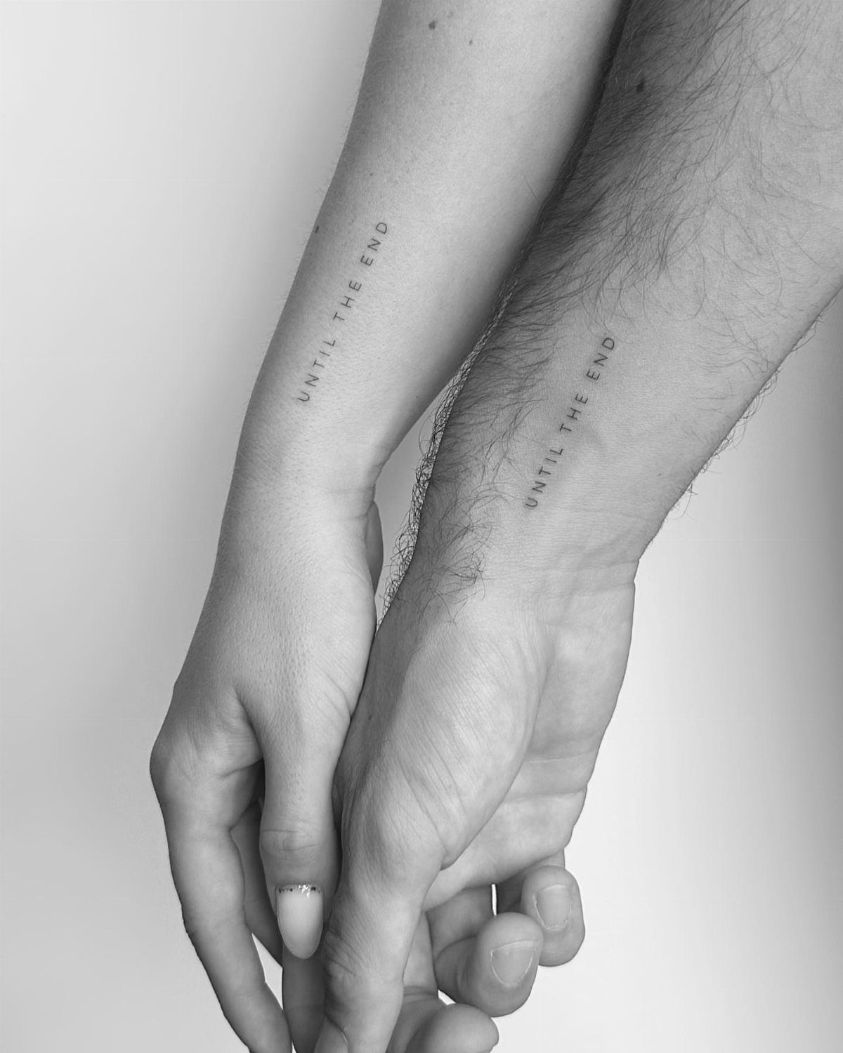
A short phrase stamped on both wrists in identical lettering gives you matching ink without splitting a single image across two people.
You pick the line that sums up what you mean to each other, and both of you carry the full message.
Script fonts blur over time because the thin strokes lose edge, so choose a weight thick enough to hold up. Simple sans-serif or bold serif lettering lasts longer than delicate calligraphy.
Inner wrists hurt more than outer forearms, but the spot keeps the text readable when your hands are at your sides.
If pain tolerance is low, move it to the outer wrist or forearm where the skin sits over more muscle.
3. Lock & Key
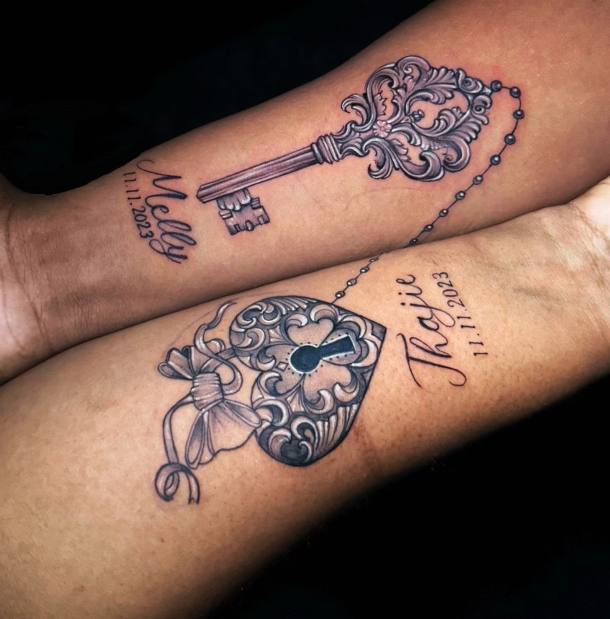
One of you gets the lock, the other the key, each piece useless without its match.
The metaphor is obvious, but the ornate Victorian-style metalwork makes it feel less like a cliché and more like a deliberate nod to something old and permanent.
Adding names and dates personalizes it beyond the stock image, though that also means the tattoo broadcasts specific details to anyone who looks. For the symbolism without the announcement, skip the text and let the lock and key stand alone.
Forearms give you enough space for the decorative flourishes that make this design worth doing. A minimalist version shrinks down to wrist size, but you lose the detail that separates it from every other lock-and-key pair.
4. Fingerprint Heart Tattoos
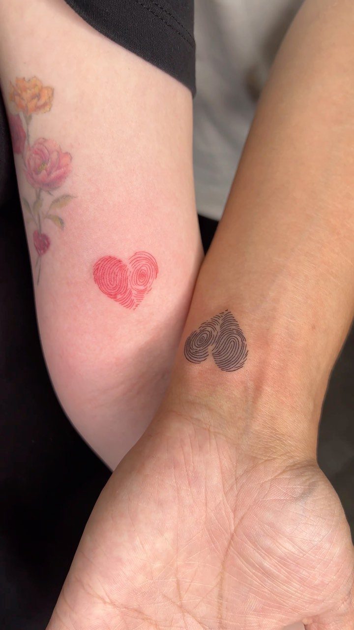
An actual fingerprint pulled from an inkpad or a phone scanner becomes the texture that fills a heart shape, so the design is literally built from a mark only one of you can make.
You each wear the other’s print, which flips the usual matching approach and gives you something provably unique.
The artist needs a clean scan to pull the ridges and loops, so bring a high-resolution image or get printed at the studio. Blurry prints lose the detail that makes the idea work.
Red ink fades faster than black and needs a touch-up every few years to stay bright, but the contrast between one red heart and one black keeps the pair distinct when you hold them side by side.
5. Geometric Tattoos
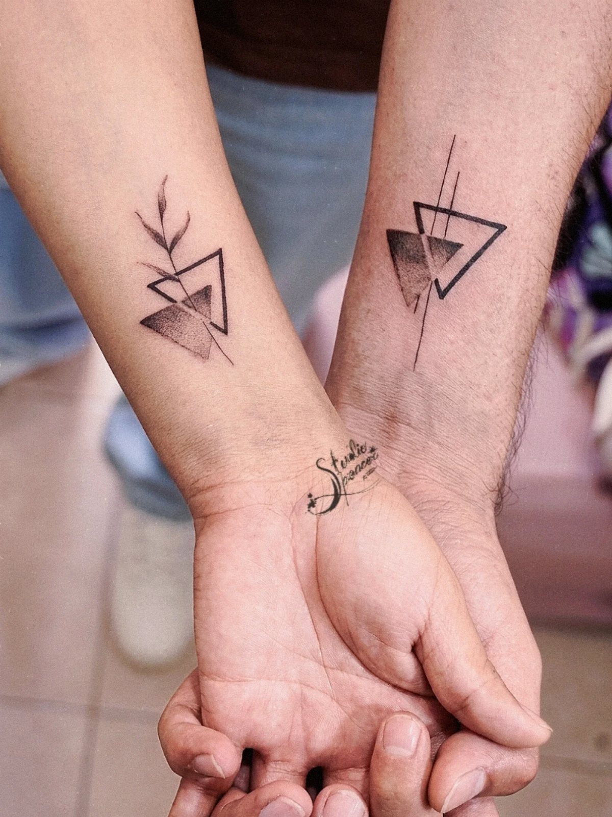
Geometric designs use clean lines and repeating shapes to build something that feels modern and intentional rather than sentimental. Triangles, hexagons and interlocking polygons give you a matching set that reads as a pair without spelling out the relationship.
The precision matters here. Lines that wobble or don’t meet crisp at the corners make the whole piece look amateur, so this is not the design to trust to a walk-in artist.
Find someone with tight geometry in their work and book a consultation to sketch the exact angles you want.
Wrists and forearms are the easiest placements to line up when you hold your arms together, which is half the point of a matching design.
6. Watercolor Tattoos
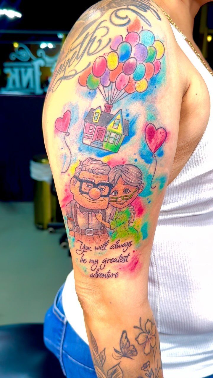
Watercolor tattooing layers translucent color washes over or around the linework, so the design looks like it was painted directly onto your skin.
The technique gives you soft gradients and bleeding edges that feel looser and more artistic than traditional solid fills.
Color this bright fades faster than black ink, and watercolor fades faster than solid color because the pigment sits lighter in the skin.
The style works best at larger sizes where the artist has room to build gradients and layer colors. Upper arms and thighs give you that space; anything smaller loses the flowing effect that makes watercolor worth doing.
7. Heartbeat Tattoos
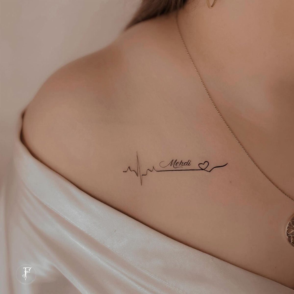
A single EKG line captures the rhythm of love in one simple, readable shape.
Adding a name or date personalizes it, though that also locks the tattoo to a specific person in a way that’s harder to reframe if things change.
The collarbone and inner wrist are the most common placements.
Collarbone sits higher and shows in open necklines; wrist keeps it visible without broadcasting it. Black ink holds the thin lines better than color, and the design scales down small enough to fit anywhere you want it.
8. Minimalist Connecting Line Couple Tattoo
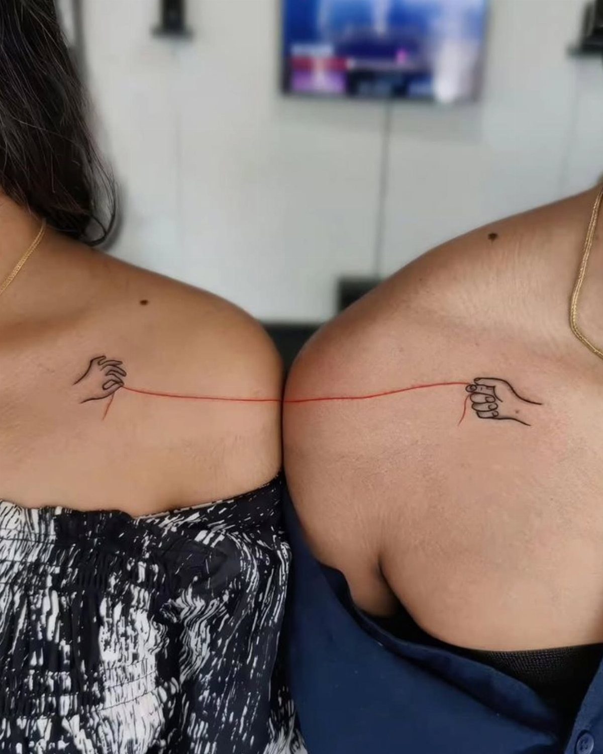
A simple line that connects from one person’s tattoo to the other’s when you stand side by side gives you matching ink that only completes when you’re together. Red line adds contrast, though black holds longer without fading.
Shoulders work because the placement lines up naturally when you stand next to each other. Upper arms and forearms give you the same effect with more flexibility in how you position yourselves to connect the design.
9. Date Couple Tattoos
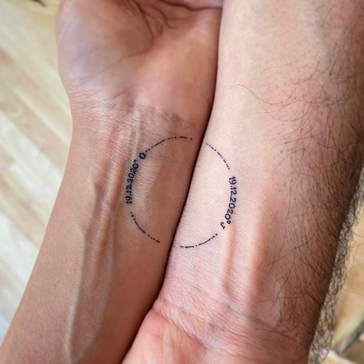
The date that started everything, stamped in the same font and placement on both wrists, gives you matching ink that’s immediately recognizable to anyone who knows what the number means.
Roman numerals or simple digits both work; pick whichever reads clearer to you at small sizes. Inner wrists keep the date visible, though the skin there is thinner and hurts more than the outer wrist or forearm.
10. Soundwave Tattoos
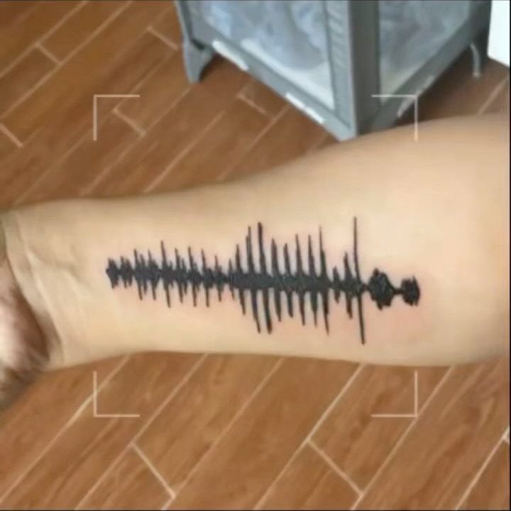
A voice recording converted into a soundwave pattern gives you a tattoo that looks like abstract line art until you explain what it actually is.
Record a short phrase or a few words, send the audio file to your artist, and they’ll trace the waveform into a design that fits your forearm or ribcage.
The technology to play back the audio from the tattoo exists, but most people skip it and keep the design as a visual representation.
Black ink keeps the lines sharp, and the forearm gives you enough length to fit a full sentence without cramping the waveform.
11. Coordinates Tattoos
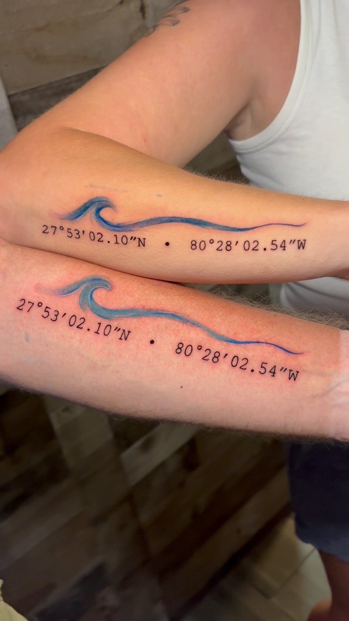
The exact latitude and longitude of where you met, got engaged, or spent a trip that mattered stamps a location onto your skin in a format only the two of you recognize at a glance.
Adding a small icon like a wave, mountain, or compass rose gives context without spelling it out.
Forearms keep the numbers readable without requiring a large space, and the coordinates sit horizontal so they’re easy to read when your arm is at your side.
Black ink holds the fine text better than color, and a clean sans-serif font stays legible longer than script.
12. Tiny Heart Tattoos
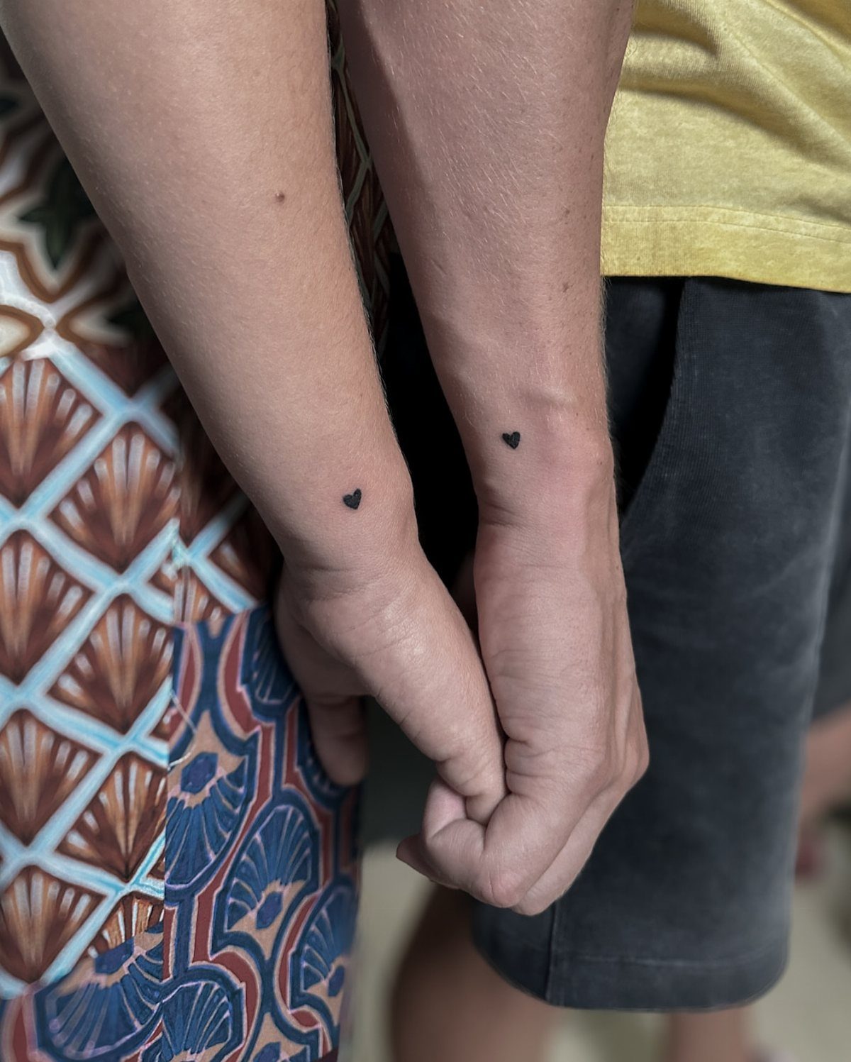
A solid black heart the size of a dime or smaller gives you matching ink that doesn’t take up prime real estate or announce itself from across the room.
The shape reads instantly, and the simplicity means it won’t blur or lose detail over time.
Wrists, ankles, and behind the ear are the most common placements for something this small. Wrists hurt less than bony spots like ankles.
13. Airplane Tattoos
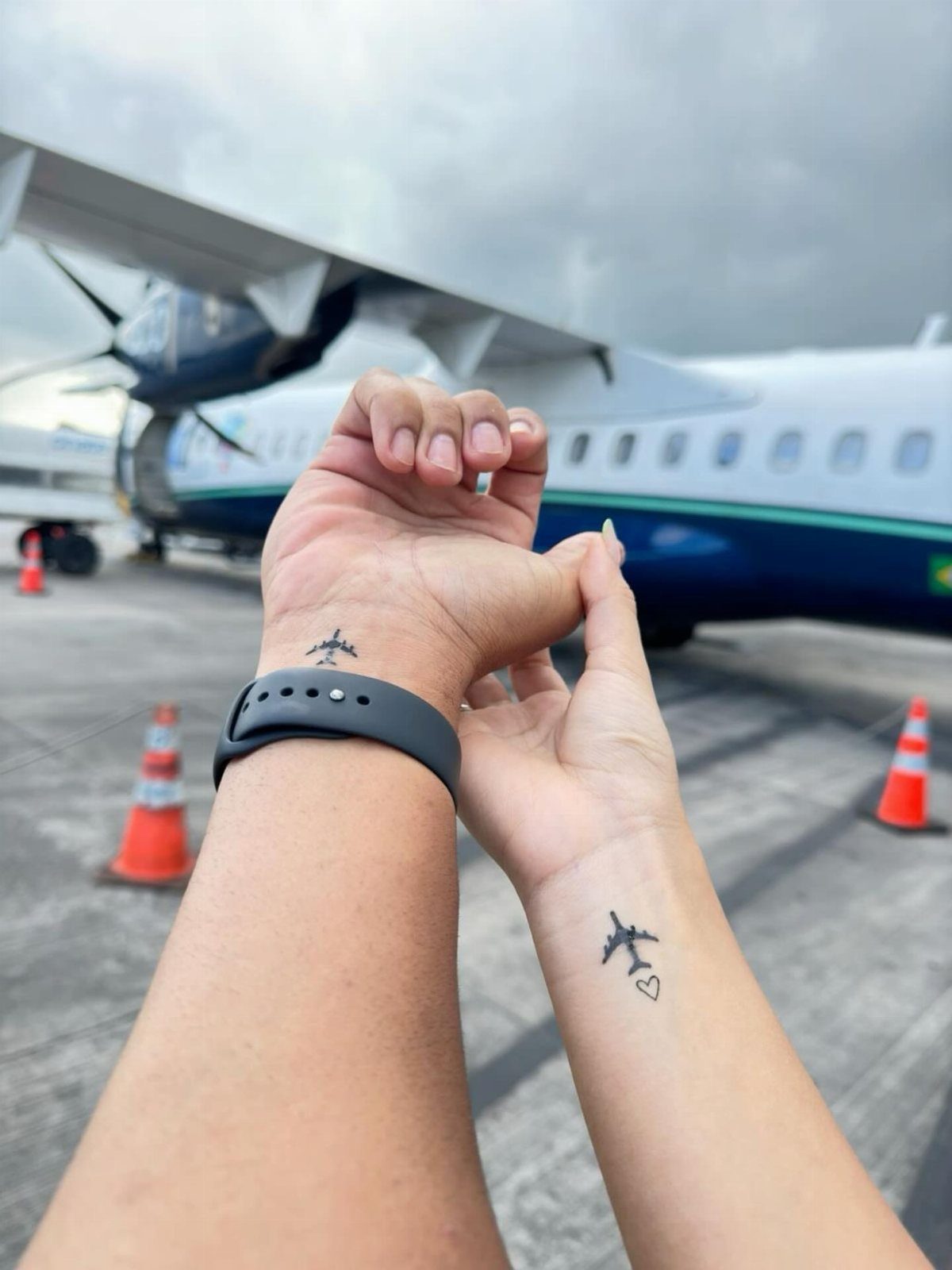
A small plane inked on your wrist marks the trips you’ve taken or the distance you’ve crossed to be together. Adding a heart near the fuselage or wingtip personalizes it without cluttering the shape.
The outline stays sharp at thumbnail size, so you can fit it on a wrist, ankle, or behind the ear. Black ink keeps the detail readable, and the design scales down without losing the recognizable silhouette that makes it work.
14. Initials Tattoos
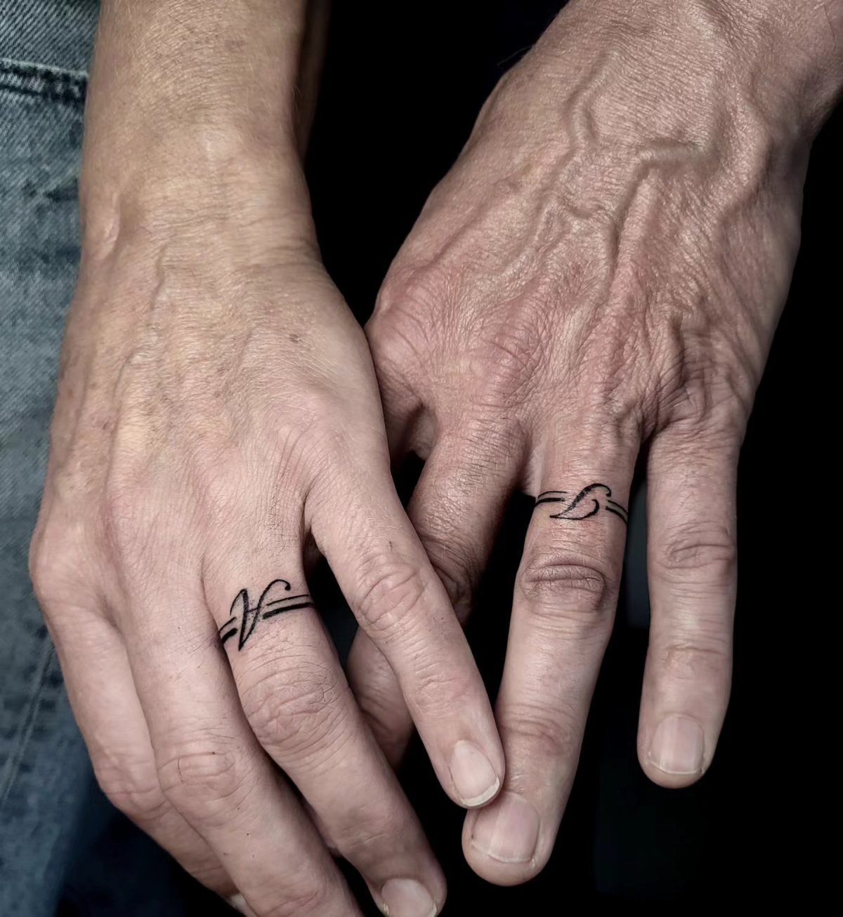
Each of you wears the other’s initial, stamped on the ring finger where a band would sit. The placement makes the statement obvious, and the single letter keeps it small enough that the skin can hold the shape without blurring.
Ring fingers hurt more than you’d expect because the skin sits directly over bone with no cushion underneath.
If pain tolerance is a concern, move the initial to the side of your finger or the base of your thumb where there’s more padding.
15. Infinity Tattoos
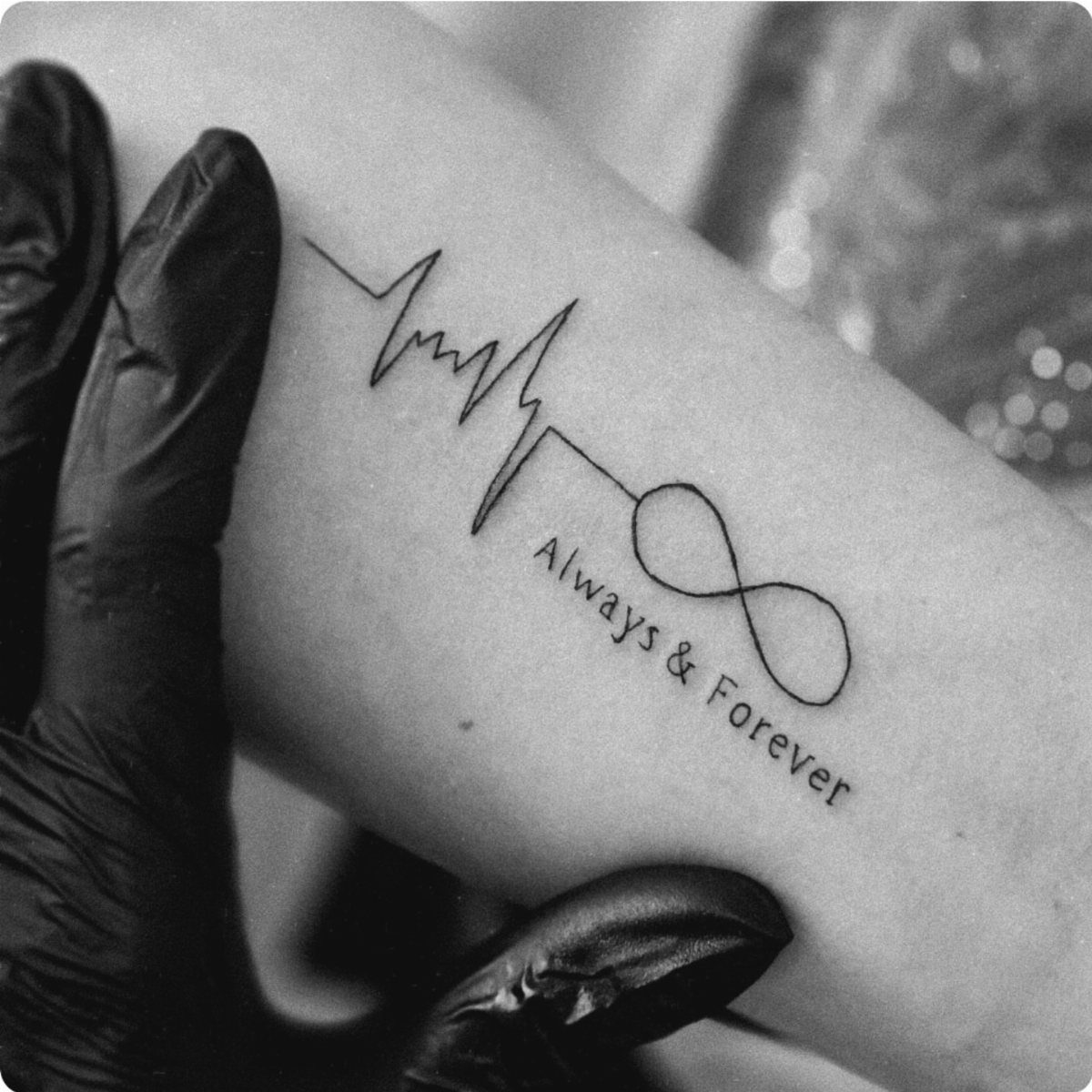
The infinity symbol loops endlessly, which is why it shows up in so many couple tattoos. Pairing it with a heartbeat line or text like "Always & Forever" adds a layer of meaning without overcomplicating the design.
Forearms and inner wrists give you a flat surface where fine lines stay readable as the tattoo ages. Anything smaller risks the text becoming illegible as the ink spreads over time.
16. King and Queen Crowns
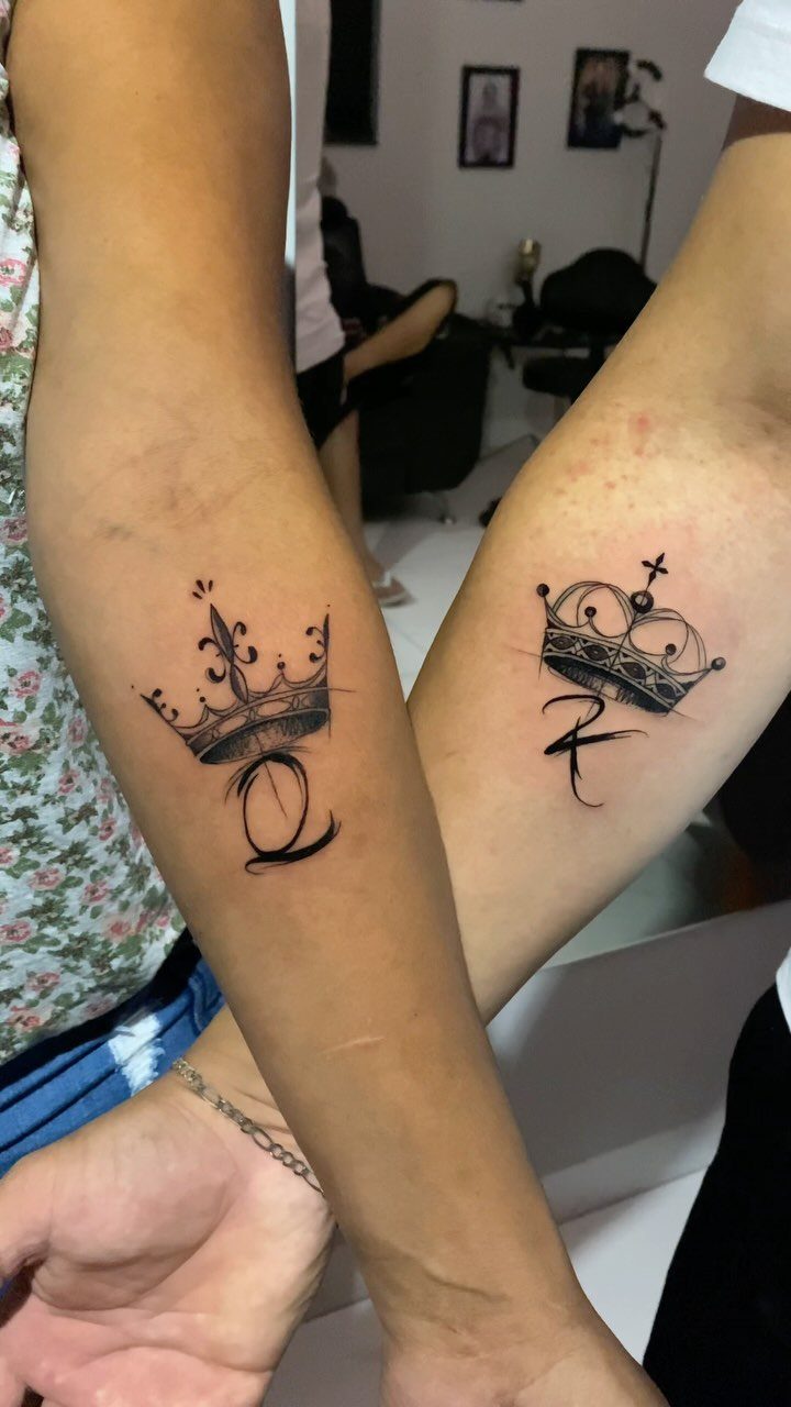
Matching crowns with a K and Q stamped underneath spell out the dynamic in a way that feels less cliché when the crowns themselves have clean, simple linework.
The design works because it acknowledges both sides of the pair without ranking one above the other.
Forearms give you enough room for the crown detail and the letter without crowding the composition. A wrist or ankle lets both of you show the crowns when you want and cover them when you need to.
17. This Love Tattoo
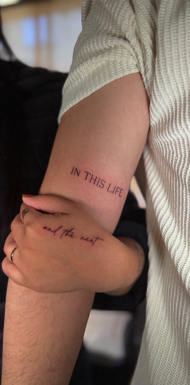
One of you gets "IN THIS LIFE," the other gets "and the next," so the full phrase only completes when you’re standing together.
The split keeps each tattoo readable on its own while making it clear the two belong to a set.
Script fonts work here because the text is the whole design, but choose a weight that won’t blur as the ink settles. Inner wrists and forearms sit flat enough that script this size heals evenly and stays legible for years.
18. Butterfly Tattoos
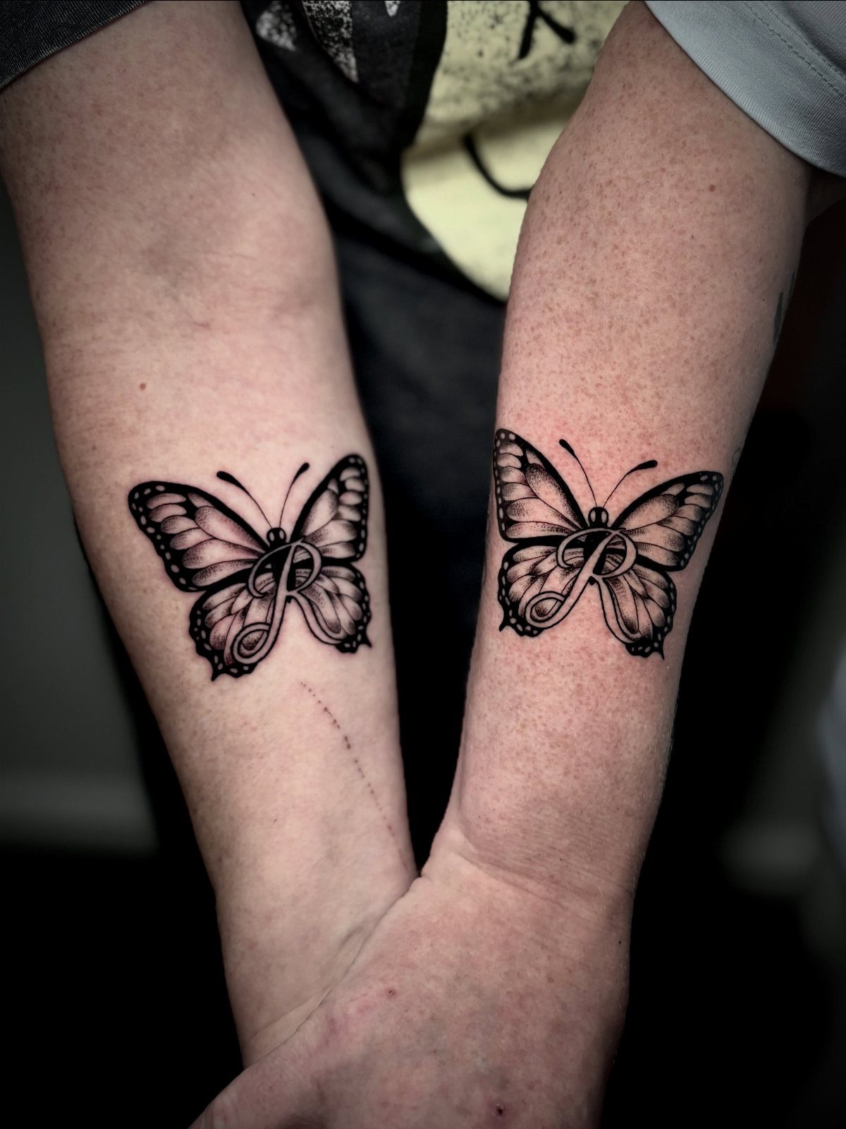
Matching butterflies with a shared initial centered in each wing give you a design that’s both personal and immediately recognizable as a pair. The symmetry of the wings makes the letter sit naturally in the composition without looking forced.
Forearms give you room to angle the wings naturally, and the flat surface keeps symmetry clean on both sides. The design scales down to wrist size, though you lose some of the wing detail at smaller sizes.
19. Puzzle Piece Tattoos
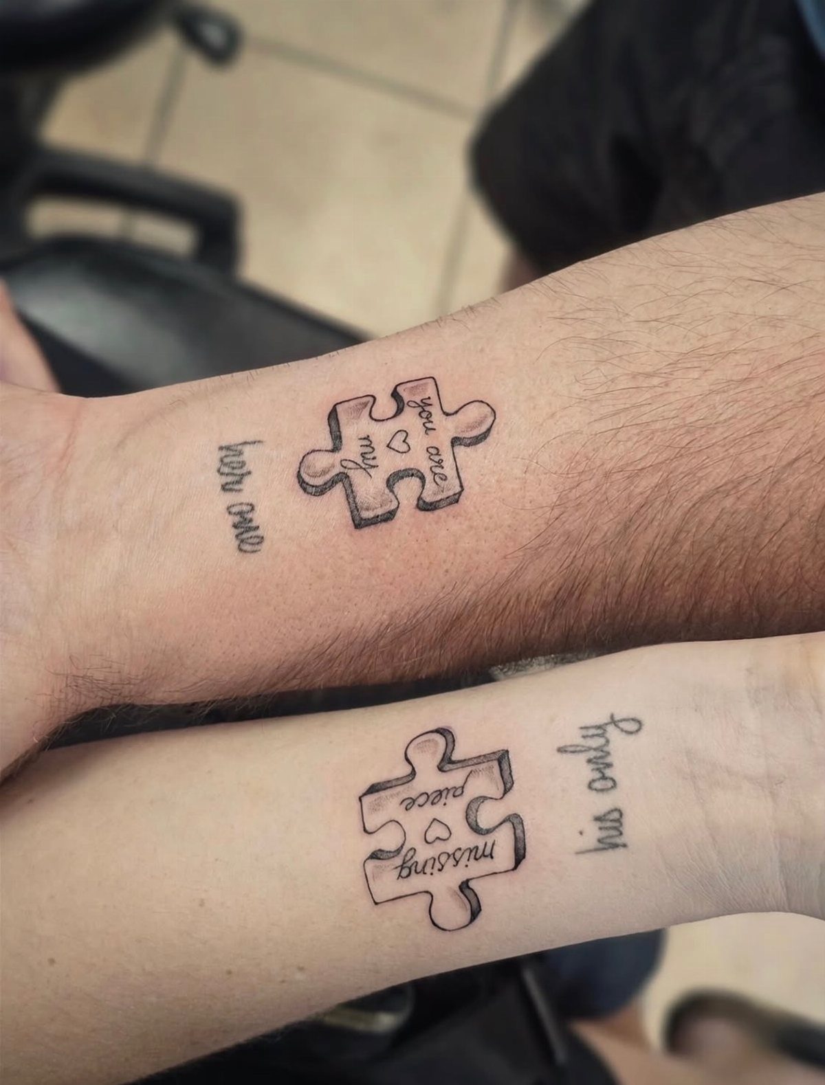
Each of you gets half of a jigsaw connection, and the pieces only fit together when you hold your arms side by side.
Adding text like "missing piece" or "you complete me" stamps the meaning directly onto the design, though the interlocking shapes already say it without words.
Forearms line up cleanly when you stand next to each other, and the flat surface keeps the edges of the puzzle cut sharp enough to read as an actual fit.
20. Abstract Line Tattoos
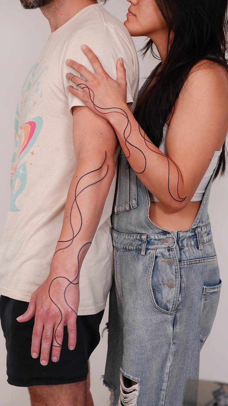
A single continuous line flows from one person’s arm to the other’s, so the tattoo only completes when you’re standing together.
The organic, looping shape feels less rigid than geometric patterns and gives the artist room to adjust the design so it connects naturally at your specific arm heights.
Shoulders and upper arms work best because the line can travel across both placements without forcing an awkward stance.
Black ink keeps the flow readable as the tattoo settles, and the design holds its shape better than thin, delicate linework that can blur over time.
21. Morse Code Tattoos
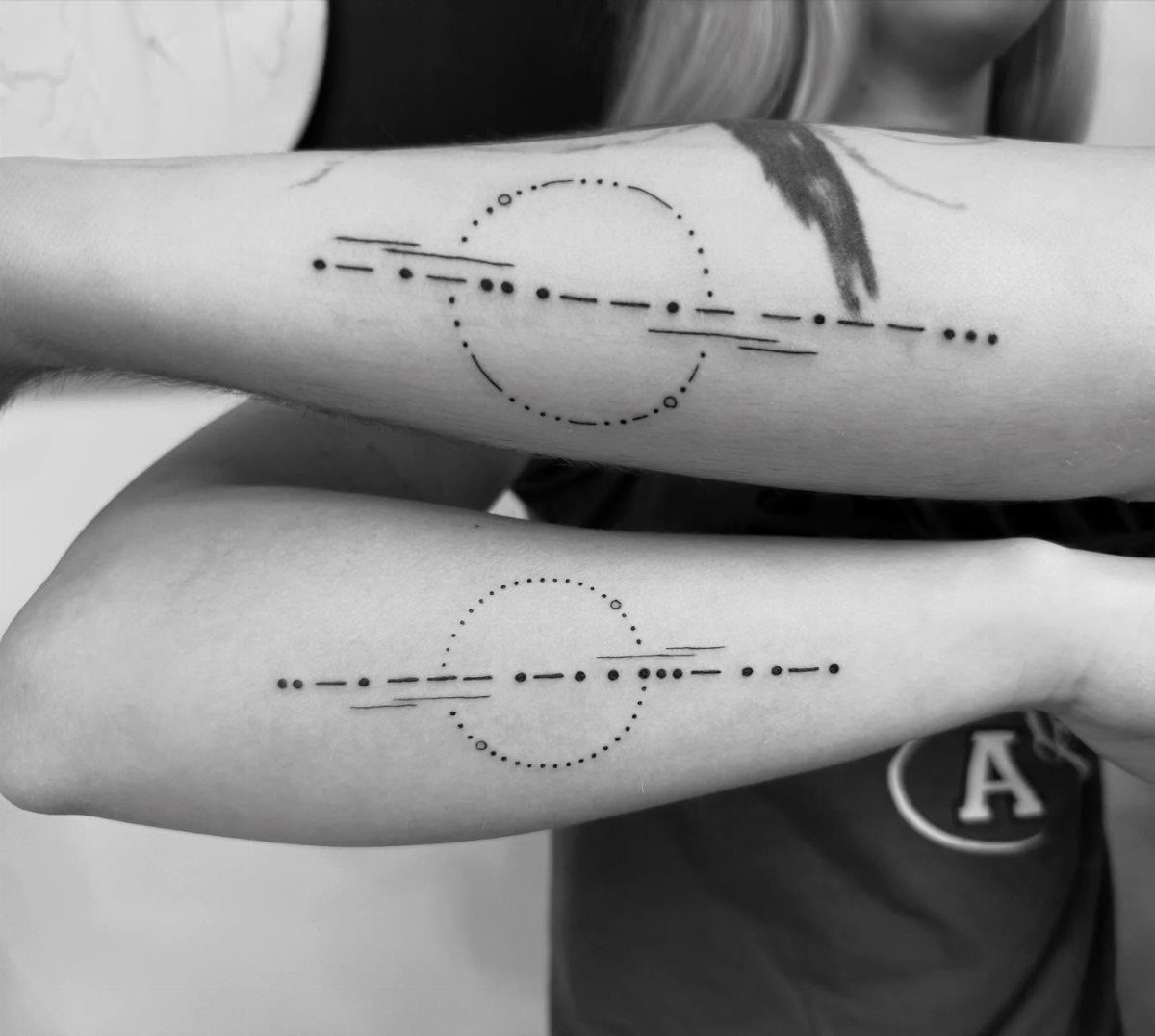
Dots and dashes arranged in a pattern that only the two of you can decode give you matching ink that looks like abstract circles and lines to everyone else.
The message stays private unless you explain it, which makes this one of the quieter couple tattoo options.
Forearms give you enough space to fit a short phrase without crowding the dots, and black ink keeps the spacing clear so the code stays readable.
22. Animal Pair Tattoos
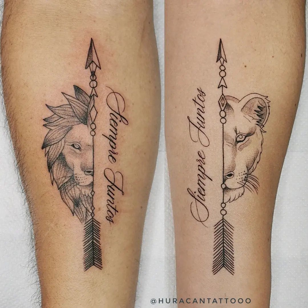
Matching animals that represent your relationship, like a lion and lioness or a pair of wolves, give you a tattoo that feels less overtly romantic and more about partnership.
Splitting the design with an arrow or line that connects when you hold your arms together adds a visual link without repeating the same image twice.
Forearms give you room for detail in the animals’ features, and the flat surface keeps symmetry tight when the pair is meant to mirror each other.
Black ink holds fur texture and fine lines better than color, though adding a single accent like red for the arrow keeps the design from looking too heavy.
23. Celtic Knots
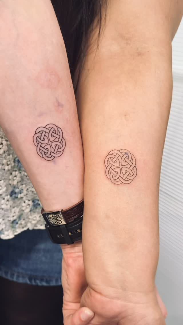
Interlocking loops with no beginning or end carry symbolism that runs deeper than most overused couple designs. The knot’s continuous line represents an unbreakable connection, and the pattern holds detail at small sizes without losing its structure.
Inner forearms keep the design visible without requiring a large space, and the symmetry of the knot sits cleanly on flat skin.
Black ink is standard here because the loops need sharp contrast to read as separate strands, and the design ages well since there’s no text to blur or fine linework to fade into a smudge.
Considerations Before Getting Tattoos
The question isn’t whether you love each other right now, but whether the design still holds meaning if the relationship shifts.
I recommend asking yourself whether the tattoo would feel like a mistake down the road, and whether you’d regret it if you split.
Sit down together and talk through what the design actually means to both of you, not just what it looks like. If one of you is hesitant or doing it to please the other, that’s a sign to pause.
Couples tattoos work best when both people want the ink for their own reasons, not because the relationship demands a public marker. The permanence is the point, so treat the decision like one.
Couple tattoos can be a polarizing topic: Some people cringe at the idea of matching tattoos for couples, while others think there’s no better way to cement, embrace, and enthusiastically show off their love for their partner.
— Glamour
Choosing the Right Artist
Look at portfolios before you book anyone. An artist who does clean geometric work might not be the right fit for watercolor, and someone known for bold traditional pieces may not have the steady hand you need for thin script.
Find someone whose existing work matches the style you want, not just someone who says they can do it. Ask for referrals from friends whose tattoos you’ve seen heal well, or search by style rather than shop name.
Schedule a consultation to see how the artist refines your idea. If they can’t improve on what you brought in, or if they rush the conversation, look elsewhere.
Placement of Couple Tattoos
Fingers work for small symbols or text, but the skin there fades faster because your hands take constant friction.
Behind the ear stays hidden under hair but shows when you want it to. Ribs, inner arms and the back keep the tattoo discreet if you need to cover it for work or family events.
Finger tattoos blur quicker than other placements because the skin regenerates faster and the ink spreads as it settles. If you want a ring finger design, expect to touch it up every few years.
Frequently Asked Questions
Which tattoo is best for couples?
The best couple tattoo reflects something specific to your relationship rather than a generic symbol everyone else has.
Sun and moon splits, fingerprint hearts, or coordinates from a place that mattered to both of you give you ink that carries actual meaning.
Lock and key or puzzle pieces work if the ornate metalwork or interlocking edges feel deliberate, not just pulled from a flash sheet.
What do matching tattoos represent?
Matching tattoos mark a shared commitment in a way that stays visible long after the conversation or the moment fades.
The design serves as a physical reminder of the connection, whether that’s friendship, partnership, or something romantic, and the permanence is part of the point.
What should I consider before getting a matching tattoo?
Think about whether the design will still matter to you if the relationship ends, and whether future regret is worth the risk now.
Make sure both of you agree on what the design actually represents, not just which one looks good. The best couple tattoos happen when each person genuinely wants the ink, not when one feels obligated to prove something.