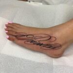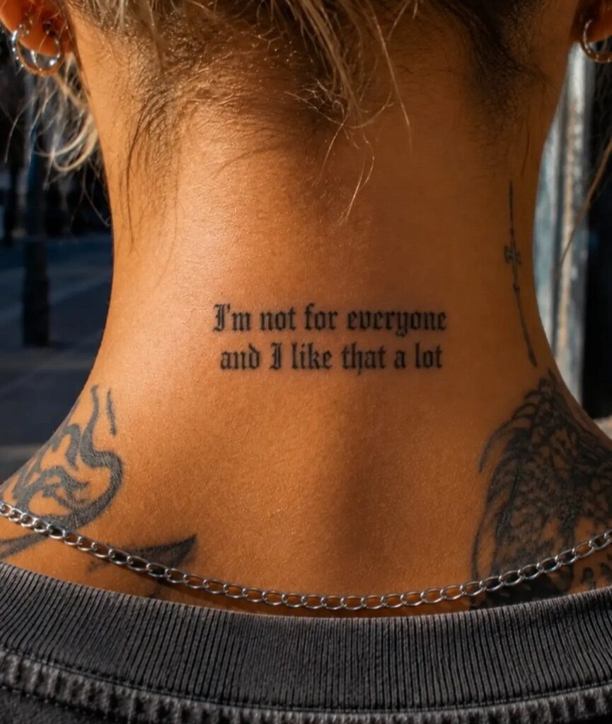
Quotes pull from longer passages, while a single word names what matters most.
The wrist sits close to bone and stings more than the forearm, which heals smoothly and stays visible in short sleeves. Red ink fades more in sunlight, so a touch-up keeps dual-color contrast sharp.
1. Inspirational Quotes
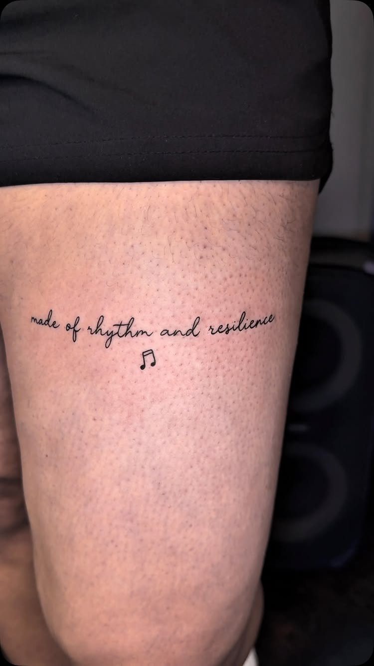
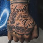
A phrase tattooed in flowing script carries the weight you give it. The thigh gives you room for a full sentence and enough space between each letter, and the natural curve of the muscle follows the line of the text.
Cursive works best when the artist leaves breathing room between words.
Too tight and it reads as a blur from arm’s length. I’d ask for a stencil placement first so you can see how the phrase sits when you’re standing versus sitting.
The outer thigh is easier than the inner, where the skin is more sensitive.
Keep reading to see the prettiest word-tattoo ideas (many in different fonts and styles), and let your new ink be a fresh reminder of just how powerful words can be.
— PopSugar
2. Script Tattoos on the Wrist
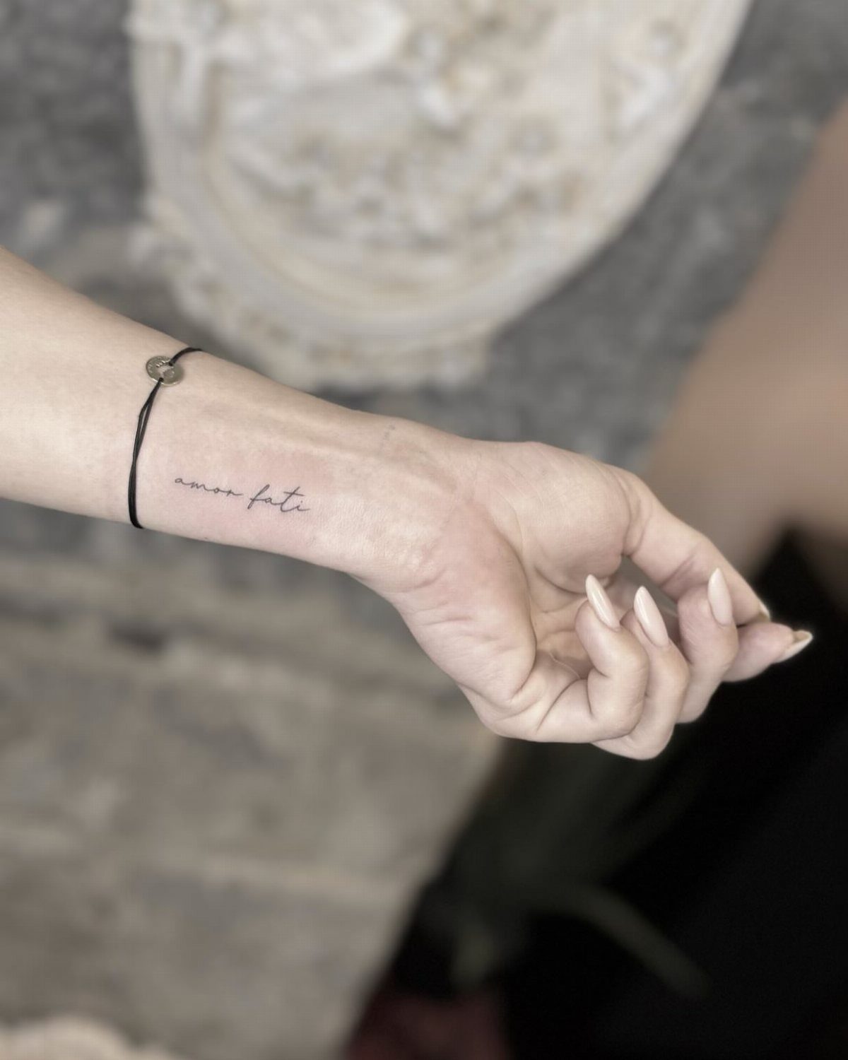
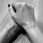
The wrist puts a word or short phrase right where you’ll see it daily. "Amor fati" fits in 2 inches of script, small enough to stay discreet under a watch or bracelet when you want it covered.
Bone sits close to the surface here, so expect sharper pain than fleshier spots. Healing takes about 2 weeks, and you’ll need to keep the area clean while washing your hands constantly.
Fine-line script holds up better than you’d think on the wrist, as long as the letters aren’t microscopic. Anything under a quarter-inch tall will blur over time.
3. Single Meaningful Word on Forearm
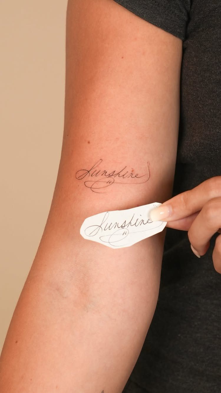
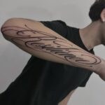
One word on the inner forearm reads cleanly and sits in a spot you control. "Sunshine" in a medium script is long enough to fill the space without looking cramped.
The inner forearm offers low to moderate pain and heals smoothly. Skin here stretches less than joints, so script stays legible longer.
I’d choose a word that doesn’t need explanation. If you have to tell people what it means every time they ask, you’ll get tired of the conversation fast.
4. Dual Color Script Forearm Tattoo
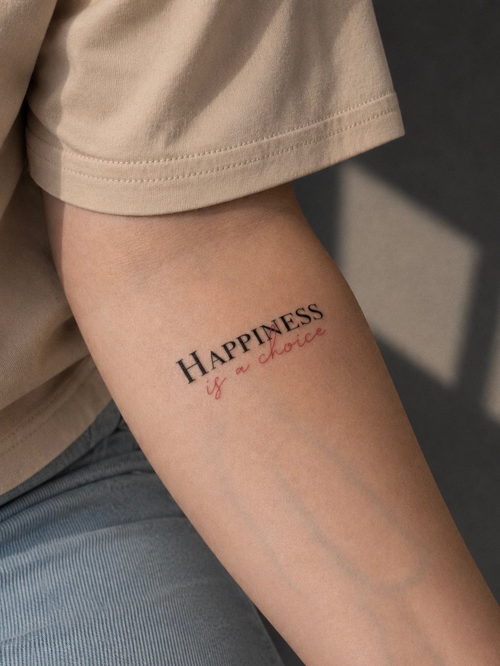
Adding a second color splits the emphasis.
"HAPPINESS" in red pulls the eye first, then "is a choice" in black finishes the thought. The contrast gives the phrase a hierarchy that single-color text can’t.
Red ink loses intensity more quickly than black, especially in sun exposure. You’ll likely need a touch-up on the red to keep the contrast sharp.
The forearm gives you room for a longer phrase without wrapping around a curve. Pain here runs mild to moderate, and the tattoo stays visible in short sleeves.
5. Script Tattoo on the Hip
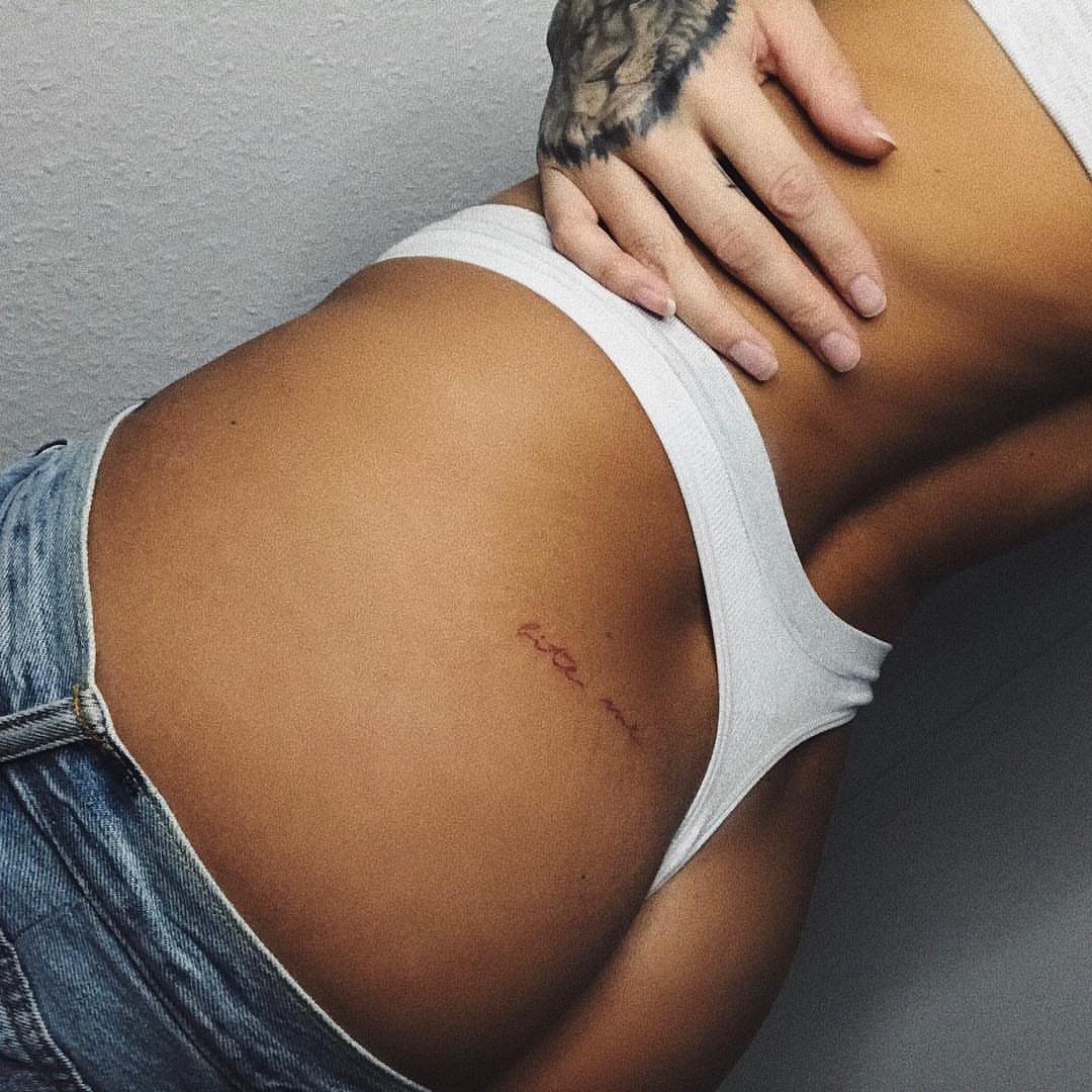
A short phrase along the hip line stays private until you choose to show it. "Bite me" takes up maybe 2 inches in a delicate cursive, tucked where underwear or a swimsuit bottom can cover it completely.
The hip bone itself hurts more than the soft tissue just above it, so placement matters. Healing here is straightforward as long as you avoid tight waistbands for the first week.
Red ink on its own looks bold but will need refreshing sooner than black. For color that lasts, ask your artist about saturation during the initial session.
Frequently Asked Questions
What font is best for tattoos?
Cursive and script fonts work best for word tattoos because they flow naturally along the body’s curves. The letters need breathing room between them or the text blurs when you’re not looking at it up close.
What are some inspirational quotes for small tattoo tattoos for females?
Short phrases like "Amor fati" or single empowering words fit well in small spots like the wrist or hip. Pick a word or phrase that doesn’t need explanation every time someone asks about it.
What is a simple line tattoo?
A simple line tattoo uses minimal detail, often just clean script or basic shapes without shading. Anything smaller will blur as the ink spreads under the skin over the years.