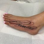
Traditional lettering spans flash sheets and Old English builds, each one sized for decades of legibility.
The deciding factor is how much formal weight the piece needs to carry: Old English suits memorial work and religious phrases, calligraphic script flows across ribs and forearms, and banner ribbons break longer text into readable lines.
1. Traditional Tattoo Flash Sheets
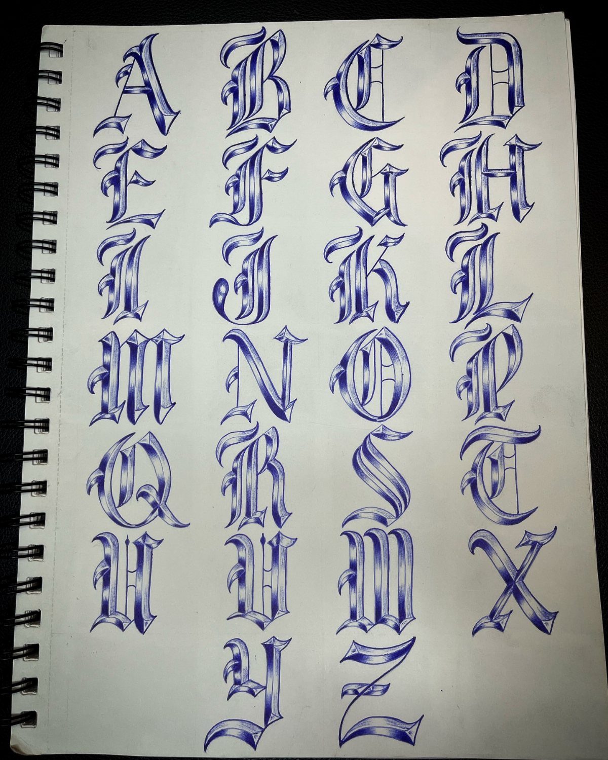
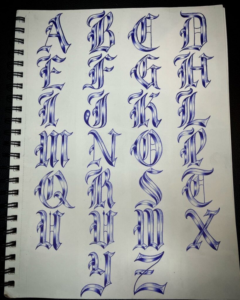
Flash sheets hold the complete alphabet in traditional tattoo style, usually drawn by hand in a sketchbook or printed on loose paper.
This format gives you the full reference in one place when you need to lay out a name, date or phrase.
The style here leans gothic, with thick downstrokes and tight spacing. Letters sit in columns for quick comparison, and the blue ink keeps the contrast high against white paper.
I keep a few of these sheets around. They save time when a client wants consistent lettering across a larger piece, and the hand-drawn originals often show small variations that make the final tattoo feel less mechanical.
2. Old English Alphabet Lettering
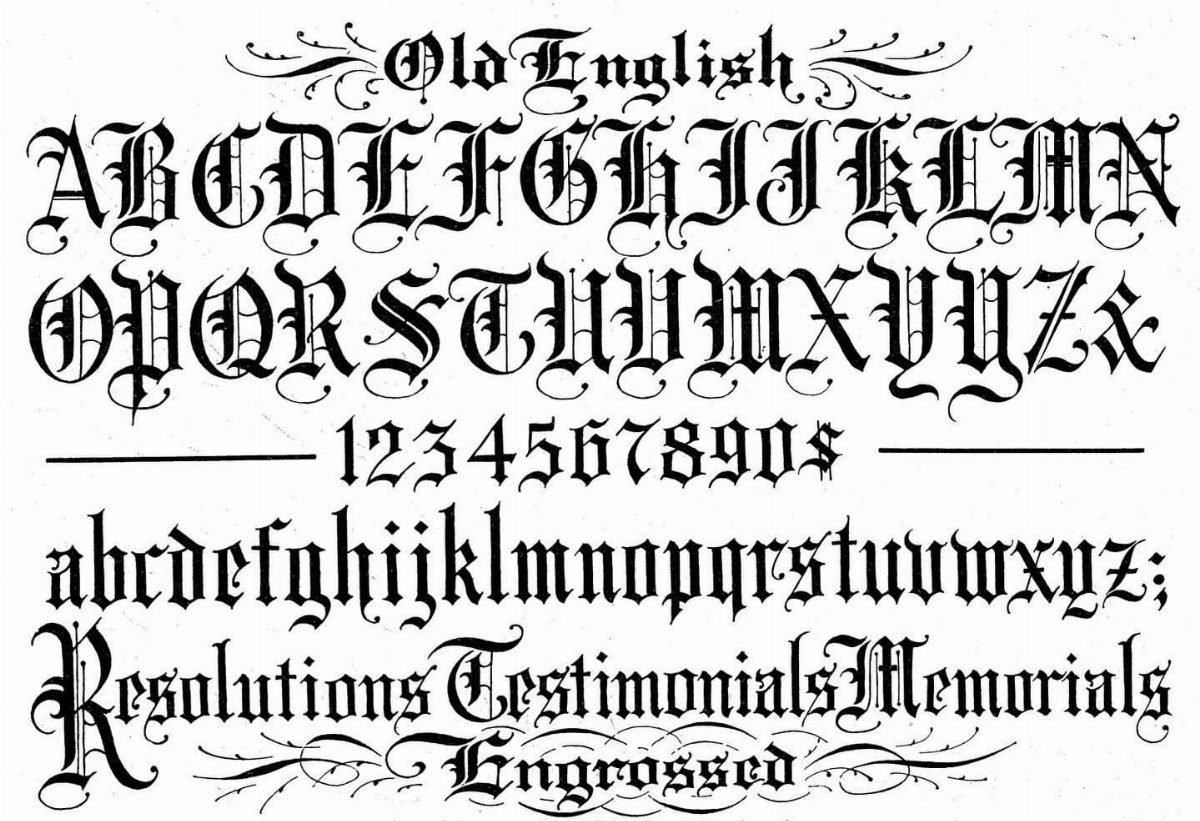
Old English lettering gives you sharp vertical strokes and decorative serifs, the kind you see on certificates and memorial tattoos. This sheet includes both cases, digits and a few sample words, all in black ink.
The uppercase letters carry more weight and read better at a distance. Lowercase works for longer text blocks, but the detail gets tight, so I usually size it large enough to keep each letter legible after healing.
This alphabet stays formal. Pair it with roses, crosses or anything that needs a sense of permanence, and avoid mixing it with looser script styles in the same design.
3. Calligraphic Script Tattoo Lettering
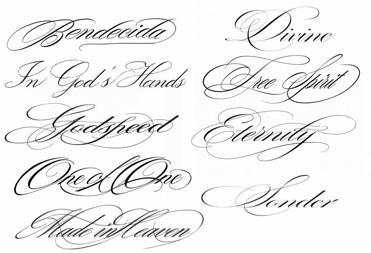
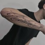
Script lettering flows with thin upstrokes and thick downstrokes, written in a single fluid line. This sheet collects short phrases in black calligraphic style, each one sized to fit a forearm or ribcage.
The slant and weight stay consistent across all the words, which matters when you’re pulling letters from different phrases to build a custom piece. I trace these with a light table when I need to match the exact stroke weight.
Script like this reads best sized tall enough that the flourishes stay clear. Anything smaller and the fine lines blur during healing, especially on areas with more movement like wrists or ankles.
4. Traditional Banner Lettering
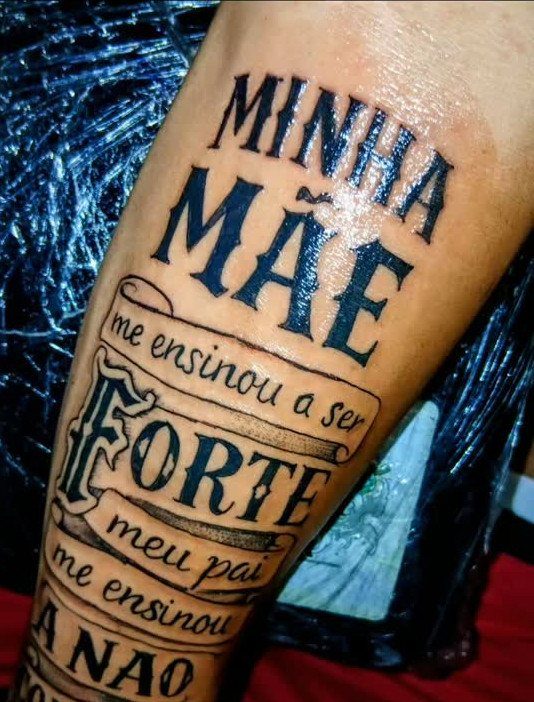
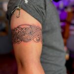
Banner lettering places bold traditional type on ribbon scrolls, usually folded at the ends. The banners frame the text and give you a way to break up longer phrases across multiple lines without losing the composition.
This tattoo uses tight spacing and clean black lettering across each banner. The parchment edges curl slightly, which adds depth and keeps the banners from looking flat against the skin.
I recommend keeping the text short on each banner, just a few words per ribbon. Longer phrases force the lettering smaller, and the decorative folds start to crowd the design.
5. Mixed Font Forearm Lettering
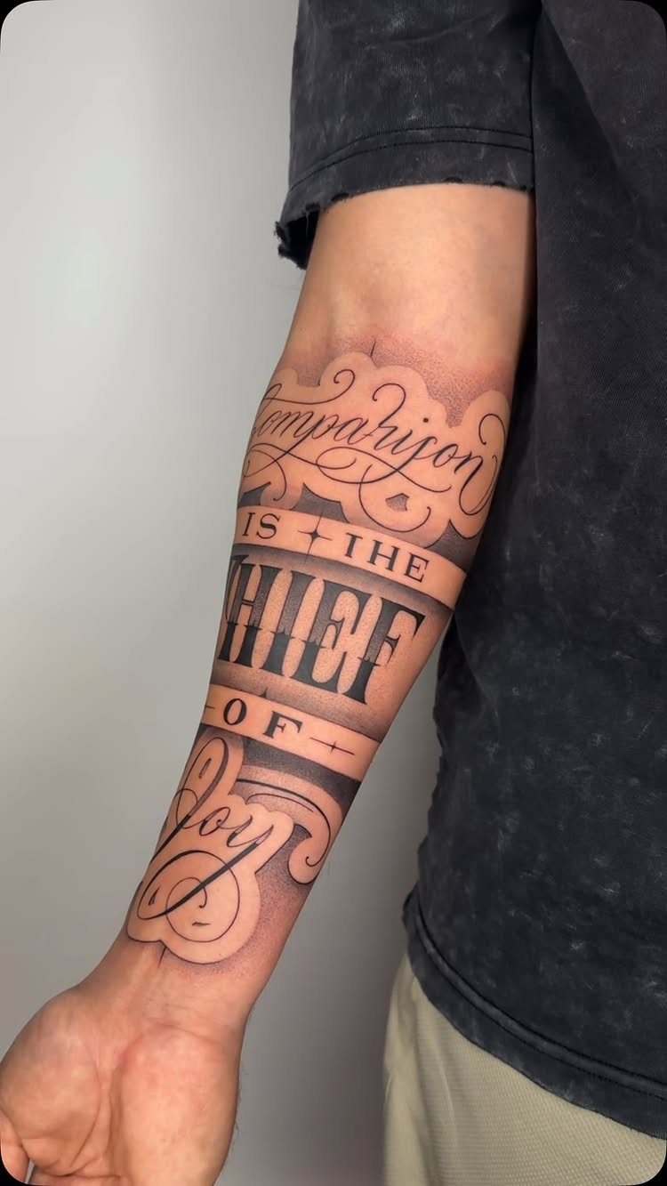
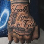
This forearm piece mixes block capitals and flowing script in the same line, with scroll details and shading behind the text. The contrast between the 2 fonts breaks up the rhythm and gives certain words more weight.
The block letters sit upright and the script slants forward, so the 2 styles read separately even when they touch.
I use this mix when a phrase has one key word that needs emphasis, like a name or a single strong term.
The shading here stays soft and gray, which keeps the text in front. Too much black behind the letters and they start to lose contrast, especially after a few years.
Importance of Lettering in Tattoos
A word, date or name needs to read clearly decades from now, and that responsibility falls entirely on the lettering. The words say exactly what you mean, where imagery alone leaves room for interpretation.
I see memorial pieces and family names most often.
A birth date, a short quote, someone’s signature traced from an old card. Text can anchor memory and meaning in a tattoo more directly than imagery alone.
Cultural references show up in the choice of style.
Old English for religious phrases, gothic script for traditional builds, calligraphy when the piece needs formality. The font itself signals what the words are meant to carry.
Type sits front and center in these designs.
The rest of the tattoo, if there is any, frames it. That makes legibility non-negotiable, and sizing becomes the first decision you make after choosing the words.
There’s a long-standing tradition in tattoo culture of celebrating that which others fear (hence the thematic prevalence of things like skulls and knives). Sailor Jerry’s Lucky 13 motif is probably the most famous set of tattoo designs that flip a bad luck symbol on its head.
Digital Tools for Tattoo Artists
Procreate lets me lay out lettering digitally before the stencil goes on. I build the phrase at scale, adjust spacing between letters and test the composition against a photo of the actual placement.
I trace over the original strokes to match weight and slant, then export the design as a stencil-ready file.
Digital tools speed up the process without taking over the craft. I still draw the first pass by hand when the design needs custom flourishes or tight curves, then refine it on screen.
Wall art and flash sheets start the same way. I design the lettering once, save it as a high-resolution file and print it for the studio or send it to a client for approval.
Tattoo Font Usage
Type the full phrase at the size you plan to wear it before you choose a font. A single letter previews well in almost any style, but a long quote shows where spacing tightens or detail vanishes.
Heavy faces hold up better over time. Traditional, blackletter and blackwork stay readable after years of sun and movement.
Match the font to the shape of the placement.
Script and cursive follow curves on the forearm, ribcage and collarbone. Wide, flat surfaces such as the chest, upper back and outer bicep can handle bold block letters without crowding.
Run your top choices through a generator that shows them on skin, not just typed on a white background. What reads clearly on a screen can lose contrast once it sits against your actual tone and texture.