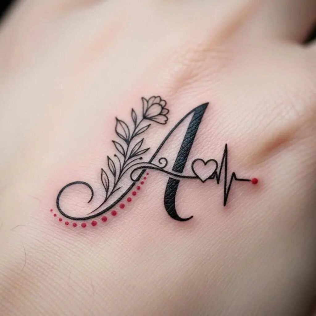
A name tattoo can stay simple or grow into multi-session work when you pair it with a realistic portrait across the back.
Fine line script works for intimate spots like the collarbone or inner wrist, but bolder lettering holds up better at larger scale and won’t blur as the tattoo ages.
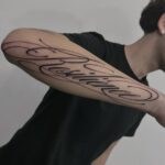
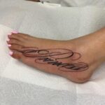
1. Cursive Name Tattoo Design
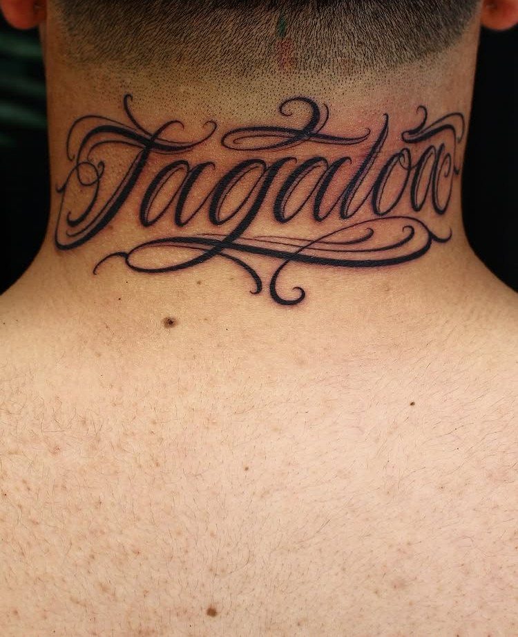
Cursive script gives a name a fluid, personal feel that prints and stencil fonts can’t match.
The style reads well at any size, which matters when you’re working with longer names or putting them somewhere visible like the neck or forearm.
Placement depends on the name’s length. Short names fit cleanly on the wrist or behind the ear; longer ones need more real estate and look best along the collarbone, forearm or down the side of the ribcage.
Keep the font legible at the size you’re working with.
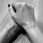
2. Partner Name Tattoo with Initials
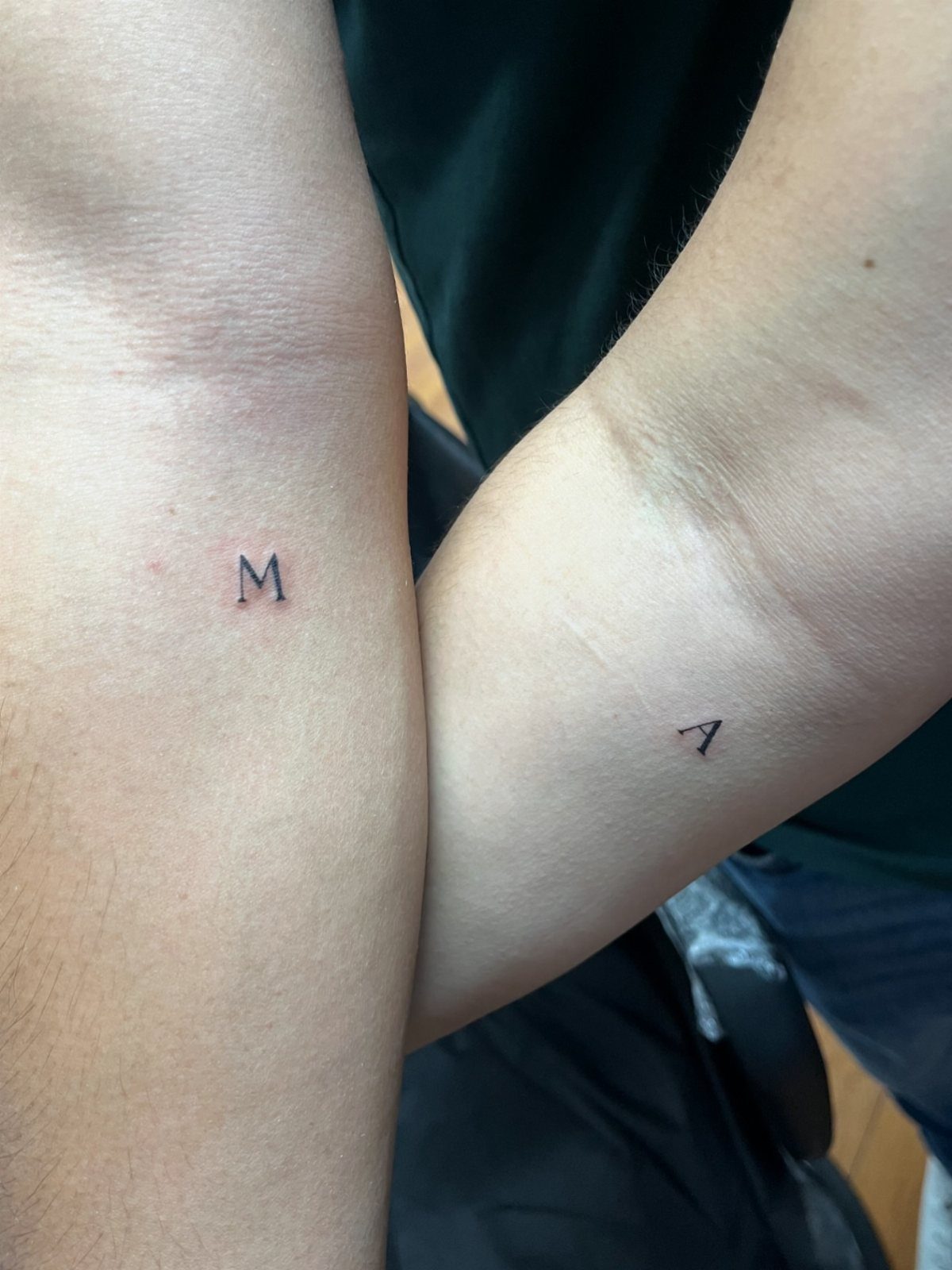
Single initials stay discreet while still marking something permanent. They work best when both partners choose the same size and style, so the tattoos feel connected even when they’re on different bodies.
Placement on the inner forearm keeps them visible to you but easy to cover when needed.
The spot heals fast since the skin stays flat and doesn’t bend much through the day. Simple black linework for initials runs less than most larger designs.
3. Interlocking Initials Couple Name Tattoo
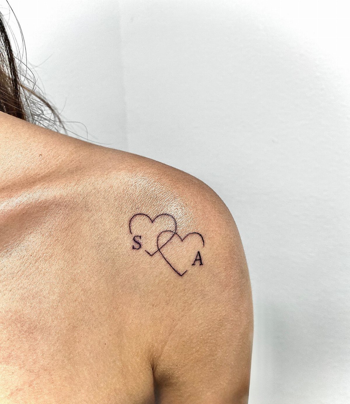
Interlocking hearts turn two initials into one design that only works as a pair. The initials lock together inside matching shapes, so the design reads as one unified symbol.
High shoulder placement stays private under most clothing but shows in a tank top.
You could also run this on the inner wrist or ankle. The design stays small, usually under 2 inches, so it won’t stretch or blur over time.
4. Name Tattoo with Flowers
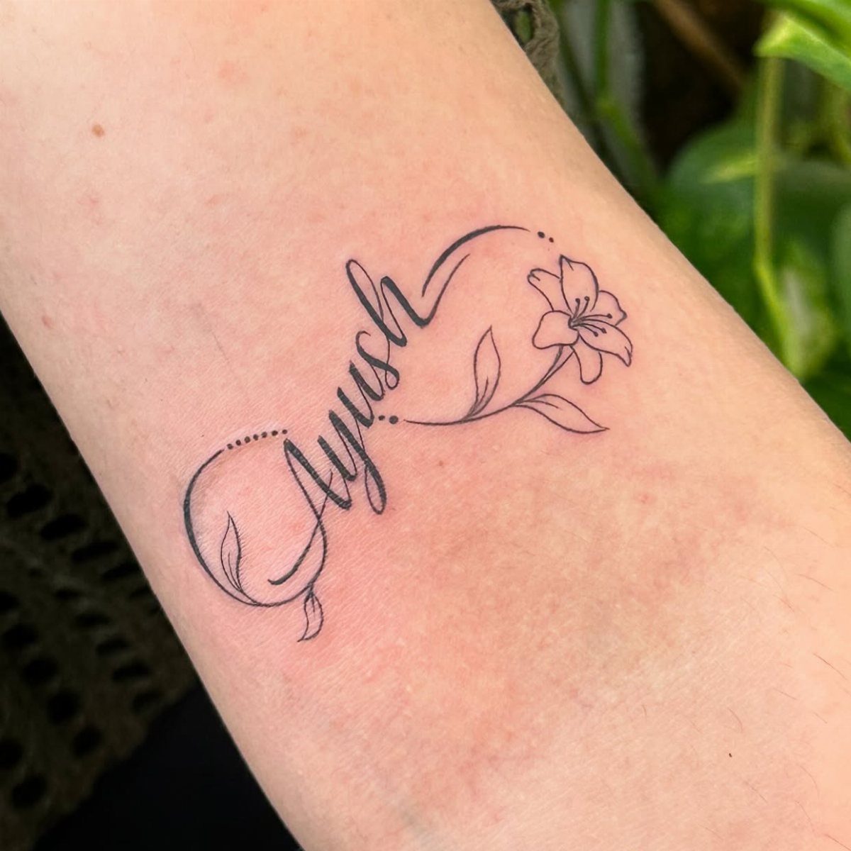
Adding a flower to a name softens the lettering and gives you room to build something larger without cramming in more words.
The lily here threads through the script naturally, so the two elements feel like one piece instead of separate tattoos placed side by side.
Forearm placement works well for designs that mix text and imagery because the flat surface keeps both parts readable. Pick a flower that either means something to the person you’re naming or balances the script’s weight.
5. Name Tattoo with a Heart
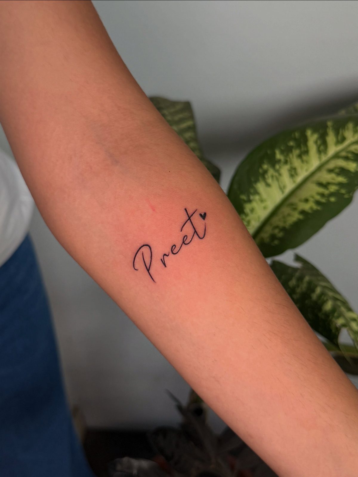
A small heart at the end of a name keeps the focus on the lettering while adding a detail that makes the intent clear.
The shape stays simple, so it won’t compete with the script or make the design feel crowded.
This works best with cursive fonts that have a natural flow, since the heart can sit where a final flourish would normally go.
Forearm placement gives you enough length to write the name out fully without shrinking the letters down to a size that might blur as the tattoo ages.
6. Geometric Monogram Tattoo
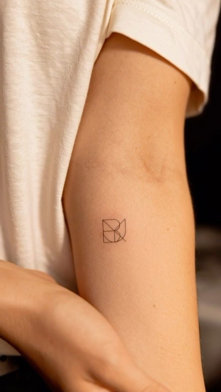
A geometric monogram stacks or overlaps initials inside clean shapes like triangles, hexagons or circles. The structure gives the letters a modern, architectural feel that stands apart from traditional script.
This style reads best when kept small and placed somewhere with smooth, flat skin.
The inner upper arm works because the area doesn’t flex much and the tattoo stays sharp. Black ink keeps the lines crisp; shading or color can muddy the geometry over time.
7. Portrait with Name Tattoo
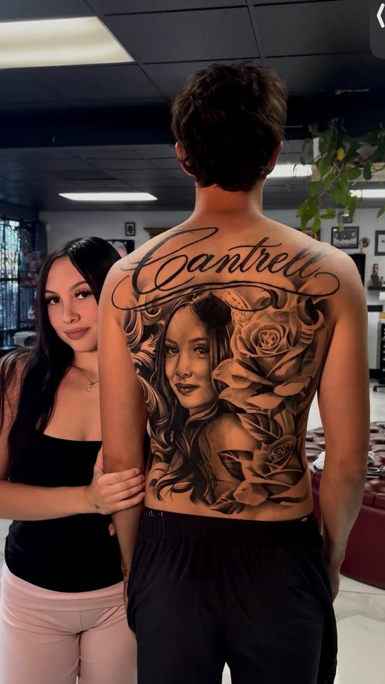
Portrait tattoos need size to hold detail, and the back gives you the room to work at a scale where the face reads clearly years later.
Adding the name in script across the top or along the bottom frames the portrait and makes the connection clear.
This is a multi-session piece.
A realistic portrait takes multiple sessions, and the back heals slower than flat areas like the forearm. Cost runs higher than text alone because of the time and skill involved.
8. Peacock Feather Initial Tattoo
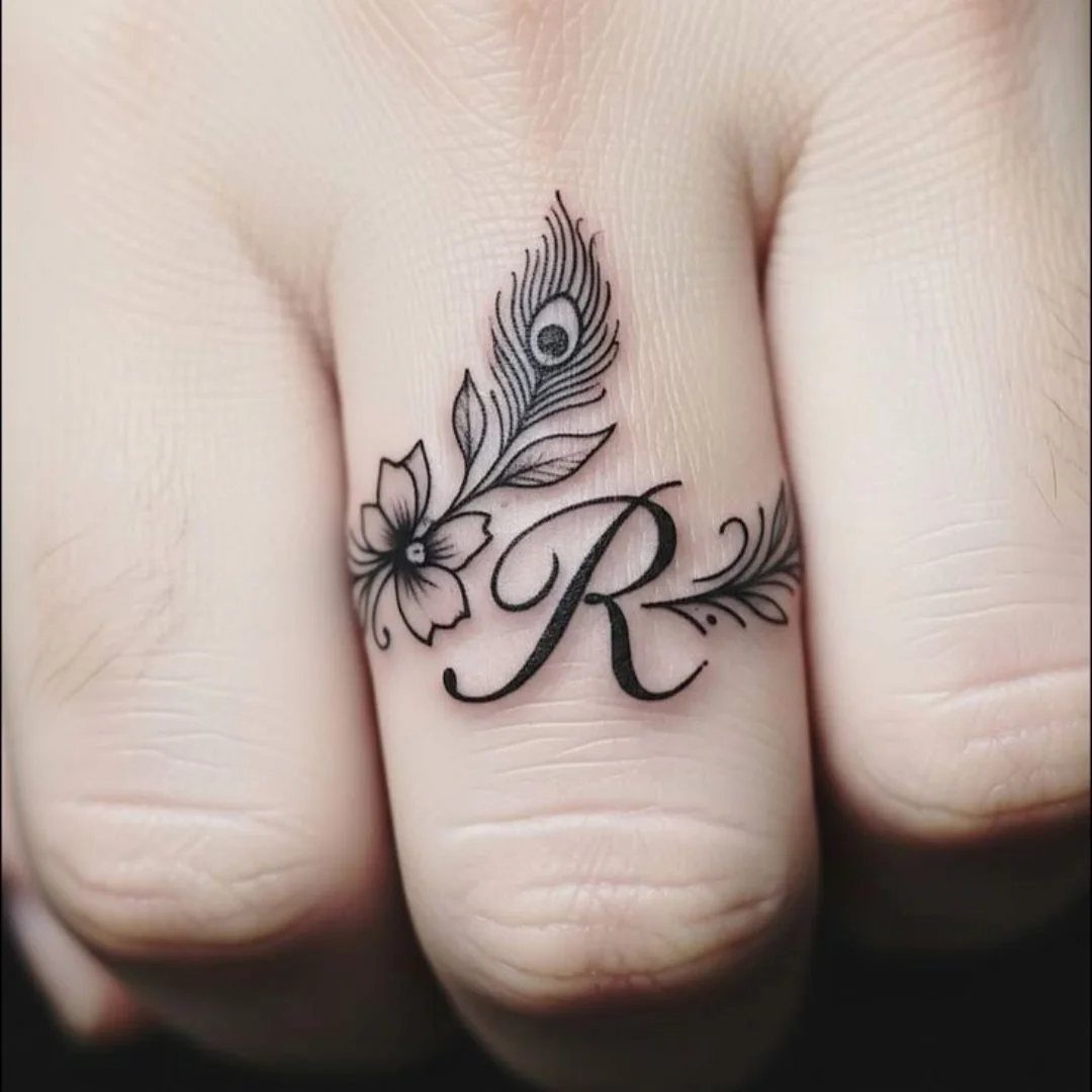
Wrapping a peacock feather around an initial turns a single letter into something more decorative without losing the simplicity of a small tattoo.
The feather’s curve follows the shape of a finger naturally, and the floral accent balances the design without crowding it.
Finger tattoos lose ink faster because the skin there sheds quickly and the area gets more friction from daily use. Plan on a touch-up within a year or two to keep the lines sharp.
9. Infinity Symbol Name Tattoo
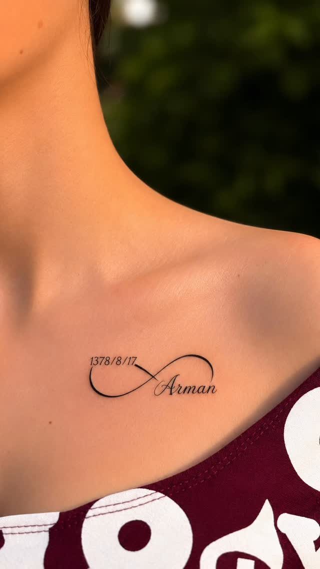
Pairing an infinity symbol with a name and date marks a specific moment or person in a design that stays legible at a small size.
The loop frames the text and gives the tattoo a clear shape, so it doesn’t read as floating letters.
Collarbone placement works for designs under 3 inches because the bone sits close to the surface and the area stays flat.
Pain here is sharper than on fleshy spots like the upper arm, but tight necklines should be avoided while the skin is raw.
10. Finger Name Tattoo
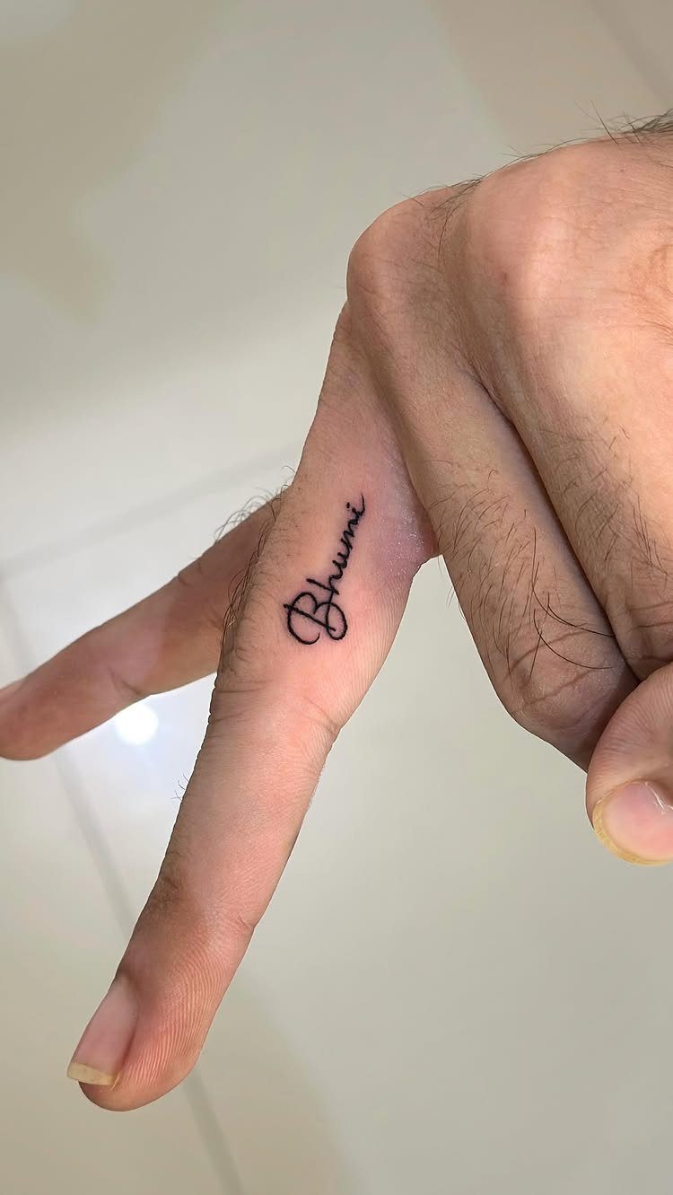
Running a name along the side of a finger keeps it private unless you’re showing it on purpose.
The placement suits short names or single words, since longer text either shrinks too small to age well or wraps awkwardly around the knuckle.
Fingers fade quickly and need more frequent touch-ups than other spots. I’d plan on refreshing this every year to keep the script readable, especially if your hands are in water often or exposed to sun.
Choosing the Right Font
Fine line script works when the name will be seen close, like a partner’s initials on the collarbone or a child’s name on the inner wrist. The delicate weight suits intimate placements and smaller scale.
Bold blackletter carries more permanence. Gothic scripts hold visual authority that lighter fonts can’t match, and they work best where you have the room to let the letterforms read at full weight: the chest, the forearm, or across the back.
Script that looks like someone’s actual handwriting gives the tattoo a closer, more intimate feel.
Reproducing someone’s actual signature or a hand-drawn script gives the tattoo warmth that typed fonts don’t carry. Letters hold their shape over decades if they’re scaled right from the start.
Sans-serif keeps its sharpness and legibility without much fuss. The geometric letterforms stay legible across a range of placements and carry a modern confidence.
Roman numerals substitute for names when you want to mark a date instead. The bold, geometric shapes age well because there’s no fine detail to blur.
Designing for Longevity
A name tattoo that’s too small loses definition as it ages. Fine letterforms blur and individual characters stop reading clearly.
The minimum size depends on the script and the placement, but the rule holds across all of them: if the letters feel tight at the size you’re considering, they’ll be illegible in a few years.
Fine line serif scripts feel elegant and intimate. Bold blackletter or gothic scripts read as permanent and weighty.
Sans-serif holds up without looking dated. The right choice is the one that matches the relationship between you and the name you’re marking.
Forearm puts it out in the open where it reads instantly. A name on the chest sits close to the heart.
Frequently Asked Questions
What is the best name tattoo design?
The best design is the one that fits the relationship you’re marking and the spot you’re putting it.
Cursive script works for almost any name and reads well at small sizes, while portraits with names need room on the back or chest to hold detail long-term.
Pair the font weight and style to the placement: fine line for intimate spots like the wrist, bold blackletter for the chest or forearm where the tattoo needs to carry visual weight.
Is there a free name tattoo design generator available?
Yes, several sites let you type a name, preview it in different fonts, and download the result without paying.
These generators give you a starting point for sizing and style, but the final tattoo still depends on your artist’s ability to match the script to your skin and placement.