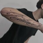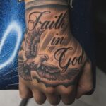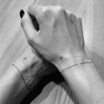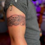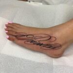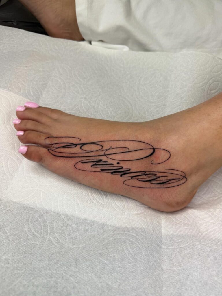
Script flows letter to letter like handwriting, Gothic pulls from medieval manuscripts with dense vertical strokes, and calligraffiti blends calligraphy structure with graffiti edge.
Chicano lettering carries Los Angeles barrio history in every curve, so if the aesthetic draws you but you have no connection to the roots, talk openly with your artist about fit.
1. Tattoo Script
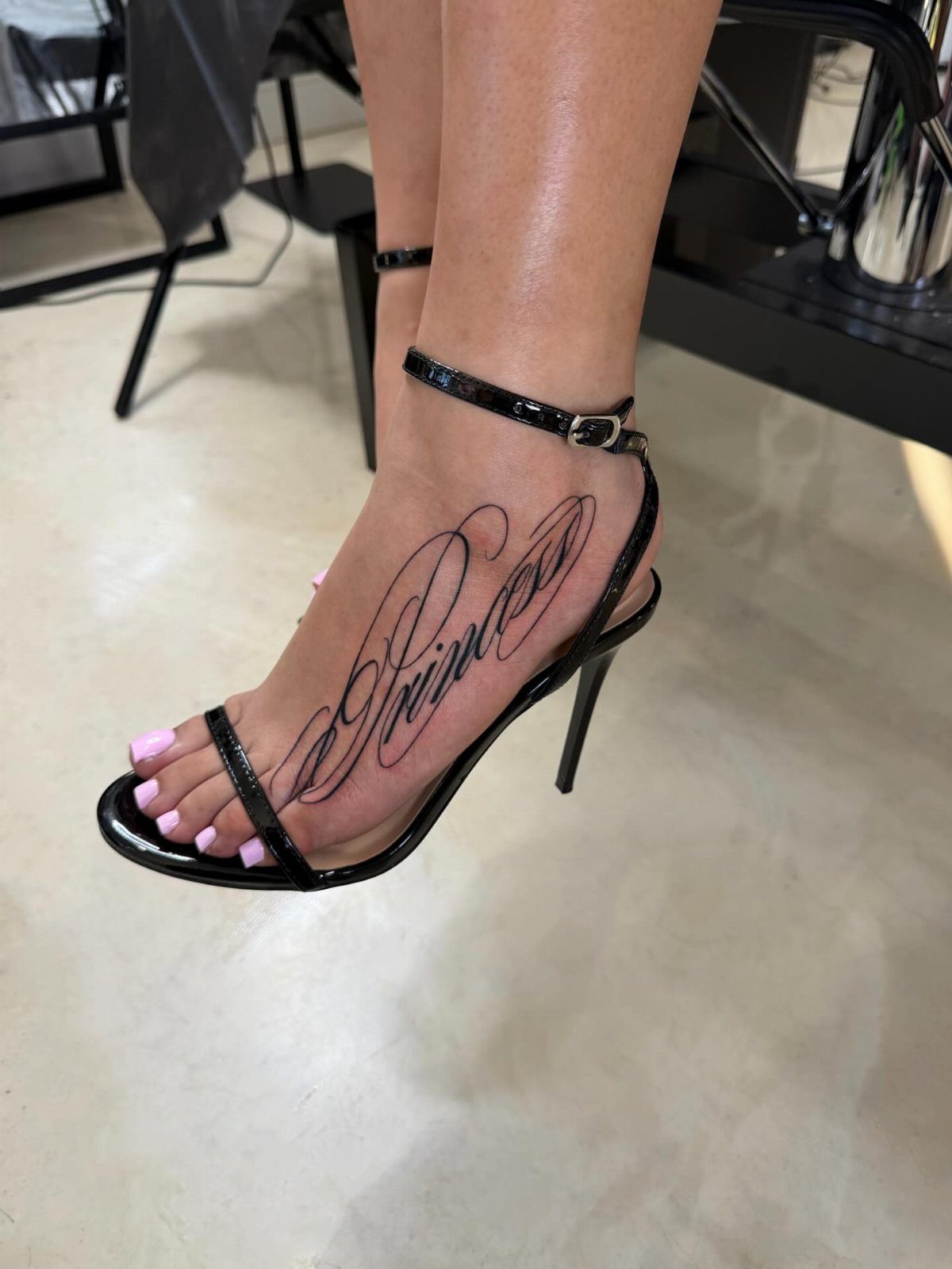
Script fonts connect letters the way handwriting does, each stroke flowing into the next. The example reads cleanly on a narrow placement like the foot because it stays light and avoids ornament.
Script reads best when the word carries weight on its own.
A name, a role, a single term you want visible. The foot limits how much text you can fit before the design wraps awkwardly or loses legibility, so one word or a short phrase is usually the ceiling.
Line weight matters. Too thin and the tattoo fades faster, too heavy and it loses the handwritten quality that makes script work.
Choosing a font for tattoos involves balancing emotional expression with practical factors like body placement, legibility, and long-term clarity. Delicate, thin-line fonts can fade or blur faster, while bold, structured fonts and larger lettering generally ensure better longevity and clarity.
2. Chicano Lettering
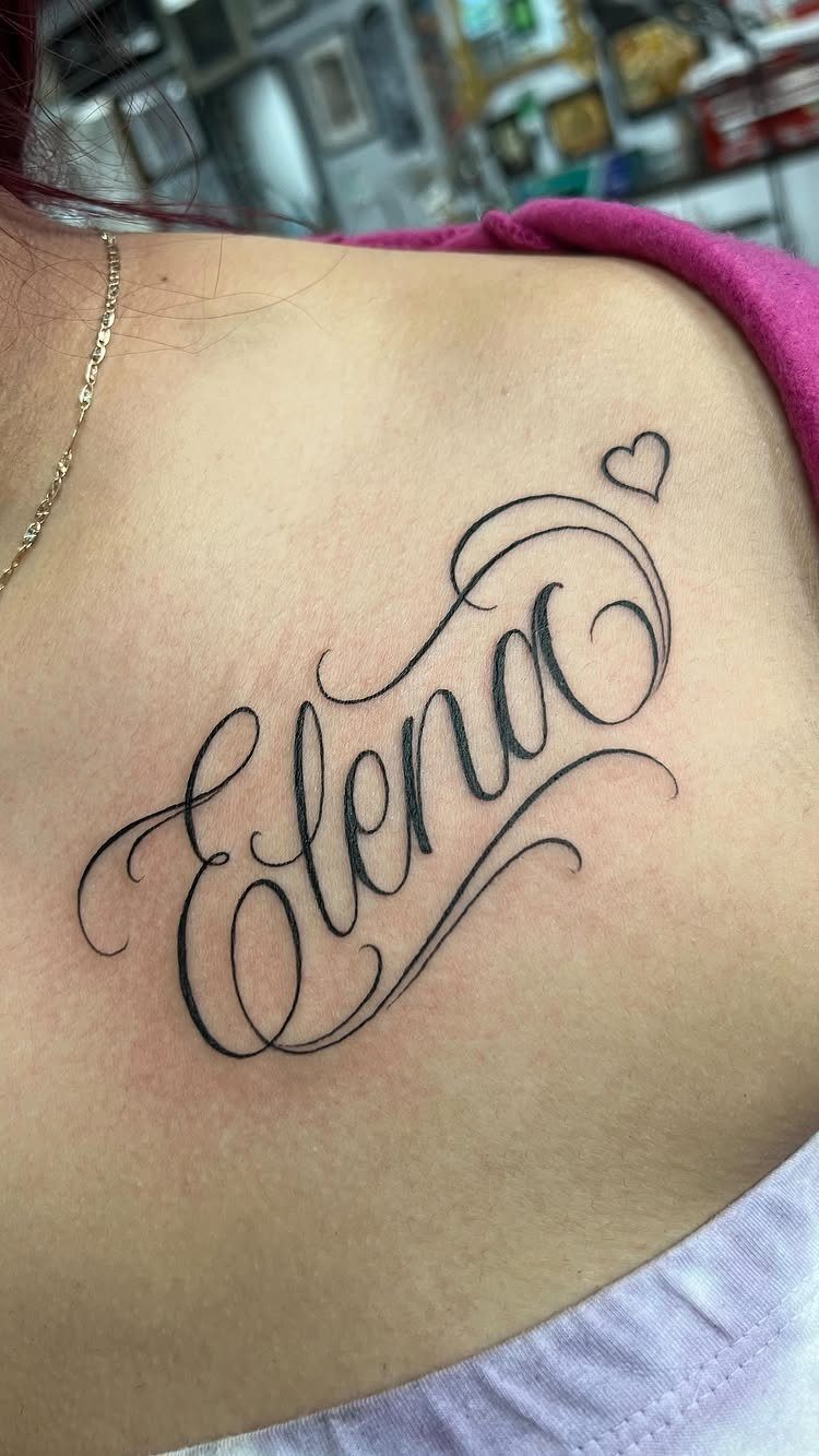
Chicano lettering grew out of Los Angeles barrio culture in the mid-20th century, and it carries that history in every curve.
The letters are elaborate, symmetrical, often shadowed or doubled, with flourishes that turn a name into a statement piece.
This style demands precision. Each letter locks into the next with matching weight and spacing, and a single inconsistent stroke breaks the rhythm.
I recommend finding an artist who already has Chicano work in their portfolio, because the technique does not transfer easily from other lettering styles.
Chicano reads best in short bursts.
A name, a date, a place. The more ornate the letterforms, the shorter the text should be.
3. Minimalist and Fine Line Lettering Tattoo
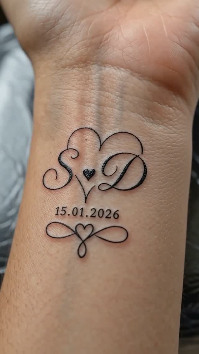
Fine line lettering strips the design down to what fits in a single pass of a tight needle.
According to the artist, the date marks a moment turned into art, and that is the appeal: you can fit several small elements in a compact placement and still keep each one readable.
Fine line ages differently than bold script.
The thinner the line, the more it softens over time, so this approach works best when you are okay with the tattoo settling into a lighter, softer version of itself after a few years.
4. Gothic Tattoo Fonts
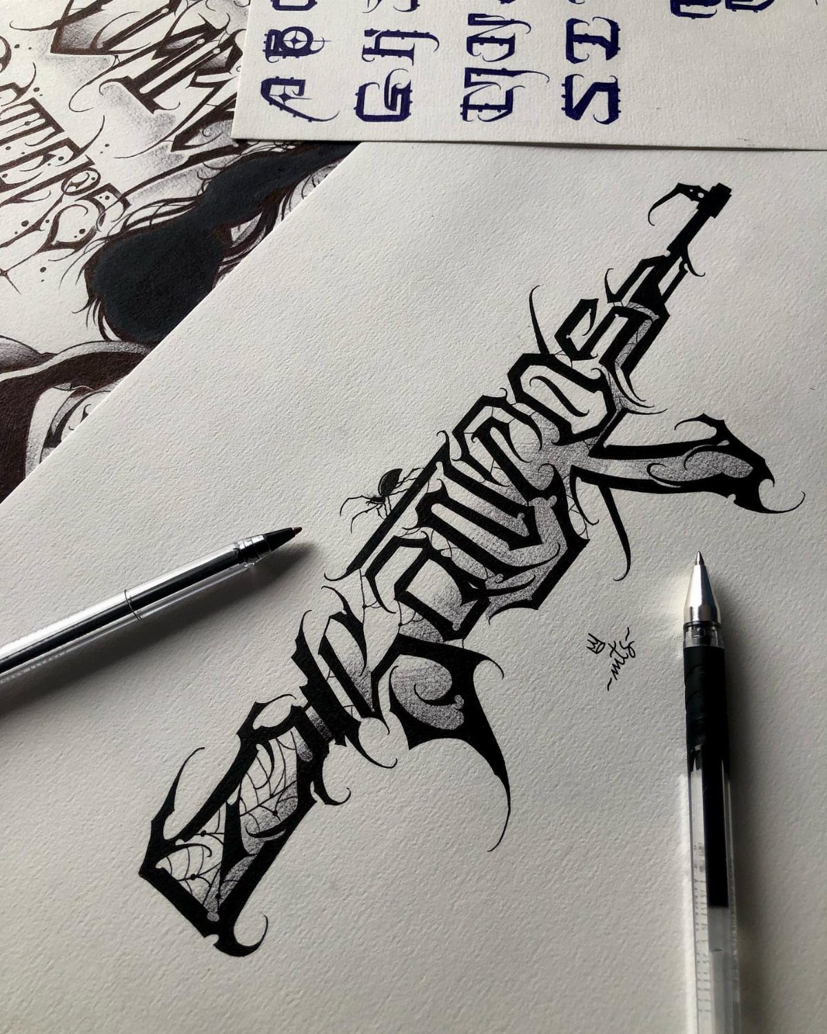
Gothic fonts pull from medieval manuscript traditions, and the result is angular, vertical, densely packed.
Gothic works when you want drama and historical weight.
A single word, a phrase, maybe a date. The letterforms demand space to breathe, so this is not the style for a paragraph or a long quote.
Readability drops fast as you add letters. I would keep it to 1 or 2 words, 3 at most, and ask for a full-size stencil before the session so you can see how it reads from arm’s length.
5. Old English Tattoo Fonts
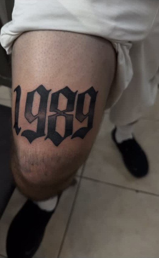
Old English fonts sit somewhere between Gothic and blackletter, elaborate enough to feel formal but still built to be read.
This style suits short text.
A year, a name or a single word, usually. The more letters you add, the harder it becomes to parse from a distance, and tattoos need to read quickly.
Placement matters. Old English carries visual weight, so it works best on areas with enough real estate to let the letters sit at a legible size.
The thigh, the forearm, the upper back. Small placements force the text to shrink, and at that scale the ornamental details blur together.
6. Cursive Font
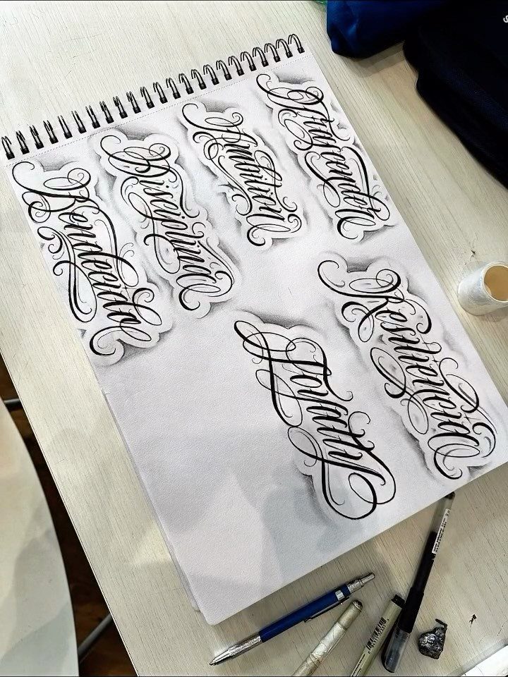
Cursive fonts cover a wide range, from loose handwriting to tightly controlled calligraphy. The sketchbook shows several variations, some with thick flourishes, others more restrained, all cursive but visually distinct.
That range is useful. Cursive adapts to match whatever tone you are after, so it works for personal phrases that need to sound right as much as look right.
A word like "Loyalty" in a bold, shadowed cursive reads different than the same word in a light, flowing script.
Cursive scales well. It works as small as a wrist placement or as large as a rib cage, and it stays readable across that range as long as the letter spacing holds.
I would ask your artist for a stencil at actual size before committing, because cursive that looks balanced on paper can feel cramped or loose once it hits skin.
7. Calligraffiti Tattoo Lettering
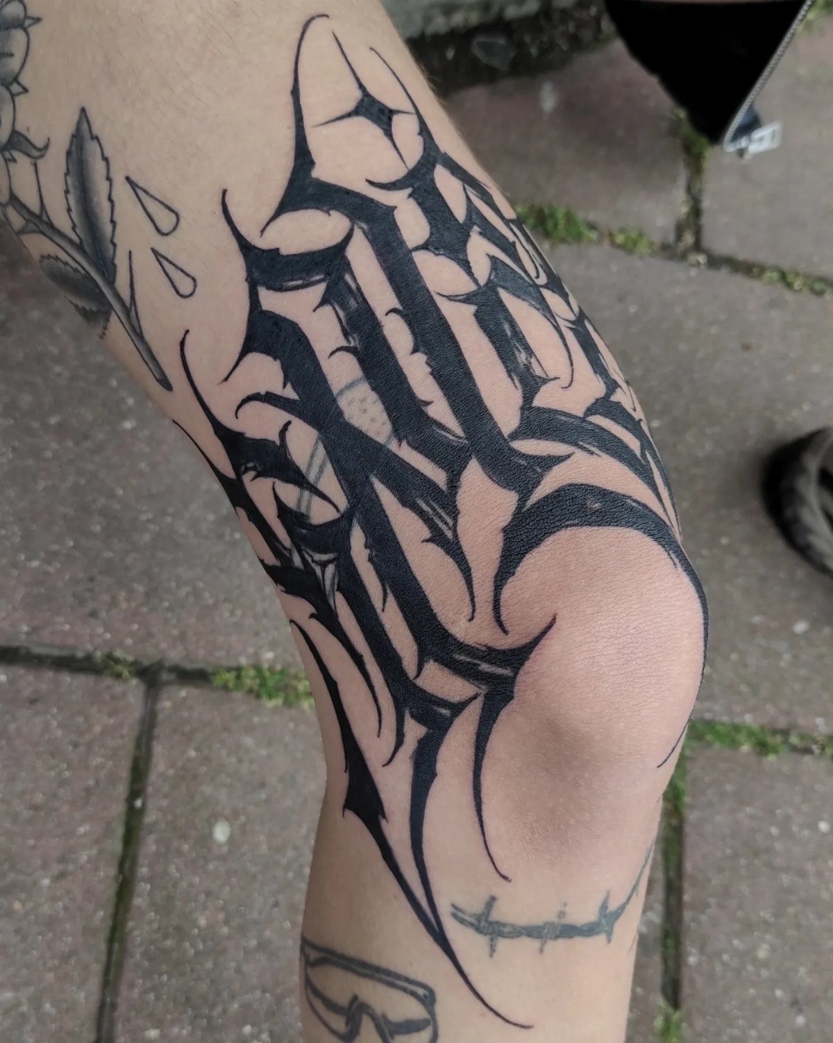
Calligraffiti blends calligraphy structure with graffiti aggression. The strokes are thick, angular, edged with the kind of energy that makes the text feel like it is moving even when it sits still.
This style takes up space, and it should. A compact spot like the wrist or ankle would cramp the proportions.
Black ink lets the structure do the talking. Color would soften the impact, and calligraffiti works because it hits hard.
8. Ornate Swirl Calligraphy Font
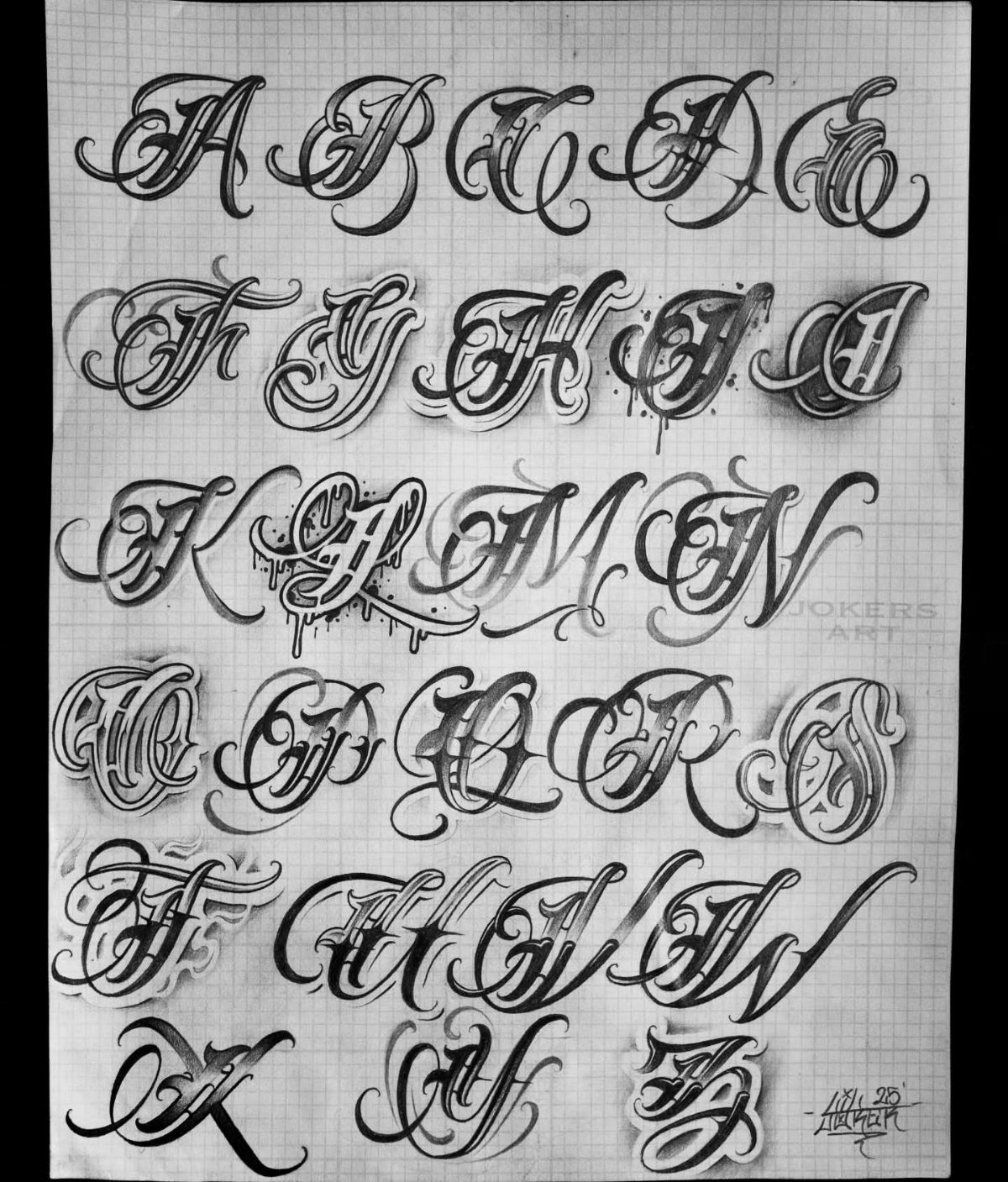
Ornate swirl calligraphy layers flourishes over the letterforms themselves, turning each character into a small composition. The white highlights add dimension, and the swirls extend beyond the base structure of the letters.
The alphabet format lets you preview how each letter behaves before committing to a word or phrase.
Some letters carry more decoration than others, and seeing the full set helps you gauge whether a specific name or word will balance or tip into illegibility.
A monogram, a single name, maybe 2 words.
How to Ensure Longevity
Thicker strokes hold ink better over time. A line needs enough width to stay crisp as your skin changes, and calligraphy fonts that lean on delicate hairlines or ultra-fine flourishes will soften faster than designs built on solid letterforms.
Simple shapes age more predictably than intricate ones.
The more detail a letter carries, the more likely those details will blur together over time. A clean, bold script with moderate ornamentation will age better than a design packed with tight swirls and layered shadows.
Black ink stays sharper than gray wash or white highlights. If the design depends on contrast between shades, that contrast will fade as the pigment settles, and the text may lose definition.
Placement affects longevity too. Areas with more friction or sun exposure will fade faster, so factor that in when choosing both the font and the spot.
Working with a Tattoo Artist
Bring reference images to your consultation. Screenshots, sketches, or saved designs give your artist a concrete starting point and help them understand the weight, spacing, and ornamentation you want.
An experienced artist will adjust a font to fit your body.
A design that looks balanced on a flat page may need redrawn curves or adjusted letter spacing to follow the contours of your forearm or shoulder blade. That is part of the process, not a compromise.
Ask to see healed photos of lettering work in their portfolio. Fresh tattoos always look sharper than healed ones, and you want an artist who understands how line weight and spacing will settle after the skin heals.
A stencil at actual size lets you check readability before the session starts. If the text feels cramped or hard to parse at a glance, now is the time to adjust it.
Cultural Significance of Fonts
The style grew out of Pachuco gang culture and was used to mark loyalty, family, pride, and loss.
That history means the style is not just decorative.
If you are drawn to the aesthetic but are not connected to the culture, I recommend talking openly with your artist about what the design means to you and whether it fits.
Some artists will adapt the visual elements into something that respects the roots without appropriating them. Others may steer you toward a different ornate script that matches the look you want without crossing that line.
Frequently Asked Questions
How do I choose the best font for my tattoo?
Pick a font that reads clearly at the size and placement you want, with line weight thick enough to stay sharp as it heals.
Personal meaning matters, but the design needs to work technically first: script for flowing single words, Gothic or Old English for short dramatic phrases, fine line for minimal placements that can handle softer aging.
Can I use a font generator for real tattoos?
A generator offers a starting point, but the design needs to be redrawn to fit your body.
Fonts that look balanced on a screen often need spacing tweaks or weight adjustments to follow the curve of your forearm or ribs, and an experienced artist will handle those changes during your consultation.
What are the best placements for lettering tattoos?
Forearms handle horizontal text well and give you flat space for most styles, while ribs and spine suit longer vertical phrases.
Collarbones work for short, bold text that needs to read from a distance, and fingers or knuckles take single letters or very short words in simple, heavy letterforms that hold up to friction.