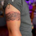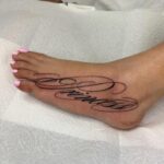
A font’s line weight decides whether it stays sharp or blurs into an unreadable smudge as the ink spreads over the years.
Chicano lettering leans into ornament with thick strokes and careful shading, script wraps cleanly around flat surfaces like a forearm or collarbone, and blackletter’s dense vertical strokes age better than thinner styles but demand more space.
Fine line lettering sits lighter but fades sooner, typewriter fonts read plainly without decoration, and calligraphic strokes turn the text into ornament.
1. Chicano Lettering
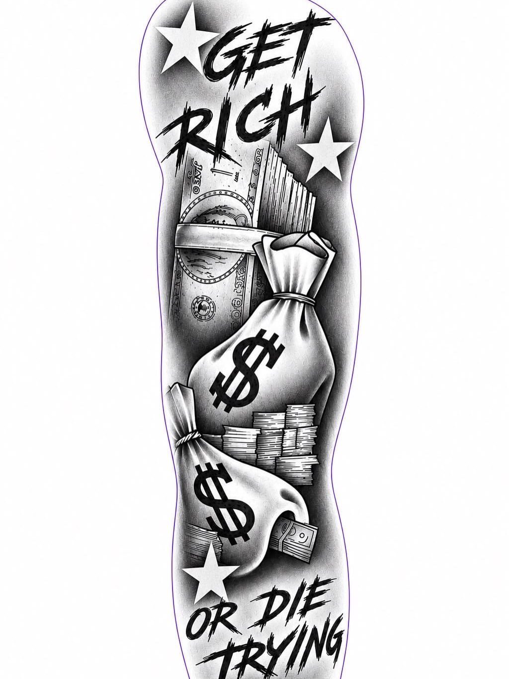
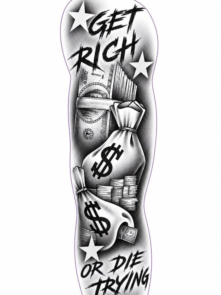
Chicano lettering pulls from the hand-drawn scripts that emerged in Mexican-American communities, shaped by the same culture that gave us lowrider art and mural traditions.
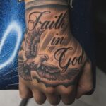
The letters lean into ornament: thick strokes, careful shading, and curves that stretch wider than most fonts allow.
If your tattoo carries personal or cultural weight, this style gives it the formality it deserves. The letterforms hold attention on their own, so they work alone or woven into a scene with portraits, roses, or money motifs.
Expect your artist to sketch the layout by hand. The spacing and flourishes are custom, not pulled from a template, and that means the design takes longer to draw than a standard script.
2. Tattoo Script
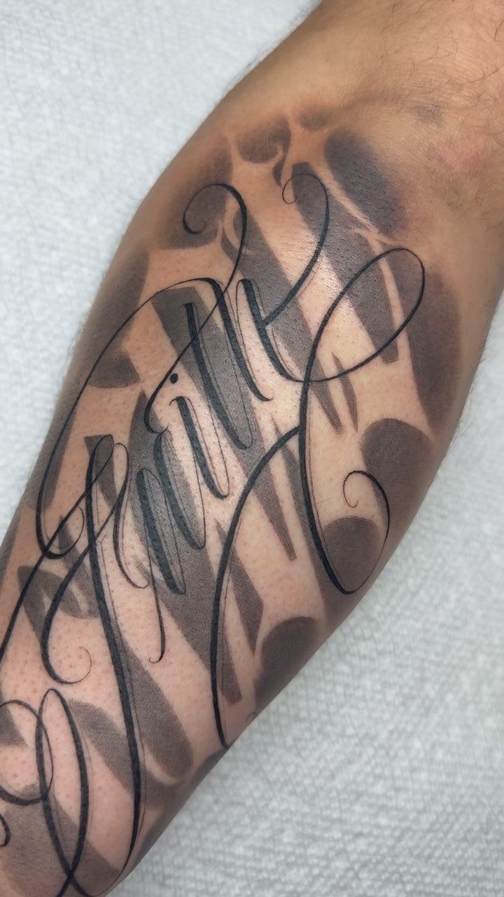
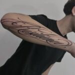
Script pulls from the cursive you learned in grade school, but stretched into tattoo proportions: letters flow into each other, the baseline stays level, and the rhythm holds even when the word is long.
It reads fast and ages well because the strokes stay simple.
The thinner the line, the more care it needs. Fine script loses clarity over time, so ask your artist to keep the weight medium or heavier for text that stays readable.
Placement matters here.
Script wraps cleanly around a forearm or collarbone, but loses legibility on a ribcage or shoulder blade where the skin moves too much. Keep it where the surface stays flat.
3. Gothic and Blackletter
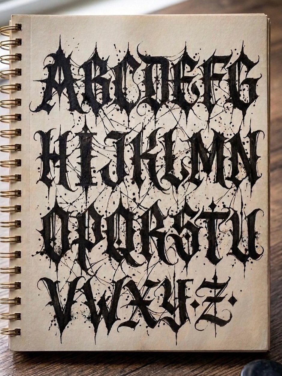
Blackletter is the dense, angular script that medieval scribes used for manuscripts, and it still carries that formality. The vertical strokes are thick, the letters stand close together, and the whole thing reads darker on the skin than most fonts.
This style suits single words or short phrases.
A full sentence in blackletter becomes hard to parse, especially once the ink spreads slightly. For more text, break it into separate lines or choose a lighter script.
The weight of the letters means they age better than thinner styles, but they also take up more space. A word in blackletter needs room to breathe, so plan for the design to run longer than you might expect.
4. Custom Hand-Lettering
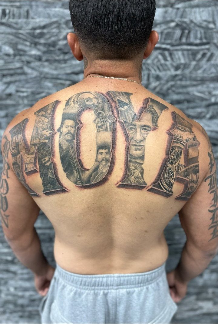
Custom hand-lettering means your artist draws the letters from scratch, shaped around your text and the body part where it sits.
The result is something that fits nowhere else: letters that stack, interlock, or stretch into forms a font cannot produce.
This route works best when the words matter more than the style.
If you already know what you want to say and the standard scripts feel too generic, ask your artist to sketch options. The process takes longer than picking from a sheet, but the letters will be yours alone.
Expect multiple revisions. The first sketch rarely lands, and good custom work comes from refining the proportions until everything balances.
5. Fine Line Lettering Tattoo
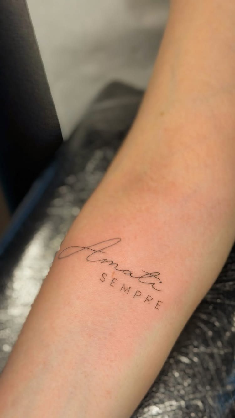
Fine line lettering uses the same narrow needles that produce delicate florals and minimalist line drawings.
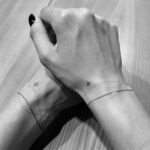
The result is text that sits lighter on the skin, with strokes thin enough to fit between freckles or over veins without dominating the area.
This style suits short phrases, coordinates, or single words where subtlety matters more than impact. The letters stay legible up close but fade into background from a distance, which makes them feel more private than bold script.
Fine lines blur and fade sooner than heavier ink.
Fine lines blur faster than thicker strokes, especially on hands, feet, or anywhere the skin moves constantly. For this look to last, keep it on a forearm where the surface stays still.
6. Typewriter Font
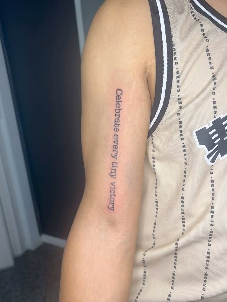
Typewriter fonts mimic the fixed-width characters that old mechanical typewriters stamped onto paper, where every letter takes up the same horizontal space and the ink sits slightly uneven.
The result reads plainly and carries a retro, analog feel without leaning into ornament.
This style works for phrases you want read quickly, like a line of poetry, a mantra, or a date. The letters stay uniform and neutral, so the words themselves carry the weight instead of the letterforms.
Typewriter text stacks well vertically, which makes it a good fit for ribs, forearms, or the back of a calf where space runs long and narrow.
Keep the phrase short; a long block starts to look like a paragraph instead of a tattoo.
7. Calligraphic Lettering
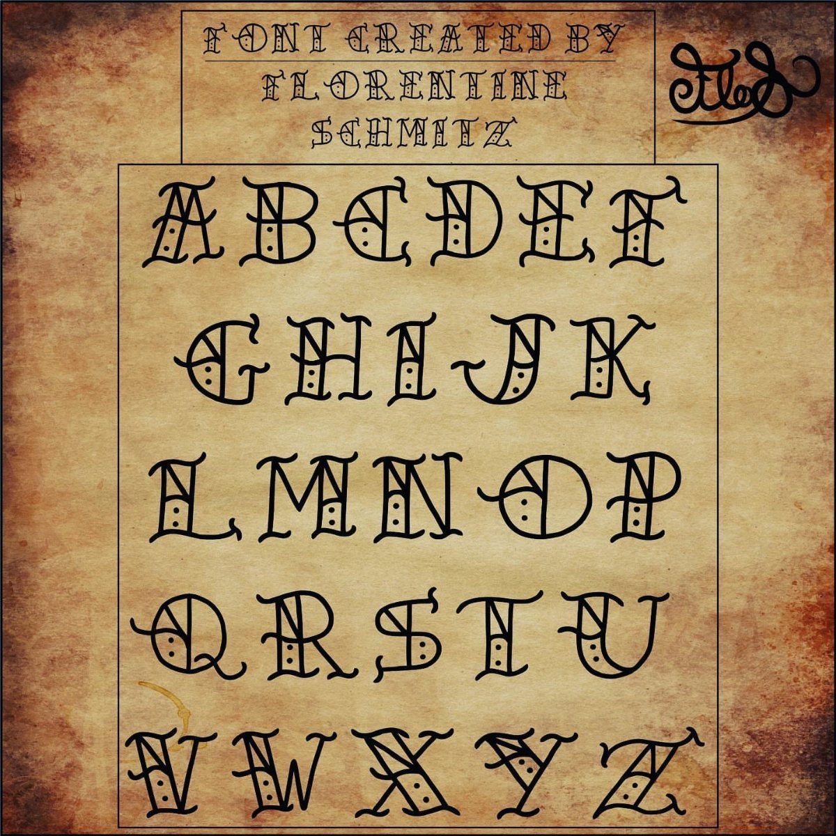
Calligraphic lettering borrows the formal, wide-nib strokes that ink pens produce, with thick downstrokes and hairline horizontals that give each letter visible rhythm. The curves and flourishes lean decorative, so the text itself becomes ornament.
A full sentence crowds quickly, and the decorative weight starts competing with readability.
Tell your artist which placement you have in mind so they can adapt the flourishes to fit.
Calligraphy drawn for flat paper needs reworking to sit cleanly on curved skin, and the spacing between letters matters more here than in simpler scripts.
Choosing the Right Font
Thicker strokes hold their shape as this happens, while delicate scripts blur and lose definition.
Spacing matters just as much as weight. Letters packed too close together merge as the ink spreads, so leave room between characters even if that means sizing up the design.
Placement shapes how long a font stays readable.
Starting slightly thinner than you think you need can help. As skin ages and stretches, the lines widen naturally, and a font that starts too heavy can end up looking thick and muddy years later.
Tattoo Placement Considerations
High-traffic areas like hands, feet, and fingers wear tattoos down faster than anywhere else. Fine line fonts fade quickest in these spots, while bolder styles hold up better but still need touch-ups over time.
The body moves and stretches as you age, and the tattoo moves with it. Fonts with thin strokes can spread into thick, blurred shapes, which is why some artists tattoo text slightly thinner than it might look ideal at first.
Placement also decides how much room you have.
Curved areas distort how letters sit. A phrase drawn flat on paper needs adjustment to flow cleanly over a bicep or around a wrist, so tell your artist the placement before they finalize the design.
Working with Tattoo Artists
Start by looking at portfolios. Find an artist whose work matches the style you want, and check for healed photos that show how their tattoos look months or years later, not just fresh.
Bring reference images when you meet. Screenshots, sketches, or anything that shows the look you’re after gives the artist a clear starting point instead of guessing from a description.
A consultation is where you explain what the text means and where it will sit. A good artist will tell you if the font you want will hold up in that spot, or suggest adjustments to make it last.
Listen when your artist flags a problem. If they say the letters need to be bigger, spaced wider, or drawn heavier, it’s because they’ve seen how tattoos age and know what stops working.
Frequently Asked Questions
How to choose a tattoo font?
Pick a font that matches the weight your words carry and the body part where it sits. Heavier strokes age better than fine lines, and some styles lose clarity on curved or high-movement areas like ribs or fingers.
Size and placement come first when you talk to your artist; both decide how much spacing and line weight the letters need to hold up.
What are popular tattoo lettering styles?
Script, Chicano, Gothic blackletter, and fine line lettering show up most.
Script flows fast and wraps cleanly around flat surfaces, Chicano adds ornament and cultural formality, blackletter carries medieval weight, and fine line sits lighter for subtle text. Each one ages differently and needs different placement considerations.
How long does a lettering tattoo take?
Most single words finish in under 2 hours; a full phrase in script can take 3 or 4 depending on how much detail you add.
Chicano lettering with shading and flourishes can stretch to 5–8 hours or more, and large pieces like a full ribcage quote may need multiple sessions.