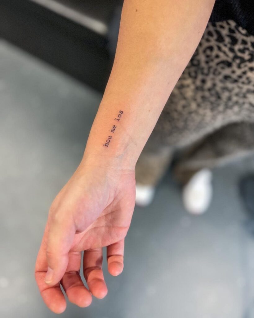
Typewriter font tattoos run from a single lowercase initial smaller than a dime to multi-line forearm quotes that take 1–2 hours to ink.
Pick all-caps if you want the text readable from a few feet away, lowercase for something softer, or a dictionary layout if the word needs context.
Coordinates in typewriter numerals keep the meaning private since most people cannot read latitude and longitude on sight, and the evenly spaced letters hold their structure when you stack 3 lines without one dominating the other.
1. Quote and Coordinate Typewriter Tattoo
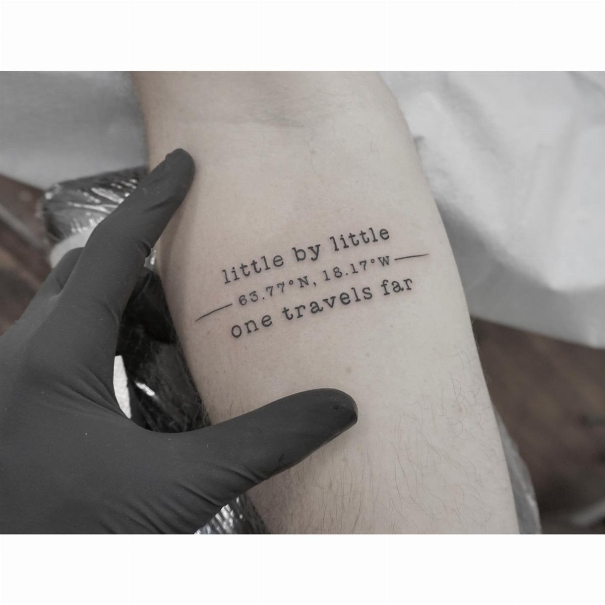
This piece runs a short motivational line with latitude and longitude below it, then finishes with a second phrase, all in lowercase typewriter letters.
The coordinates mark a place that matters: where you met someone, a trip that changed things, or home.
Typewriter font keeps the layout readable when you stack multiple lines. The letters sit evenly spaced, so "little by little" above 63.77°N, 18.17°W holds its structure without one line dominating the other.
Forearm placement lets you read it yourself and gives enough length for 3 lines without crowding. Most artists charge by the hour for text this detailed; expect 1–2 hours depending on how carefully they space each character.
2. Wrist Typewriter Word Tattoo
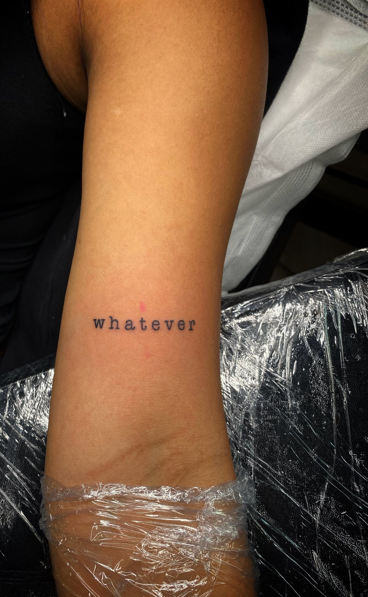
A single word on the inside of the wrist, lowercase, in a font that mimics the uneven ink density of a real typewriter key strike. "Whatever" works because it reads fast and the letters stay distinct even at small scale.
Wrist tattoos hurt more than forearm ink since the skin sits close to bone and tendon, but the spot heals quickly when you keep it clean and avoid friction from watch bands or bracelets.
Pick a word you actually say. Typewriter font has enough character that the text does not need decoration, and a short word keeps the letterforms legible as the ink settles over time.
3. Multi-line Poetic Quote Tattoo
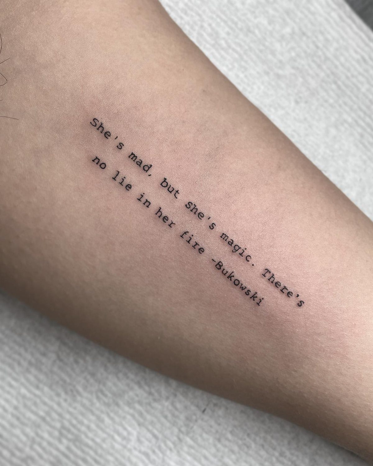
A literary quote set in 3 lines down the outer forearm, attributed at the end with a dash and the author’s name. The Bukowski line here runs long enough to need careful letter spacing so the words stay readable without bunching.
Outer forearm gives you a straight, visible canvas that does not bend much when you move your arm, so text holds its alignment better than on the inner forearm where skin folds.
Choose a quote you have read more than once. I prefer something short; longer lines force the artist to shrink the font, and typewriter lettering loses its crispness below a certain size.
Most artists will test the layout on transfer paper first so you can check spacing before the needle starts.
4. Vertical Typewriter Side Tattoo
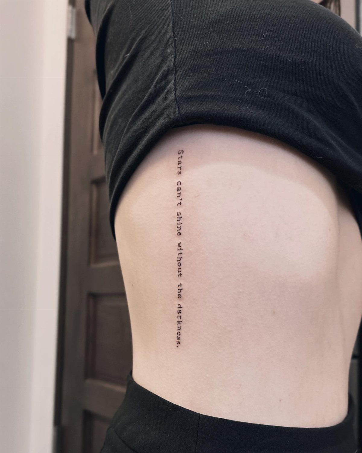
Vertical text running down the ribcage in typewriter font, reading from top to bottom. This orientation works on the side because your ribs give the artist a relatively flat working surface compared to the curve of an arm or leg.
Rib tattoos sit high on the pain scale.
Skin stretches thin over bone here, and every breath shifts the canvas slightly. Sessions for side text can take a while, and most people need breaks.
The upside is that vertical text stays private unless you choose to show it. Text reads cleanest when you stand straight; slouching or twisting compresses the letters.
5. All-caps Typewriter Tattoo
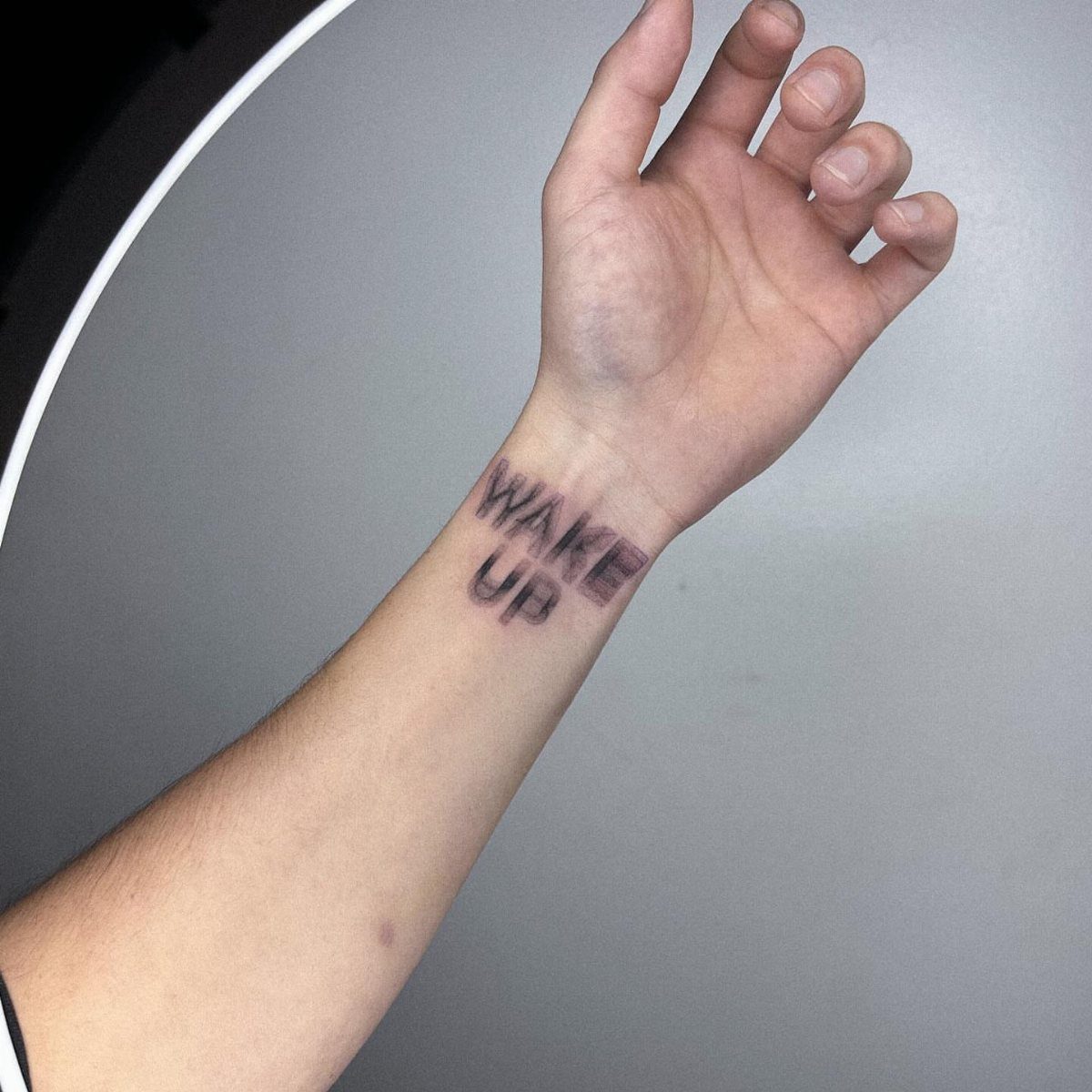
2 words in all-caps typewriter font, inked across the top of the wrist where a watch band would sit.
Capital letters hit harder than lowercase and make the message readable from a few feet away, which matters for tattoos meant to work as a visible reminder.
All-caps typewriter has tight spacing between letters, so keep it to 2 or 3 short words. Artists can fit this size on the wrist quickly.
Black ink on the wrist fades slower than colored ink, but expect to get it touched up eventually since hands see constant sun and washing.
Skip lotion on fresh wrist tattoos for the first week; the skin there sweats more than other spots and lotion traps moisture.
6. Single Lowercase Initial Tattoo
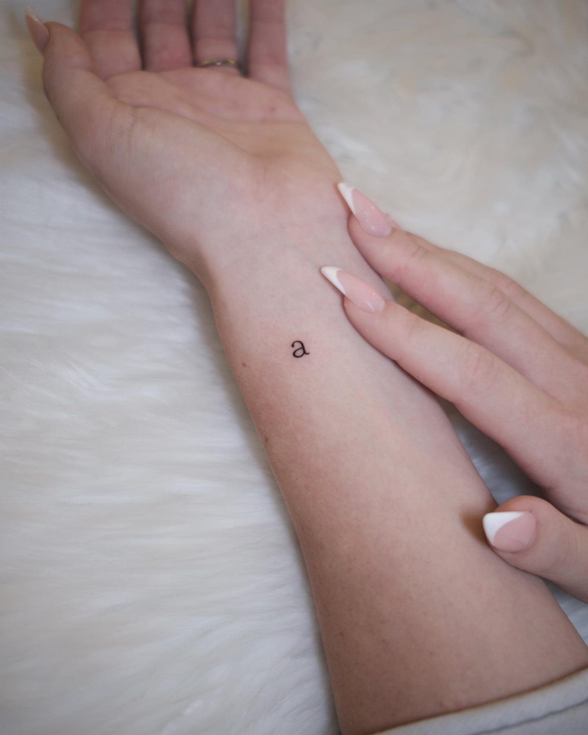
A single lowercase initial, smaller than a dime, placed on the inner wrist. Typewriter font gives the letter enough detail to stay interesting at tiny scale: the serifs and slightly uneven weight keep it from looking like generic sans-serif text.
Inner wrist is one of the most visible spots on your body, so an initial works for something personal that does not require explanation. The letter could stand for your name, a partner, a child, or someone you lost.
The detail in typewriter font holds better than script at small scale, but expect the serifs to soften slightly over the first year as the tattoo settles.
7. Typewriter Ink Smudge Effect
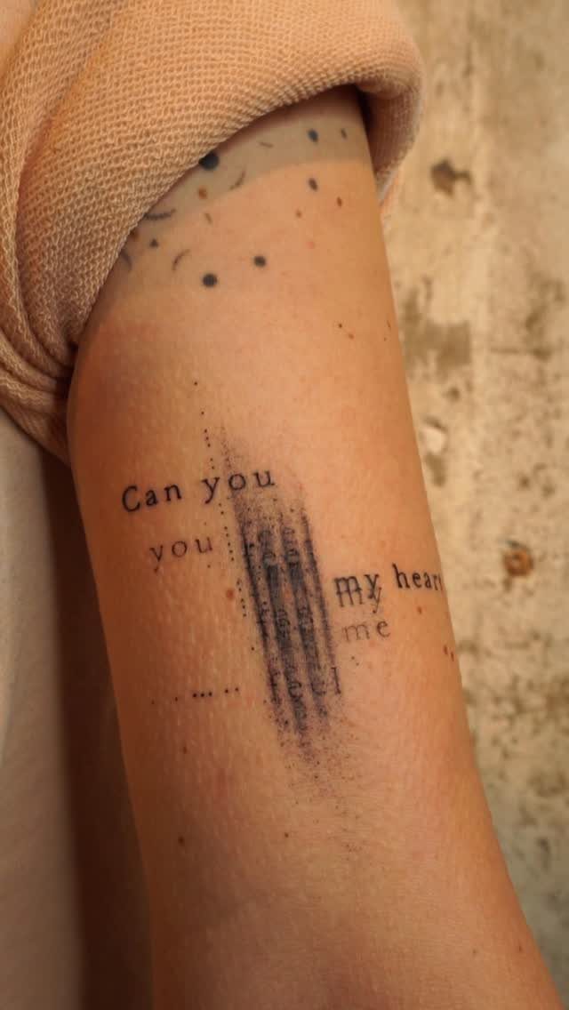
Text broken by a vertical ink smudge, as if the paper shifted mid-keystroke.
The smudge crosses several letters and adds texture without making the words unreadable; typewriters left marks like this when the ribbon caught or a hand brushed wet ink.
The effect works best on shorter phrases where the smudge can interrupt one or two words without losing the sentence.
Artists either tattoo the text first and add the smudge over it, or plan the whole piece so the smudge sits in a natural break between words.
Expect the smudge to soften slightly as the tattoo heals. Black ink holds detail better than gray wash here.
8. Typewriter Text with Star Accents
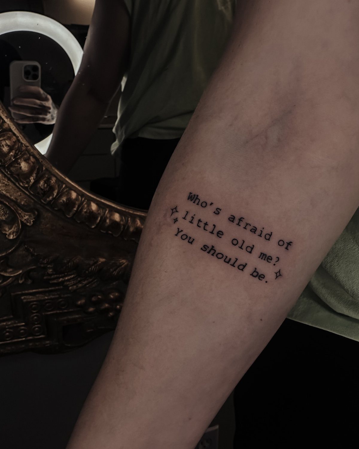
Small four-pointed stars frame the quote at both ends, adding symmetry without competing with the text.
The stars sit level with the top and bottom lines, so the whole piece reads as one balanced block rather than text with decoration tacked on.
Stars in tattoos usually signal something personal: milestones, people, or just a preference for the shape. Here they work as punctuation, the way old typeset pages used ornaments to close a section.
Keep stars small. Larger ones pull attention away from the words, and typewriter font already has enough detail to hold a forearm on its own.
9. Dictionary Definition Typewriter Tattoo
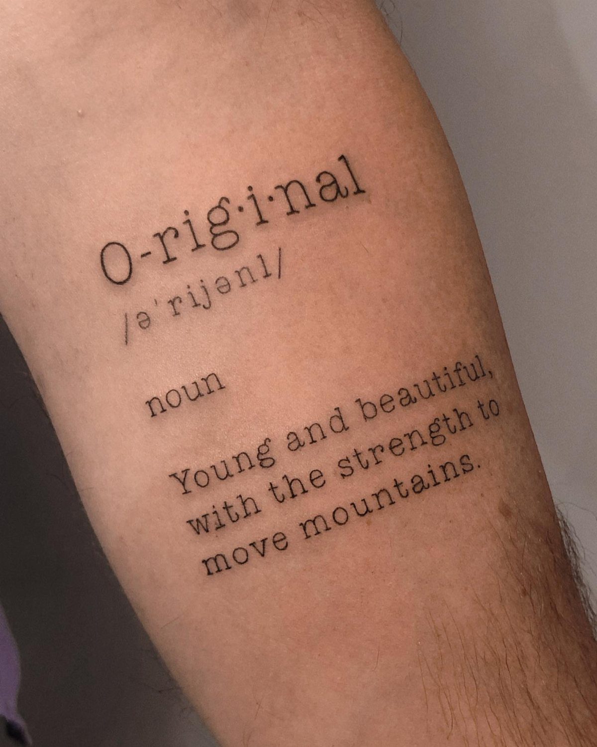
A word broken into syllables with a phonetic guide, part of speech, and a short definition below it, all in typewriter font. The layout mimics a printed dictionary entry, and the definition can be literal or personal.
The syllable breaks and pronunciation marks add visual interest to a single-word tattoo without needing extra decoration. Most dictionary tattoos use a word the wearer identifies with: a value, a nickname, or something they were called.
Forearm fits this format cleanly since the lines stack vertically and the text reads without rotating your arm. Artists charge by line count and detail, so a definition this length sits in the longer end of the session range.
10. Cross Layout Typewriter Tattoo
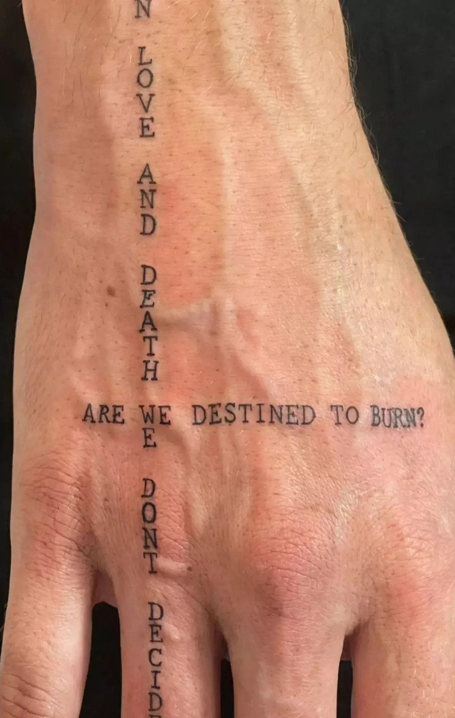
Two phrases cross at a shared letter or word, one running horizontally across the back of the hand and the other vertically down the wrist and fingers.
The intersecting layout turns the text into a grid, and both lines stay readable if you keep the font size consistent.
Hand tattoos lose sharpness quickly since hands wash constantly and see full sun.
Plan to get this touched up every few years, and expect more pain than a forearm piece since skin on the hand is thin and sits directly over bone and tendon.
The cross shape works when both phrases connect thematically. Unrelated lines just look like 2 separate tattoos that happen to overlap.
11. Typewriter Coordinates Tattoo
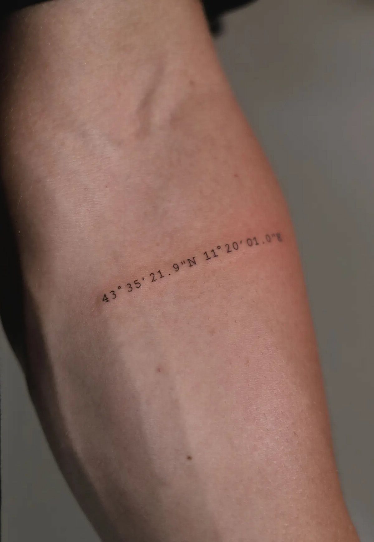
A pair of latitude and longitude numbers, nothing else. The coordinates sit cleanly on the forearm in typewriter numerals, and the lack of decoration keeps the focus on the location itself.
The numbers mean nothing to most people who see them, which keeps the meaning private.
Double-check the coordinates before the session. A single digit off puts the marker hundreds of miles away, and fixing a number tattoo means a cover-up or removal.
Frequently Asked Questions
What is an old fashioned typewriter font?
An old fashioned typewriter font mimics the mechanical look of mid-century office machines, with monospaced letters that sit evenly across the line and slight irregularities in ink weight.
Fonts like Courier, Special Elite, and American Typewriter recreate that analog texture, and they translate well to tattoos when the artist adjusts spacing and stroke weight for the body.
What are some common fonts for tattoos?
Typewriter fonts like Courier Prime, Special Elite, and American Typewriter show up often in text tattoos because their structured shapes stay readable at small scale and age better than script.
They work for quotes, dates, names, and single words when the artist strengthens thin strokes and opens tight spaces to suit skin.
Do typewriter tattoos age well?
They stay readable longer than script or fine-line text when the design has enough space between letters and the artist uses solid black ink.
Placement matters: forearm and outer arm hold detail better than hands or ribs, and sun exposure fades any tattoo over time.