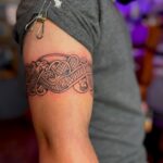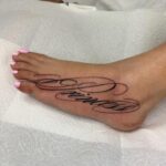
A name in script flows across a forearm fast, while a realism sleeve with portraits and dates takes multiple sessions and costs thousands.
The relationship decides the style: a partner’s name carries the highest regret rate and drives most cover-up requests, while a child’s name or a memorial with dates holds across decades.
White ink whispers under the skin on pale tones but yellows in sun, bold blackletter holds its edges for 30 years, and handwritten script traced from an actual signature pulls the gesture straight off the page with a 1001RL single needle.
1. Script Fonts
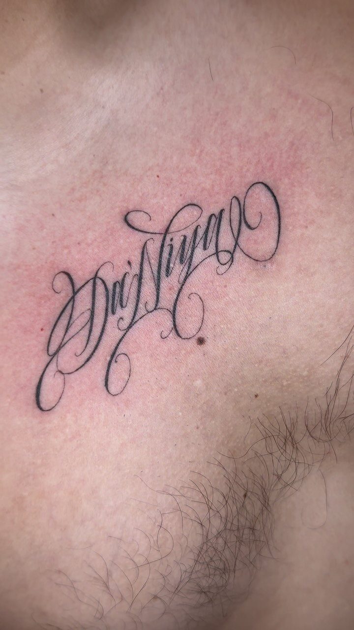
Script brings movement to a name. The letters connect and flow, and the flourishes at the end of a stroke add a finished look without needing anything around it.
Chest placement lets the letters stretch and settle. Script reads best when the size matches the length of the name: too small and the curves blur together over time, too large and a short name floats.
Pick a font with clear contrast between thick and thin strokes. That contrast stays sharp longer than delicate all-over hairlines.
2. Bold Lettering
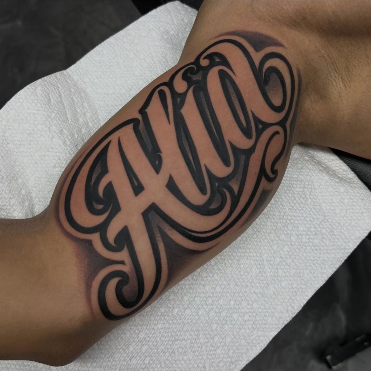
Thick letters claim the space. Bold lettering works when the name needs to be visible from across a room, and it ages well because the width of each stroke keeps the edges crisp even as skin changes.
Forearm placement puts it where you see it daily.
The width of bold script means a longer name needs more real estate: measure the stencil against your arm before you commit, because a name that wraps or breaks across 2 lines loses impact.
Black ink at full saturation gives the strongest read. Grey wash softens bold lettering but fades faster and calls for more frequent touch-ups.
3. Names Intertwined with Botanical Elements
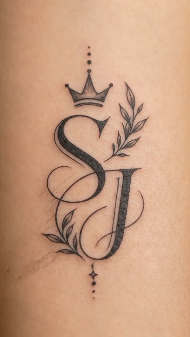
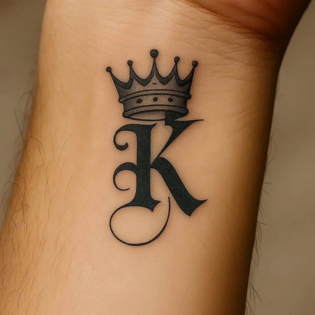
Initials laced together turn a name into a mark. The crown and leaves frame the letters without crowding them, and the symmetry makes the design feel intentional rather than added over time.
This approach works when the meaning stays private.
Most people will see a monogram; you will know whose initials they are. Botanical elements fill the negative space around compact letterforms, so two or three initials suit this better than a full name.
Keep the line weight even across letters and leaves so nothing competes for attention.
4. Memorial Name Tattoos with Dates
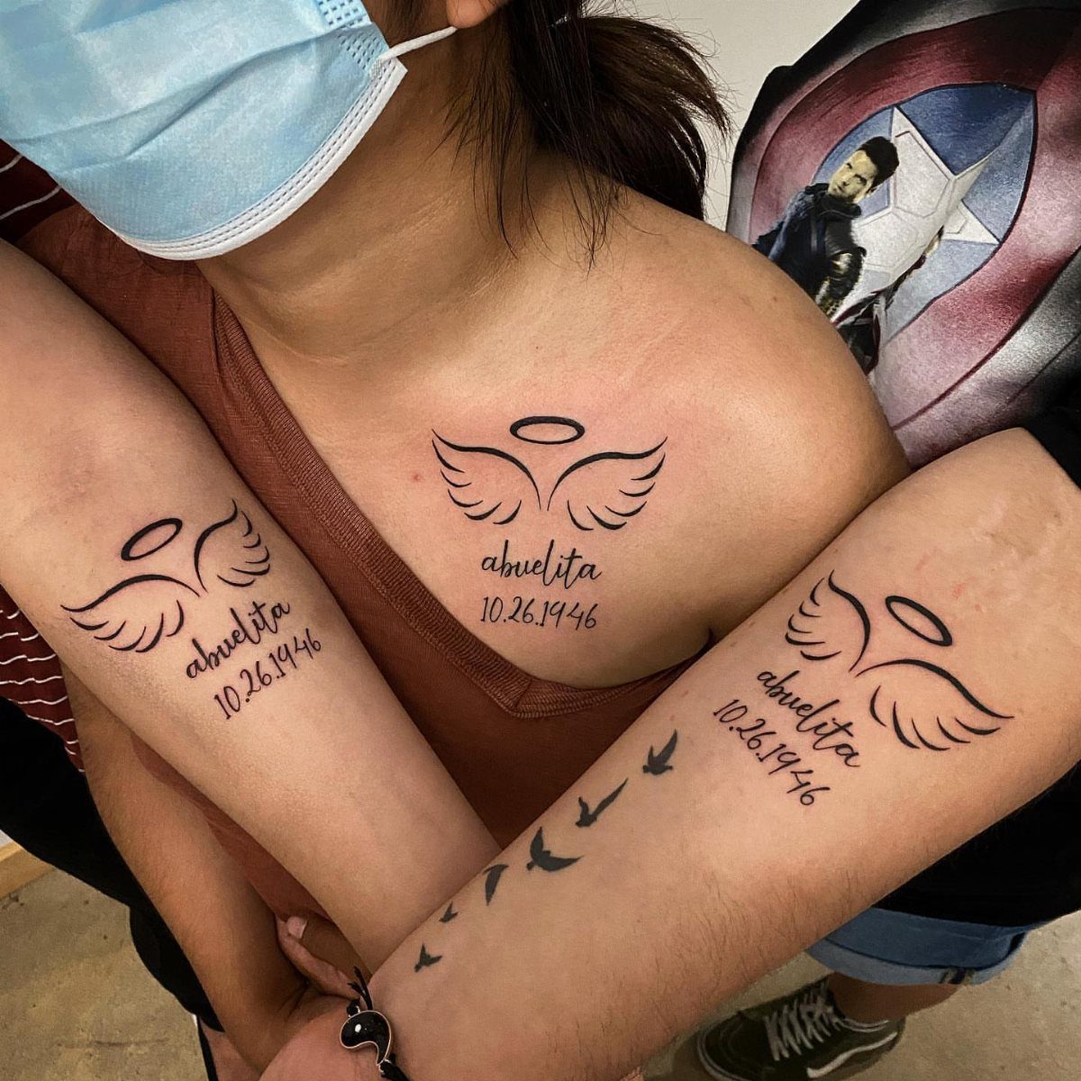
Angel wings, a name and a date. Memorial tattoos land heaviest when the design stays simple, because grief does not need decoration.
Matching placements across family members turn individual tattoos into shared commitment. Arms and chest both work; chest sits closer to the heart, arms make the tribute visible to others who knew them.
Date format matters.
Month, day and year in numbers read faster than spelled out. Black ink, no shading, no extra symbols beyond what the memory requires.
5. Flower Name Tattoo
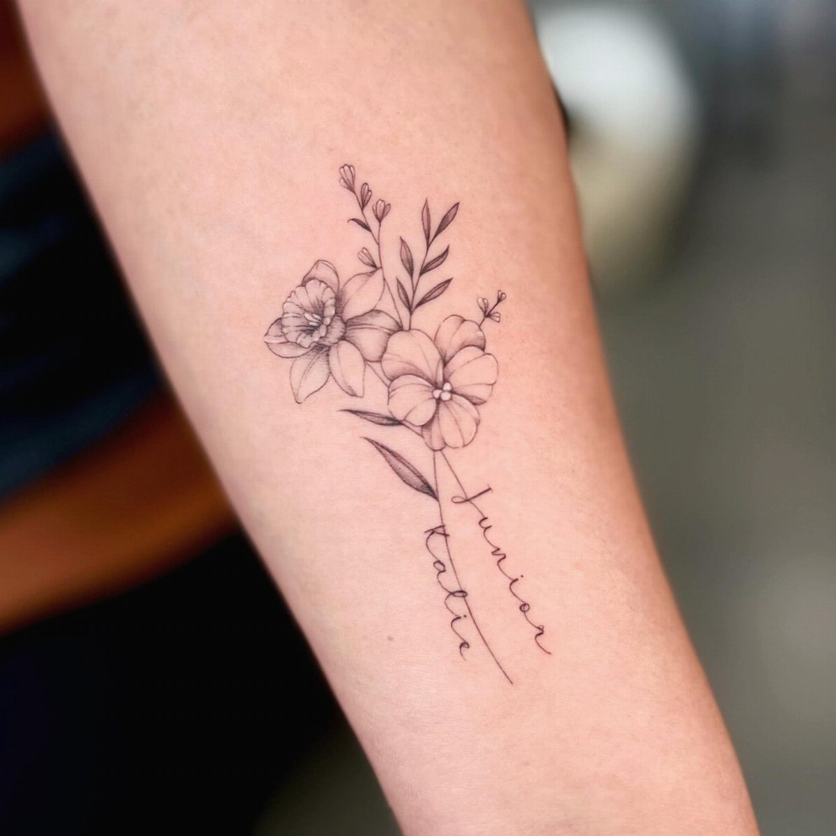
Flowers soften the formality of a name. Fine-line detail keeps the botanical work from overpowering the script, and placing the names inside or beneath the blooms roots them in something living.
Forearm offers a vertical canvas for stems and petals.
Choose flowers that mean something to the relationship: birth month blooms, a flower from the wedding, something they grew. Generic filler reads as filler.
Script size has to match the scale of the line work. If the flowers are delicate, bold block letters will look pasted on.
6. Beloved’s Name with a Heart
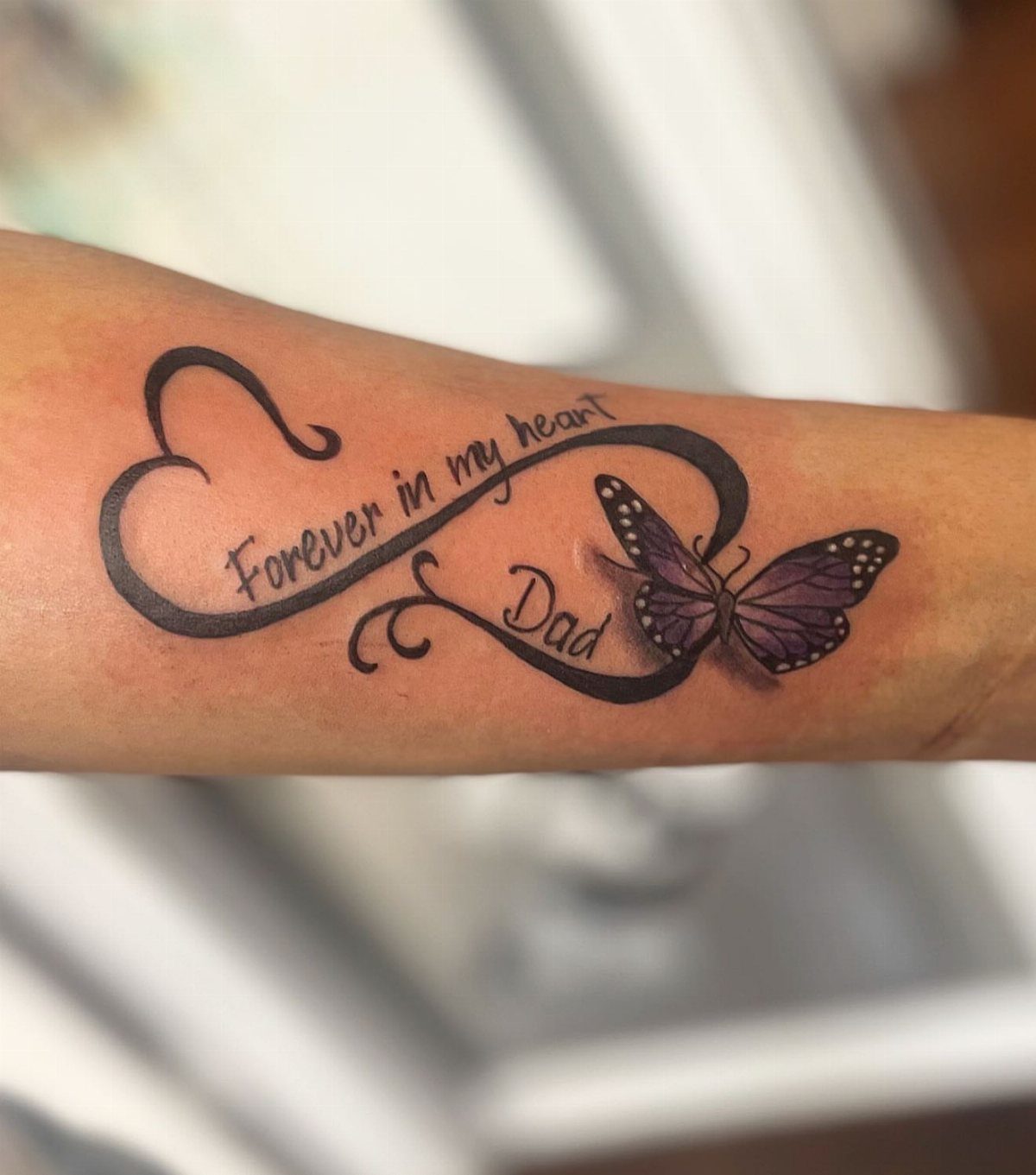
A heart outline around a name spells the relationship out. The butterfly and infinity symbol add layers, but the heart does the work: it tells anyone looking exactly whose name this is and what they mean to you.
The heart can sit open or shaded; open reads lighter, solid black anchors the whole piece. Keep the text inside or just below the heart so the layout holds together.
Purple shading on the butterfly pulls the eye but fades faster than black. Plan for a color touch-up every few years if you go that route.
7. Handwritten Name Tattoos
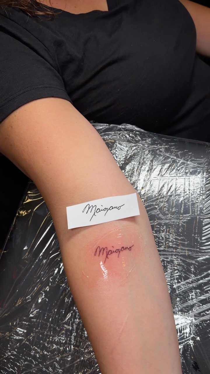
Copying someone’s actual handwriting pulls the gesture straight off the page. The lines sit where their hand put them, uneven and alive in a way a font cannot match.
Start with a clear scan of the handwriting you want inked. The artist traces it at size, so the stroke weight has to read clearly: a ballpoint scribble on receipt paper will blur, fountain pen on good stock holds detail.
Red ink here was done with a 1001RL, a single needle that keeps fine work sharp.
Forearm and ribs both suit this because the skin sits flat enough for precise line work. The longer the name, the more space you need to preserve legibility.
8. White Ink Name Tattoos
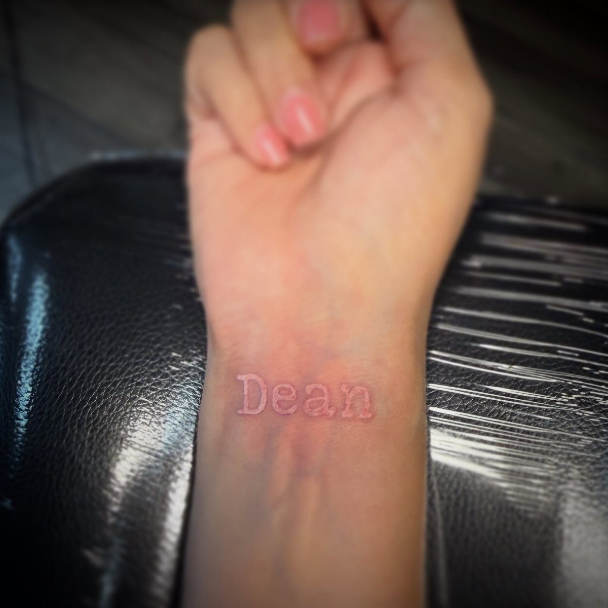
White ink sits under the skin rather than on top of it, so the name reads as a scar or a whisper. It shows best on pale skin.
Wrist placement keeps it visible only when you look for it.
White fades faster than black and yellows over time, especially in sun exposure. Most people who choose white ink want the name private, and this delivers that better than any other option.
9. Traditional & Old School Tattoo Style
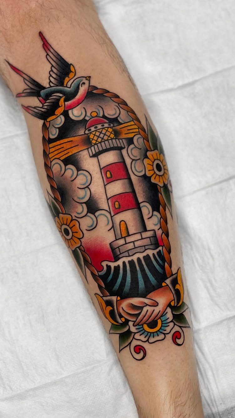
Bold black outlines and a short list of colors: red, yellow, green, blue. Traditional style came out of sailor shops, and the rules have held because they age cleanly.
A lighthouse, swallow and flowers fill an arm the way this style was built to do. The symbols carried meaning then and still do now: a swallow for safe return, flowers for someone waiting.
If you want a name inside a traditional piece, the banner is the standard move, and black gothic or serif lettering holds best.
10. Neo Traditional Tattoo Style
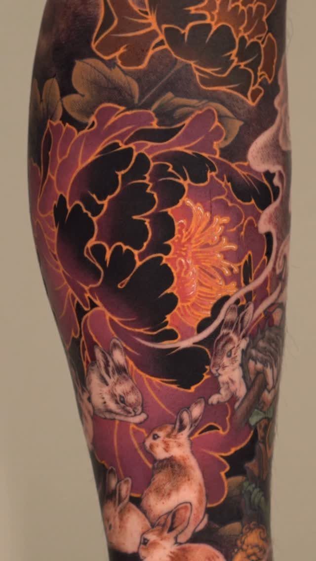
Neo traditional keeps the bold line work but opens up the palette. More colors, more shading, more room for detail than the old school rulebook allows.
A name fits into this as part of the composition rather than inside a banner. The line weight stays heavy, so script has to be thick enough to match or it will look tacked on.
11. Realism Tattoo Style
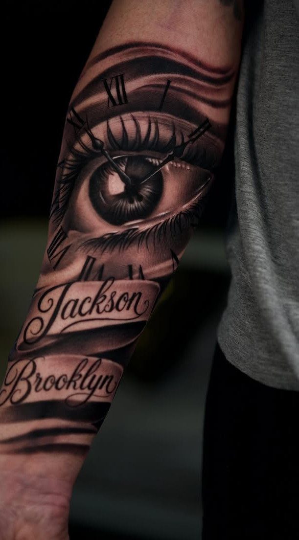
Realism renders an eye, clock face and names the way a photograph would. Every shadow, reflection and fold of skin gets mapped in black and grey, and the work depends on an artist who can handle fine gradations.
The clock and eye anchor the names Jackson and Brooklyn, so the text reads as part of the scene rather than floating.
Realism takes longer than simpler styles, and touch-ups are harder to blend. If the name matters more than the image around it, a simpler approach will serve you better.
12. Japanese Tattoo Style
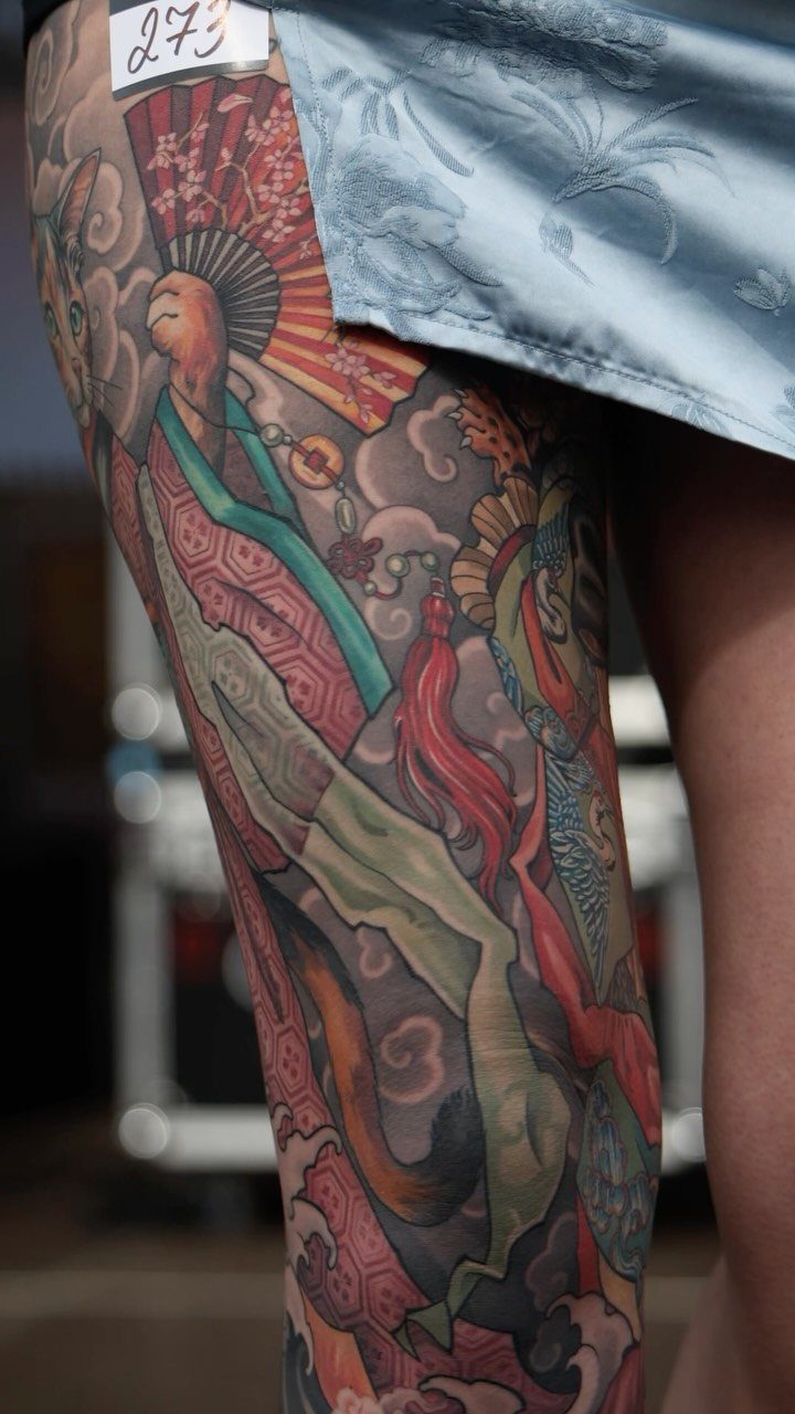
Japanese tattooing covers ground. Full sleeves, backs and legs carry the weight of koi, dragons, waves and clouds, all drawn from centuries of woodblock prints.
The figures and clouds here show the density: color fills most of the skin, and black outlines hold the shapes together.
A name inside a Japanese piece usually goes in kanji, sized to match the scale of everything around it. If the name is in English script, it will sit outside the traditional iconography because the 2 systems do not blend.
Choosing the Right Script
The font you pick carries as much meaning as the name itself.
Fine line script suits placements where the tattoo will be read up close: wrist, collarbone, inner forearm. The delicate strokes convey intimacy, and the size keeps the design legible without crowding the skin.
Bold blackletter or gothic scripts carry authority.
The thick strokes age cleanly and hold their shape over decades, making them the right choice for larger placements like chest, back or outer forearm where the weight of the letters can sit without looking cramped.
Handwritten scripts, whether traced from actual handwriting or drawn to look personal, age well when sized correctly. The warmth of irregular strokes makes the name feel lived-in rather than formal.
A name in precise, unadorned letters works when clarity matters more than decoration, and the lack of flourishes keeps the design legible at moderate scale across most placements.
Symbolic Additions
Names rarely sit alone.
An infinity symbol suggests the relationship will outlast everything else. A cross or religious image marks the spiritual weight of the bond.
A rose pairs with romantic names because the symbol has carried that meaning for centuries. A lotus flower, common in designs with Asian influence, stands for purity and rebirth.
Adding a date turns the tattoo into a record: birth, death, anniversary.
Birth flowers tie the name to a month and a person. Small meaningful symbols or ornamental frames give the design visual structure without changing what the name says.
None of these additions make the tattoo more correct. The question is whether the name alone says enough, or whether the meaning needs one more piece to land.
Tattoo Regret and Considerations
Most of the regret centers on partner names, not family.
A child’s name, a parent’s name, a memorial for someone who died: those relationships hold.
A partner’s name or a best friend’s name carries more risk. Relationships change, and a name that felt permanent at the time becomes the most common cover-up request at any shop.
Matching tattoos and dedication pieces exist without spelling out a name.
A symbol, a date, a shared image, anything that carries meaning between you without locking one name into your skin forever. If the relationship ends, the expensive regret becomes an even more expensive fix.
Some get name tattoos done as a token of memorial for someone close to them, while others get their spouse’s or children’s names inked to hold them close until eternity.