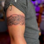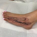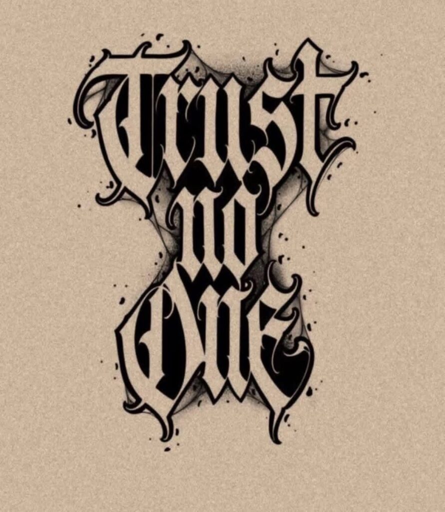
Lettering styles range from the formal weight of Old English gothic capitals to the clean lines of minimalist scripts and the uniform spacing of typewriter fonts, each one built for a different scale and placement.
The span of text you want to ink decides which font will still read cleanly once the fine lines spread: single words hold up better in thin serif or minimalist scripts, while longer phrases need the connected flow of Chicano or script lettering to guide the reader’s eye.
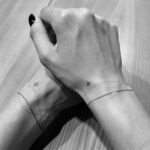
Minimalist work on the wrist stays legible down to a quarter inch tall if you pick a serif over sans-serif, since those small anchor points preserve clarity as the ink ages.
1. Chicano Lettering
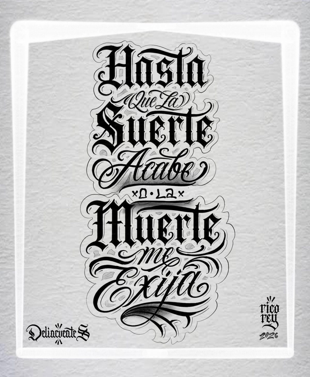
Chicano lettering draws on decades of Los Angeles street art and lowrider culture, built around thick strokes, tight spacing and letters that flow into each other.
The style reads best when the phrase sits on a large canvas like the chest, back or full forearm, where each letter has room to carry its detail without crowding.
Most Chicano scripts sit in black ink.
The ornamental curves and shading need a skilled hand to keep the letters legible once healed, so I look for an artist who already works in this tradition and can show finished examples that still read cleanly a year out.
2. Minimalist Lettering
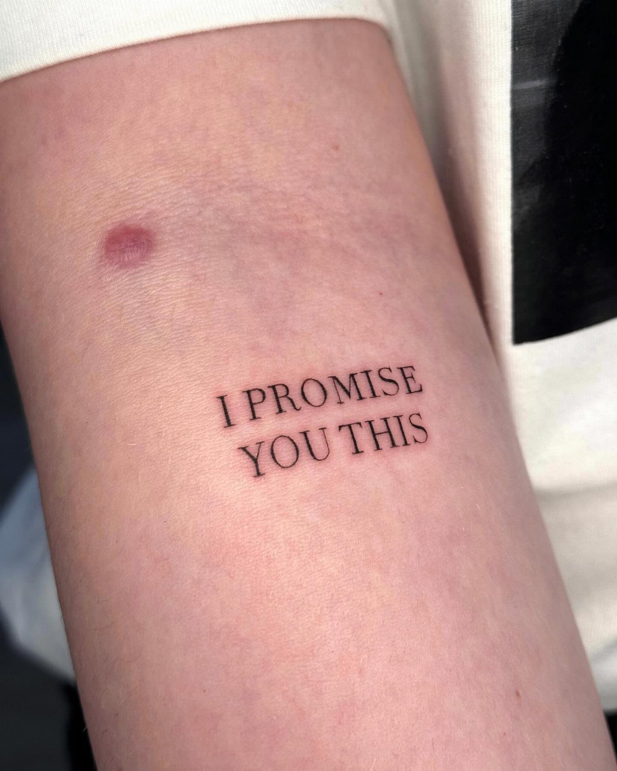
Minimalist lettering strips away decoration and keeps the line thin, which makes it ideal for short phrases that need to stay readable on smaller spots like the wrist, finger or ankle.
The style depends on precision: a wobbly line or uneven spacing shows immediately, so the artist’s line quality matters more than their portfolio size.
Serif fonts at this scale hold up better over time than sans-serif, because the small details give the eye something to anchor on.
Thin ink spreads slightly as skin ages, so I keep the letters at least a quarter inch tall to preserve clarity.
3. Tattoo Script
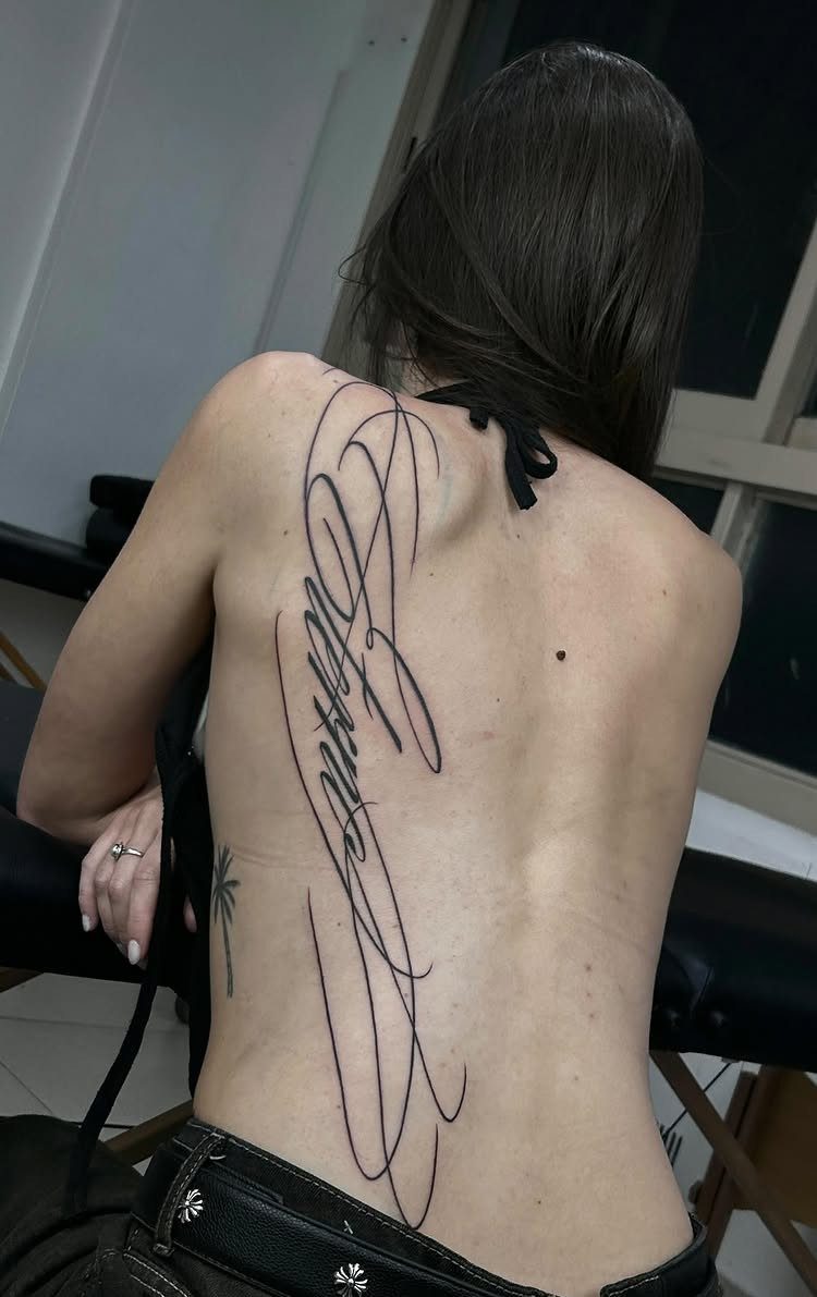
Script lettering mimics the flow of handwriting, with connected strokes that tilt and vary in weight.
The style works for longer quotes or passages because the connected letters create a visual line that guides the reader’s eye, but that same connection means any spacing error compounds across the word.
Vertical placement like the spine or ribcage suits script better than horizontal runs, because the narrow width keeps the line from stretching too far and losing rhythm.
Black ink is standard, and I ask the artist to show healed script work before booking, since fine lines can blur if the needle depth is off.
4. Name Tattoo
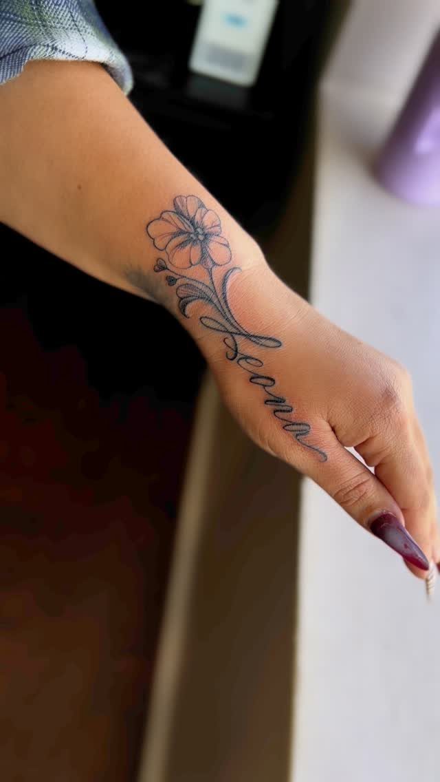
A name tattoo puts someone’s identity on your skin in a way that stays visible, so placement and legibility matter more than ornament.
Names run best along the forearm, wrist or collarbone, where you can see them daily and never grab a mirror.
I size the letters at least half an inch tall so the script stays sharp as the ink ages, and I avoid finger placements unless the name is short, since hand tattoos fade faster and need more frequent touch-ups.
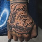
5. Old English Tattoo Fonts
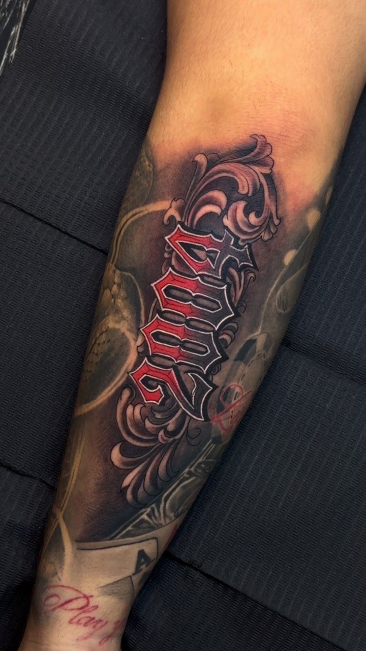
Old English fonts carry a formal, gothic weight that makes them instantly recognizable, but the elaborate capitals and tight vertical strokes limit how much text you can fit before the design turns unreadable.
The style works best for initials, short words or single numbers like a birth year, where each character has space to show its detail.
Placement needs at least 3 inches of width to accommodate the ornate strokes, so the forearm, chest or calf work better than narrow spots like the wrist or ankle.
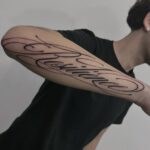
6. Calligraphy Tattoo Fonts
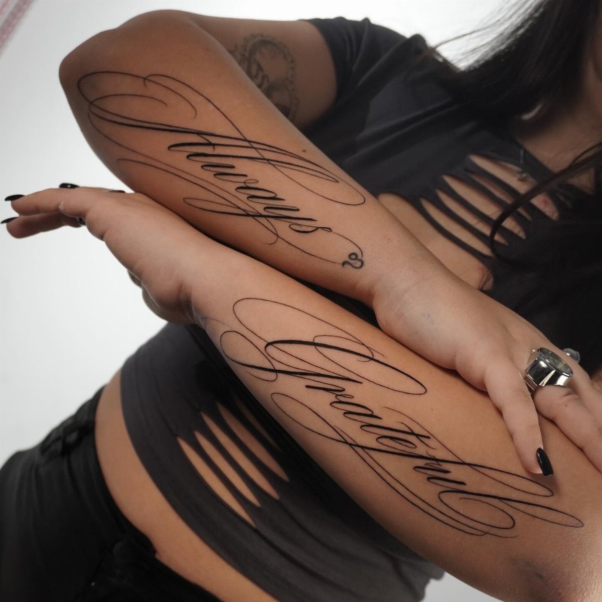
Calligraphy fonts bring the look of pen-and-ink writing to skin, with varied stroke weights and decorative flourishes that make single words feel formal.
The style suits short, meaningful phrases like "Always" and "Forever" because the ornamental curves take up space, and longer text starts to lose clarity.
Symmetrical placement like matching forearms or a pair of words on the ribcage emphasizes the formality, though the swirls can blur if the artist uses too fine a needle.
I look for an artist who specializes in script and can show healed calligraphy that still reads cleanly, since the thin upstrokes fade faster than the thick downstrokes if the ink depth is inconsistent.
7. Typewriter Font
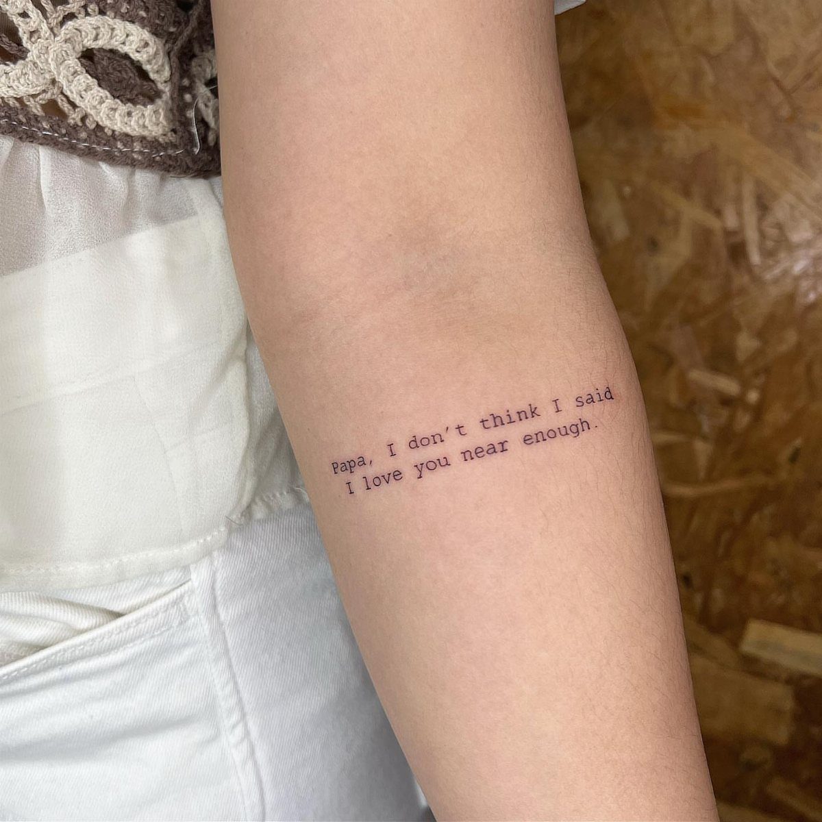
Typewriter font replicates the uneven baseline and monospaced rhythm of mechanical type, which gives sentimental phrases a vintage, personal feel.
The uniform character width means longer quotes need more horizontal space than script, so I size these for the inner bicep or shoulder where a full sentence can run without wrapping.
The slightly irregular alignment is part of the style, but it also means any wobble in the artist’s line blends in better than it would with formal calligraphy. Black ink keeps the nostalgic look intact.
8. Serif Font Tattoo
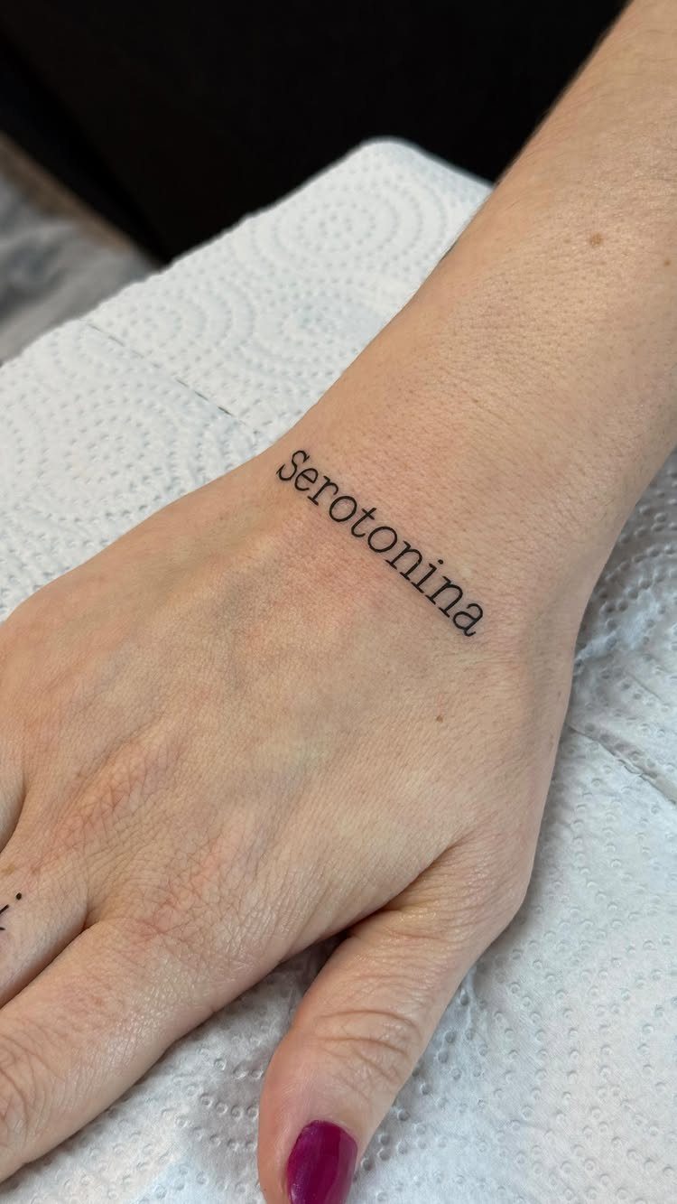
Serif fonts add small finishing strokes to each letter, which helps single words stay readable at small sizes on spots like the inner wrist or along the collarbone.
The serifs give the eye anchor points, so even when the ink spreads slightly over time, the word holds its shape better than sans-serif at the same scale.
I keep wrist text to one or two words, sized around a quarter to half inch tall, so the detail stays visible on that narrow canvas.
9. Bold Block Lettering
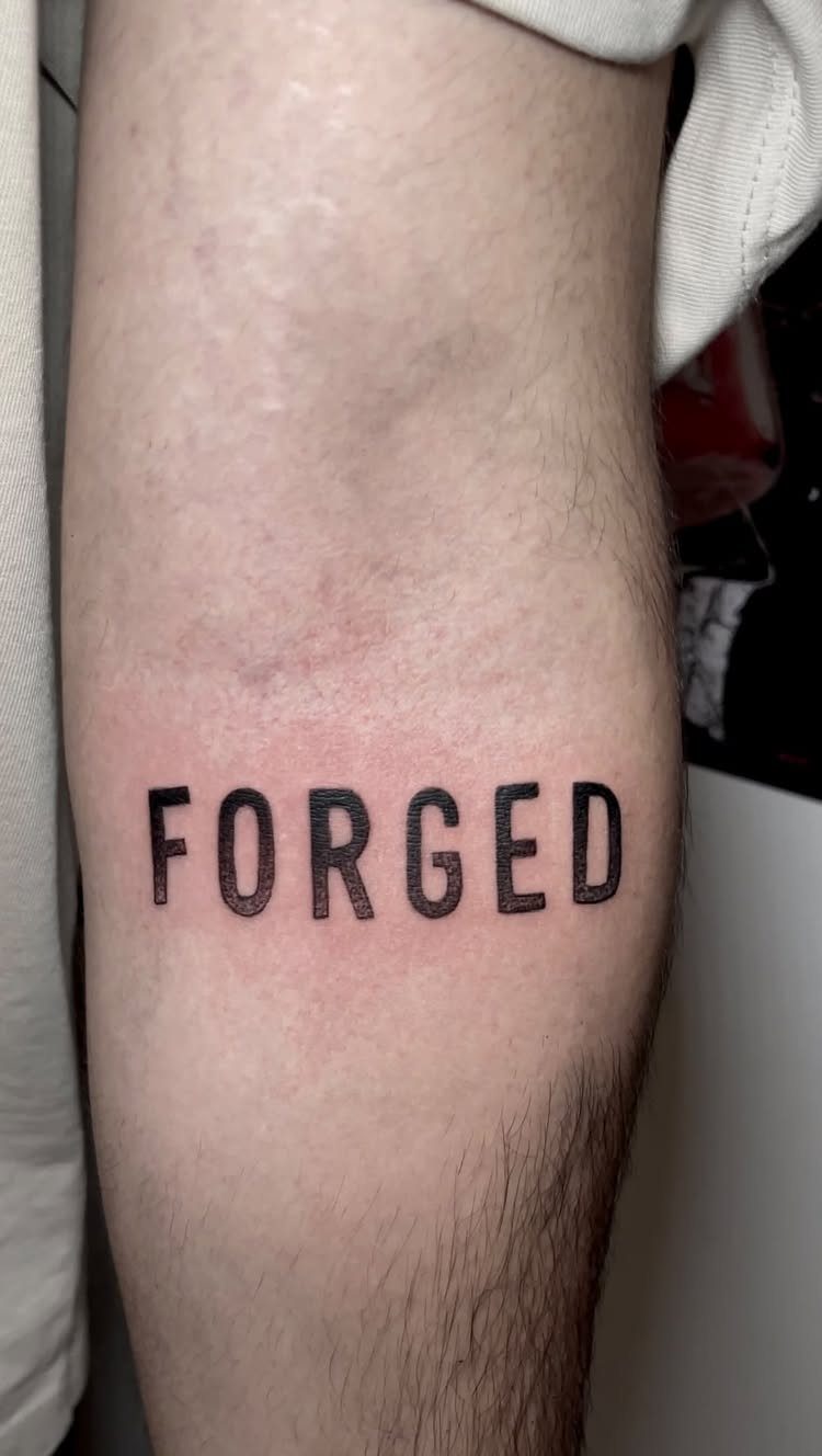
Bold block letters fill the shape completely, which gives single-word statements maximum impact and keeps them legible at a distance.
The style works best with short, declarative words that fit the width of the forearm in one line, since stacking bold capitals can make the composition feel cramped.
Sans-serif fonts hold their edges better than ornate scripts when the ink is packed this densely, and the solid fill means touch-ups are rarely needed.
Placement along the forearm or bicep gives the word a strong horizontal line that matches its weight.
10. Cross Text Hand Tattoo
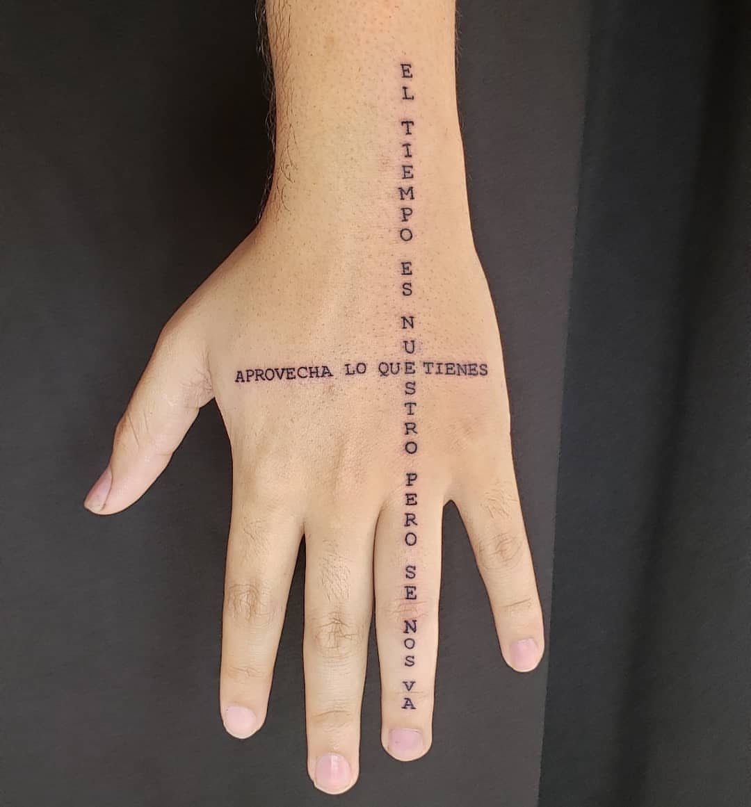
Crossing text on the hand uses 2 lines that intersect at the knuckles or finger joints, creating a layout that follows the hand’s natural movement.
The style reads best with short phrases in a narrow script, since the fingers offer limited width and hand tattoos fade faster than work on the torso or limbs.
I size each line thin enough to fit comfortably on a single finger or the back of the hand, and I plan for touch-ups regularly, since constant exposure and friction wear down ink faster here than almost anywhere else.
Choosing the Right Font
Skin behaves differently than paper. Ink spreads slightly under the surface over time, which changes how letters hold their shape.
Spacing matters as much as stroke weight. Letters packed too close together will blur into each other as the ink migrates, so I ask the artist to leave enough room between characters that the design can age without losing clarity.
Placement shapes which font will last.
Customization through hand-lettering lets the design follow your body’s curves instead of fighting them, which keeps the text readable from the angle someone will actually see it.
Working with a Tattoo Artist
Start by checking portfolios at local shops for artists who specialize in the lettering style you want.
Look for healed photos, not fresh work, since those show how their line quality holds up after months of skin movement and ink settling.
Bring reference images to the consultation, along with any notes on what the text means to you and where you plan to place it.
The artist can spot spacing or sizing problems before the stencil goes on, and their feedback usually improves the composition without changing your original idea.
Reviews from past clients tell you how the artist handles revision requests and whether they stay patient through multiple adjustments.
A skilled artist will suggest ways to make the font more durable or adjust the layout so it flows with your body, and those changes are worth listening to.
Tattoo Aging and Maintenance
Fine-line scripts and intricate gothic styles blur faster than bold fonts because the thin strokes expand more noticeably as ink spreads under the skin.
A delicate script that looks crisp the first year may need a touch-up by year three to restore the definition between letters.
The wider ink coverage resists fading, and any slight spread blends into the existing stroke rather than closing up the spaces that keep letters distinct.
Sun exposure accelerates fading, so I keep lettering on covered areas like the ribs or upper arm if I want the text to stay sharp without frequent maintenance.
Hand tattoos require more touch-ups than torso work because constant friction and UV exposure break down the ink faster.
Frequently Asked Questions
What makes a tattoo font age well?
Fonts with thicker strokes, simple letter shapes and generous spacing between characters age well because they resist the natural ink spread that happens as skin moves and settles over time.
Thin lines and tight spacing blur together as the ink migrates under the surface, while bold fills and open layouts keep letters distinct for years without touch-ups.
What is the best tattoo font?
The best font depends on what you want the text to say and where it sits on your body.
Small serif letters read cleanly on tight placements like fingers or ankles, block capitals command attention on the shoulder or chest, and flowing script fills vertical runs down the side or back of the calf.
How do I use a tattoo font generator?
Type your text into the generator, pick a font style from the options, and copy the generated text to save or share with your artist.
These tools let you compare how different lettering styles look with your specific words before committing to the design.