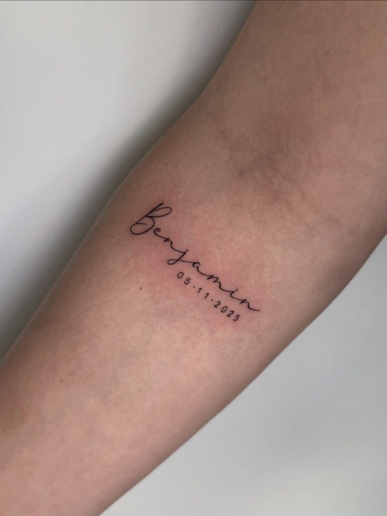
A name in flowing script takes 20 minutes and fits the wrist, while a lion cub paired with lettering needs at least 3 inches and a flat surface like the forearm to keep the features readable.
The choice comes down to whether you want standalone text or a composition that pairs the name with imagery like footprints, stars, ribbons or a lion cub.
1. Cursive Name Tattoo
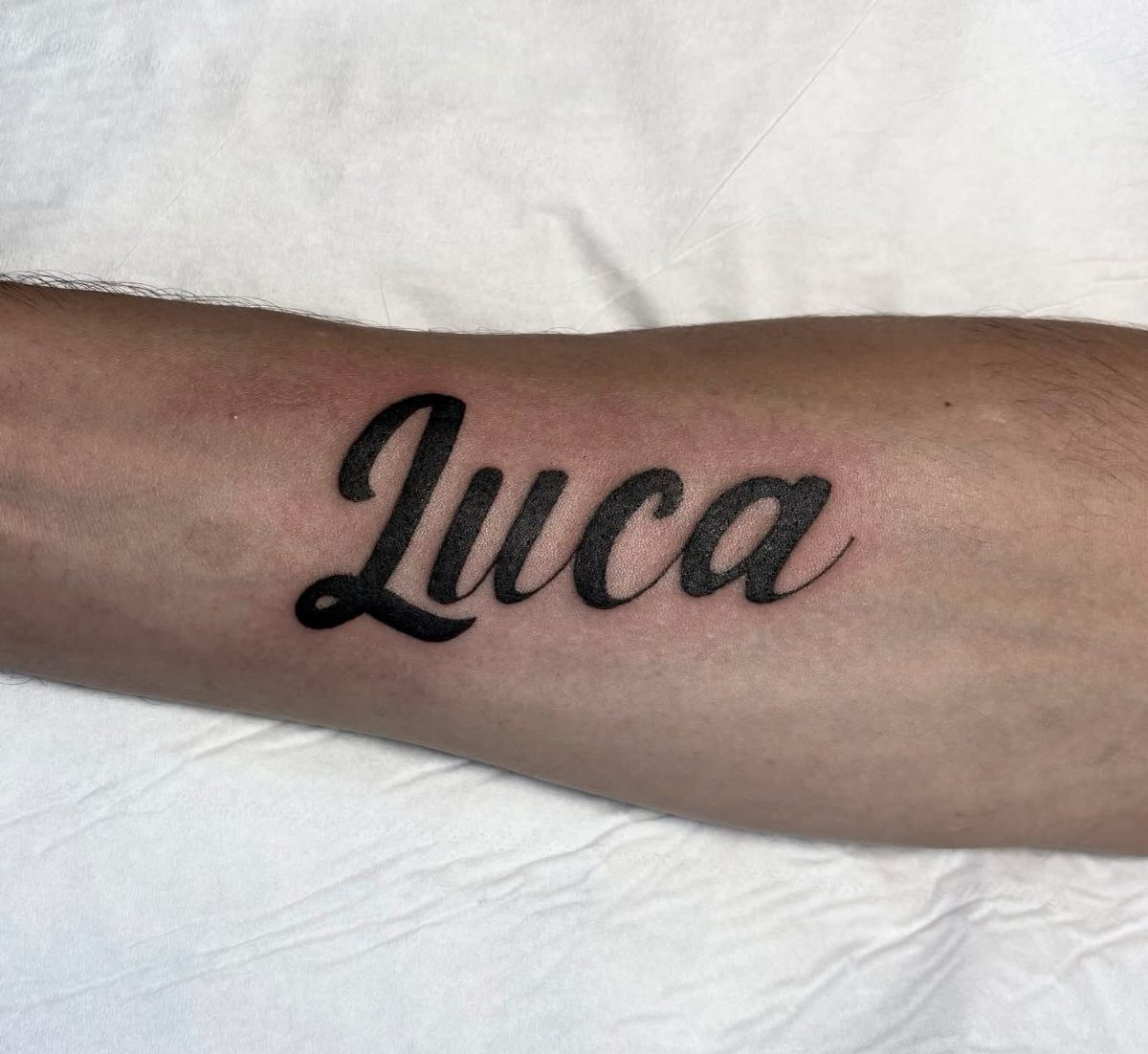
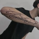
A single name in flowing script sits on the forearm, readable at a glance and sized to fit the natural width of the placement.
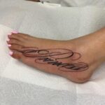
Cursive looks right only if the letters connect smoothly without crowding, so give your artist a reference font you like or let them sketch a version that fits the name’s letter count.
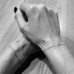
Short names like Luca hold their shape on narrow spots like the wrist or inner forearm.
Longer names need more room or risk looking cramped, so the outer forearm or upper arm usually reads better. Black ink stays crisp over time.
2. Name with a Ribbon Banner
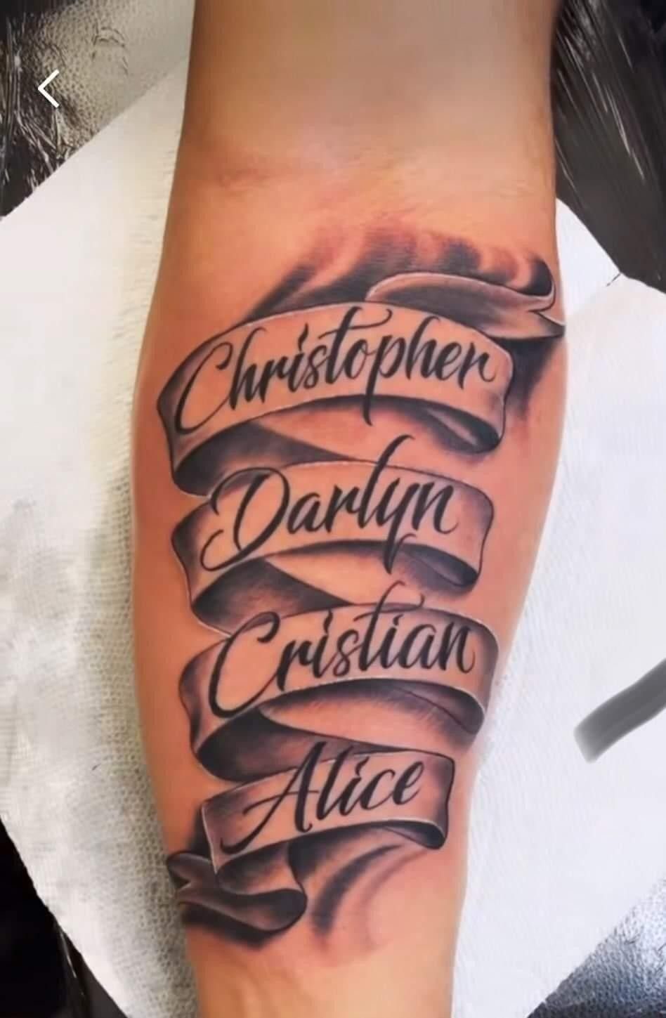
A ribbon banner wraps the name in a three-dimensional frame, adding depth and movement to plain lettering.
The shading on the folds gives the banner its shape, so ask for an artist comfortable with black and gray work to make the ribbon look like it curls through space.
Banners stretch to fit multiple names or dates without looking crowded, which makes them a good choice when you want to honor more than one child in the same piece.
The ribbon can sit flat along the forearm or curve around a bicep.
3. Name with a Teddy Bear
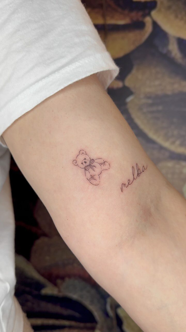
A small teddy bear sits next to or above the name, turning the tattoo into a scene instead of pure text.
The bear reads as playful and soft, which suits a parent who wants something that feels less formal than script alone.
Size matters here. A bear drawn too small loses its features and starts to look generic after a few years, so aim for at least an inch tall to keep the face readable.
Placing the bear on the inner forearm keeps it visible when you look down, and black line work without shading keeps the design clean and quick to heal.
4. Roman Numeral Date Tattoo
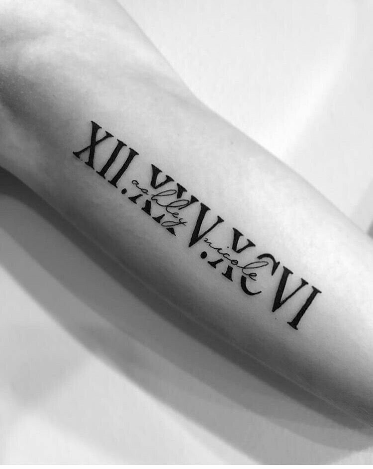
Roman numerals mark the birth date with a formal, architectural feel that pairs well with cursive names. The 2 elements sit on separate lines or wrap around each other, depending on how much space you give the design.
Numerals read cleanly when spaced evenly and sized large enough to stay legible, usually at least a quarter inch tall per character. Double-check the conversion before your appointment, because fixing a wrong numeral means covering or removing the entire date.
This format works on any flat surface like the forearm, ribcage or shoulder blade, and black ink keeps the lines sharp for decades.
5. Infinity Symbol with Name
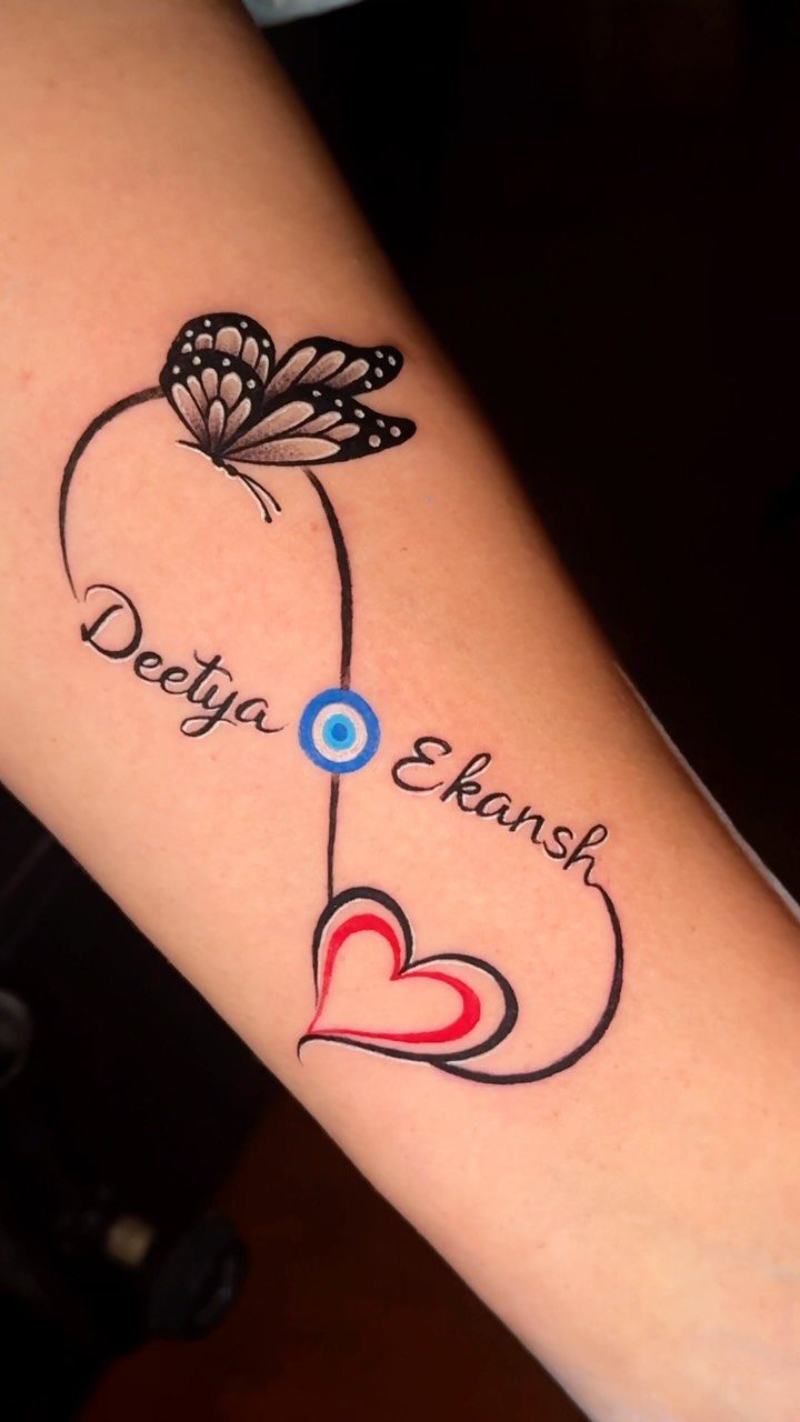
The infinity loop frames the name and creates a boundary that keeps the design contained, even when you add small symbols like hearts or protective icons.
The loop itself stays simple, usually a thin black line, so the name remains the focus.
Fitting a longer name inside the loop takes planning, because the curves narrow at the center and letters can crowd. A skilled artist will sketch the name first and size the loop around it, not the other way around.
Placement on the inner forearm or wrist keeps the tattoo visible, and adding a second name or symbol fills the negative space without making the piece feel busy.
6. Name with Floral Accents
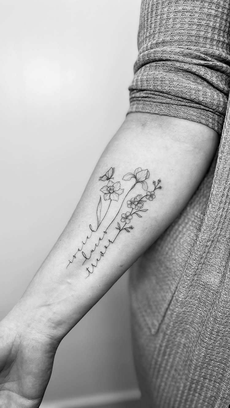
Flowers soften the formality of script and add organic movement around the name. Fine-line florals keep the design delicate rather than heavy, which suits a parent looking for something that feels personal without reading as bold or graphic.
Roses, peonies and wildflowers all work, but choose based on size: smaller flowers like daisies fit tighter spaces, while larger blooms need room to show their petals.
The flowers can wrap the name, sit underneath it or trail off to one side, and black ink keeps the linework from fading into a blur over time.
7. Name Combined with Stars
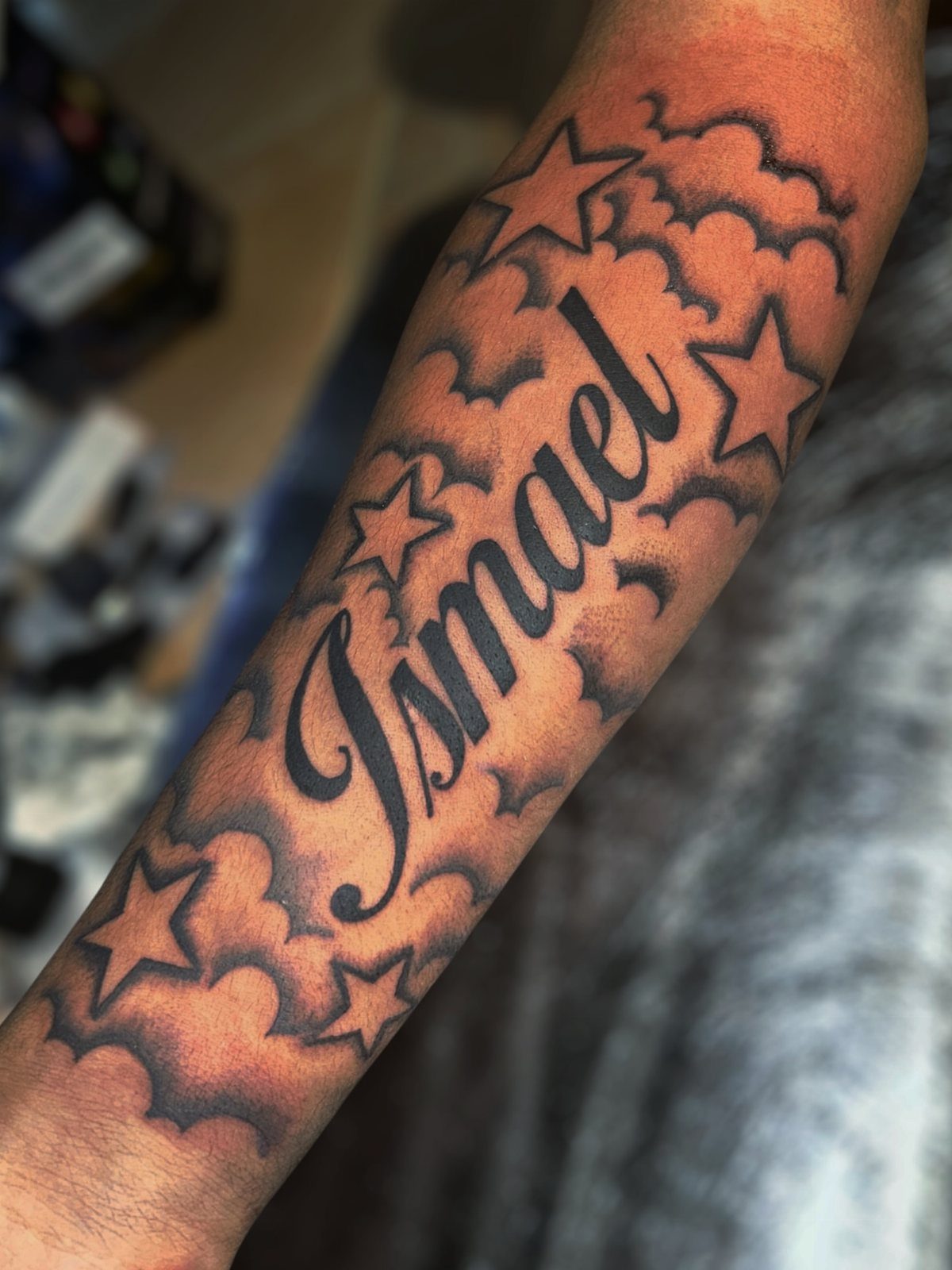
Stars scattered around the name give the design a night-sky feel without adding much visual weight. They read best when sized to match the scale of the lettering: small stars for delicate script, slightly larger ones for bolder names.
Placing the stars asymmetrically keeps the piece from looking too symmetrical or stiff. Some parents add a crescent moon or cluster the stars on one side, which balances the composition without filling every gap.
Black ink holds detail better than shading, and the forearm gives enough flat space to keep the stars from warping as the skin moves.
8. Name with Footprints
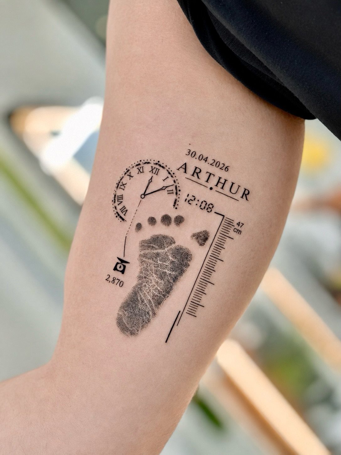
Baby footprints anchor the name to the moment of birth, giving the tattoo a documentary feel that plain script does not carry.
The prints work best when traced from an actual hospital record, which keeps the proportions accurate and adds a personal detail no one else will have.
Pairing the name with a date or birth weight turns the design into a full birth announcement, and the forearm gives enough room for all 3 elements without crowding.
9. Heartbeat Line with Name
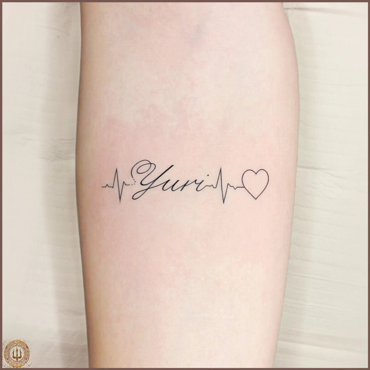
The heartbeat line spikes into the first letter of the name, linking the two elements into one continuous path.
This design reads as a literal connection between parent and child, and the transition from line to letter only works if the artist plans the spacing first.
Keeping the heartbeat narrow and clean prevents the design from looking too bold or graphic. The line itself sits best on flat surfaces like the inner forearm or wrist, where the tattoo can follow the natural length of the placement.
Black ink keeps the contrast sharp, and adding a small heart at the end closes the design without extra detail.
10. Name in a Heart
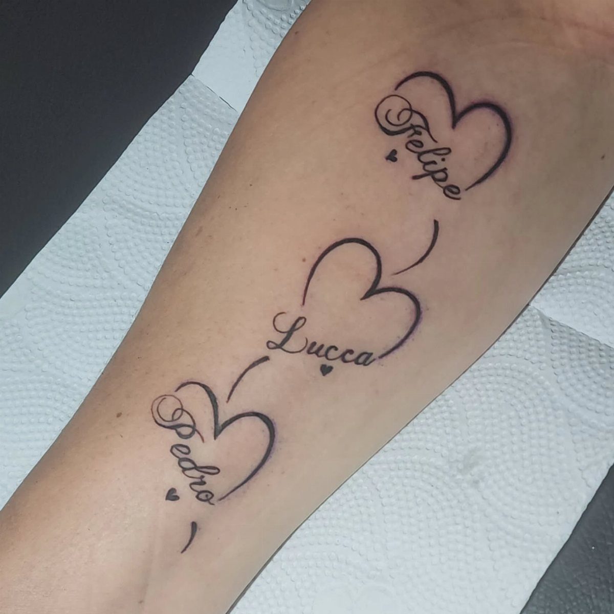
Framing the name inside a heart gives it a defined boundary and keeps the tattoo compact, which works well when you want to fit multiple children into one placement.
Each heart can sit in a row or stack vertically, and sizing them identically keeps the design balanced.
The outline stays thin so the name remains the focus, and leaving space between the letters and the heart’s edge prevents crowding.
This format suits parents who plan to add more names later, since each heart functions as its own unit. Black ink and simple linework heal quickly and stay readable over time.
11. Name with a Crown
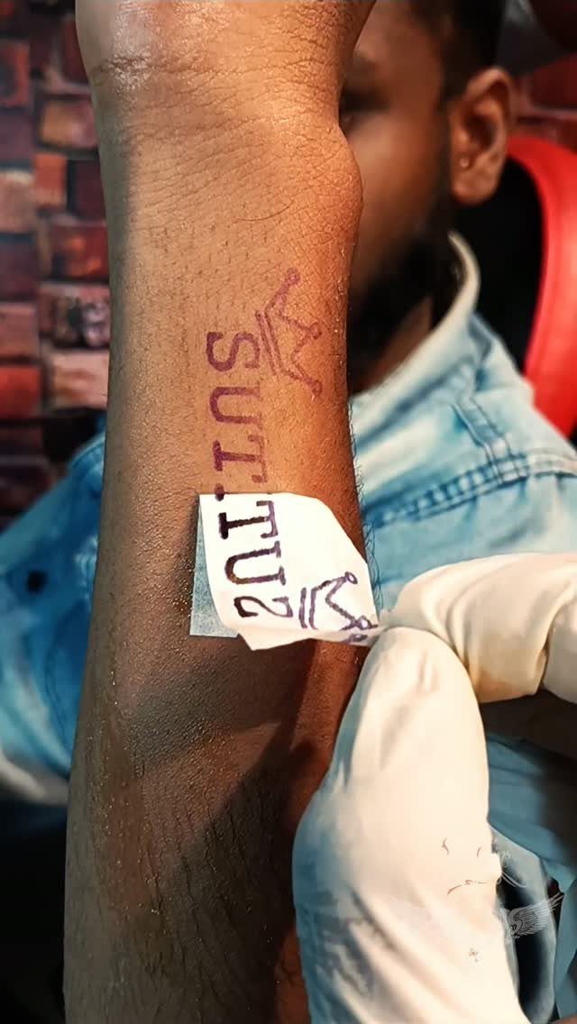
A crown sits above the name and frames it as something regal without requiring much additional space. The crown reads best when drawn with clean lines and minimal shading, which keeps the symbol recognizable at smaller sizes.
This design suits parents who want to honor their son without leaning into soft or playful imagery. The crown can be simple or detailed depending on your preference, but a traditional three-point silhouette stays legible longer than intricate patterns.
Placement on the forearm or upper arm keeps the tattoo visible, and black ink holds the lines sharp as the tattoo ages.
12. Name with a Compass
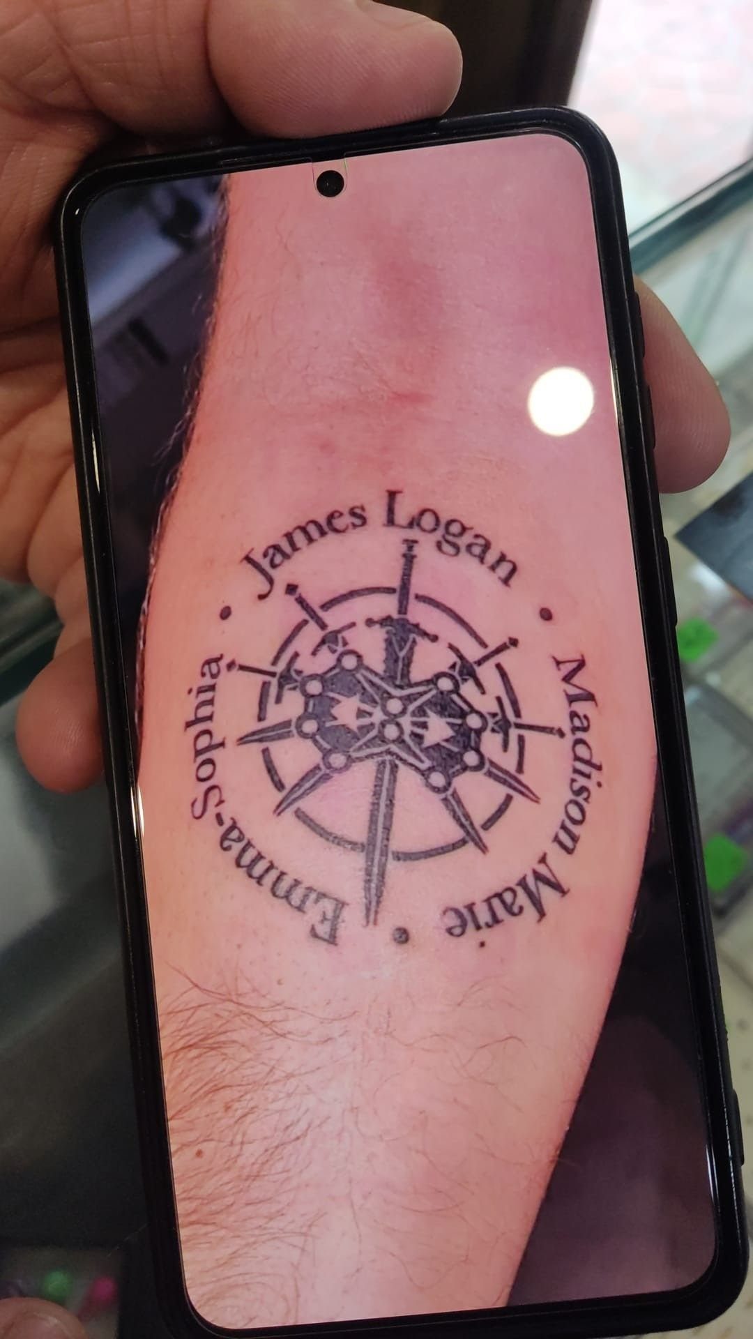
The compass anchors the name and adds symbolic weight, often read as guidance or direction. The compass points give the design a symmetrical frame, and the name can sit inside the circle or wrap around the outside depending on length.
Adding multiple names around the compass turns the piece into a family map without needing separate tattoos for each child.
The compass itself needs enough detail to stay recognizable, so plan for at least 3 inches across to keep the inner markings from blurring.
The forearm or shoulder blade gives flat space for the full design, and black ink keeps the linework crisp.
13. Name with Baby Blocks
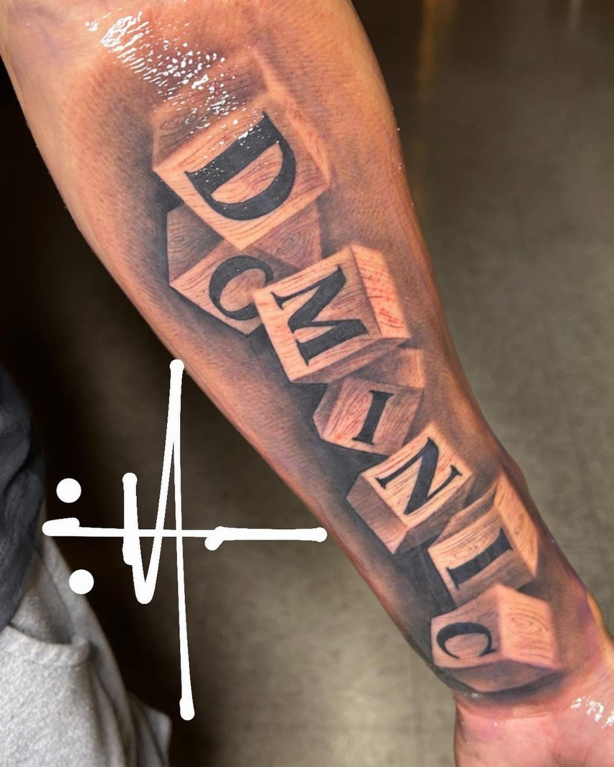
Baby blocks stack the letters of the name into a three-dimensional tower, giving the design a playful, nursery feel that plain script cannot match.
Each block gets its own shading to show depth and dimension, so the tattoo reads as sculptural rather than flat.
Longer names need vertical stacking or multiple rows to fit all the letters, which makes the design taller and better suited to the forearm or calf.
Shorter names fit horizontally without crowding. Adding a subtle background shadow anchors the blocks in space, and black ink keeps the edges crisp as the tattoo ages.
14. Name with a Lion Cub
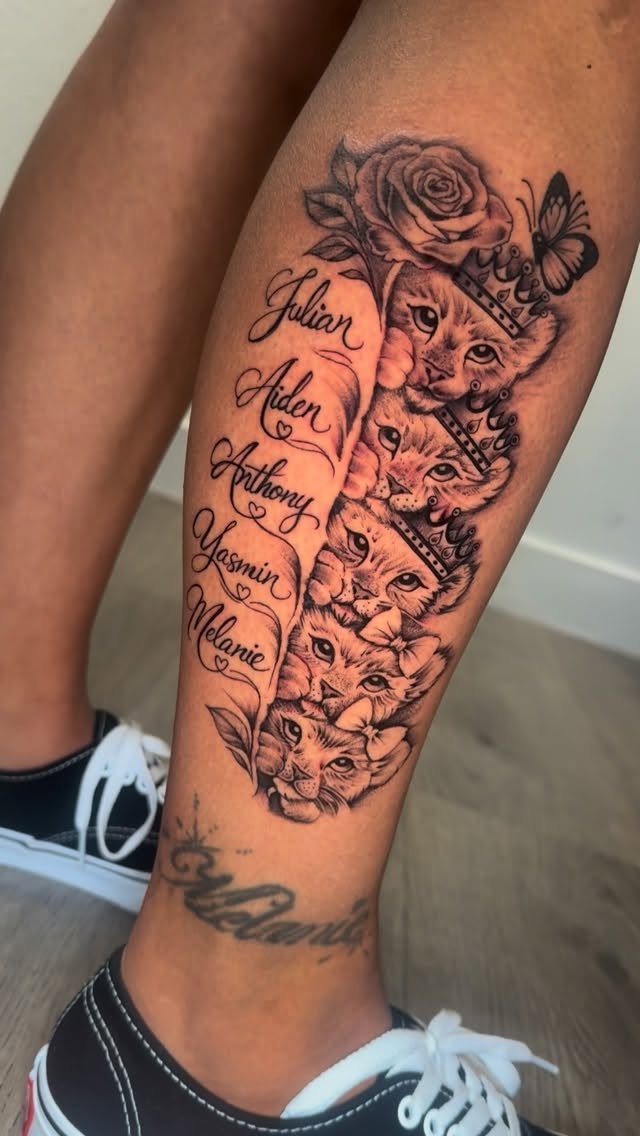
A lion cub paired with the name adds strength and protection to the piece without the weight of an adult lion’s mane.
The cub can sit beside the name or above it, and sizing it large enough keeps the features readable over time.
Multiple cubs work when honoring more than one child, with each cub matched to a name in the same design.
The cub’s expression matters: a calm, seated pose reads better than an action shot, which can lose detail at smaller sizes.
Black and gray shading gives the fur texture, and the forearm or outer thigh provides flat space for the full composition.
Tattoo Placement Suggestions
The wrist fits short names and small symbols, but the skin moves enough that fine details can blur over time.
The collarbone works for horizontal text that follows the bone’s natural line.
Keep the letters small enough to fit the space without wrapping. The chest offers flat space for larger designs that include dates or secondary elements, though the placement stays hidden under most clothing.
The outer forearm and upper arm hold bigger compositions without warping as much during movement. Ribcage and shoulder blade placements suit designs meant to stay private unless you choose to show them.
Choosing Tattoo Styles
Cursive and calligraphic scripts dominate name tattoos because they read as personal and elegant without extra imagery.
Block lettering reads more architectural and holds up better at smaller sizes, which suits compact spots like the wrist or collarbone.
Adding floral details, crowns or Roman numerals turns a plain name into a larger composition, but each added element needs space to stay legible.
Family names and last names often sit on the forearm or shoulder, where the flat surface keeps longer text from crowding.
Meaning Behind Name Tattoos
A name on your skin marks the connection in a way you see every day, permanent as the bond itself.
Pairing the name with symbols like footprints, hearts or infinity loops adds a second layer of meaning without requiring explanation, and the combination reads as both personal and complete.
Some parents choose names paired with flowers or protective imagery like lions, which turns the tattoo into a statement about the relationship rather than just documentation.
Hidden placements like the ribcage or inner arm keep the design private, while forearm or shoulder spots make the tattoo part of daily visibility.
The design itself becomes a reminder you carry, whether you add dates, coordinates or standalone script.
Frequently Asked Questions
Where to put your kids name tattoo?
The forearm, wrist, chest and collarbone all work well for name tattoos because they offer flat surfaces that keep lettering readable.
The forearm handles longer names or designs with extra elements like flowers or symbols, while the wrist suits shorter names and compact script.
The chest and ribcage give room for larger compositions but stay hidden under most clothing, and the collarbone follows a natural horizontal line for text that fits the bone’s width.
What’s a good father-son tattoo?
A compass with the son’s name inside or around it reads as guidance and direction, and sizing it at least 3 inches across keeps the detail sharp.
Matching designs like lions or heartbeat lines work when both father and son want the same imagery, and pairing the name with a crown or protective symbol adds meaning without requiring explanation.
What are the best tattoo fonts for names?
Script styles carry that handwritten, intimate feel and adapt well whether the name is short or runs several inches.
Sans-serif and slab fonts stay sharp when size drops below half an inch, making them reliable for tight areas where detail fades.
Match the style to how many letters you’re working with and ask your artist to mock it up at actual size before the appointment.