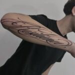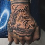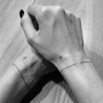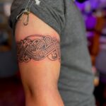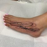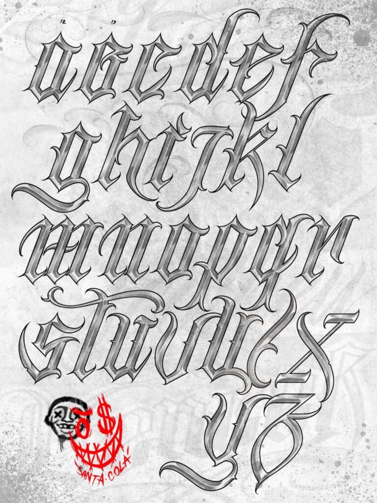
Cursive on the wrist reads differently than gothic blackletter across the back, and the style you pick decides how well your tattoo holds up after it heals.
Fine script needs careful spacing or the loops blur together once the skin settles, while bold styles like Old English and Chicano lettering hold their weight across larger placements like the chest or shoulder.
A full alphabet chart keeps every letter consistent across a longer phrase, so your artist isn’t inventing a new style halfway through.
1. Cursive Alphabet Tattoo Lettering
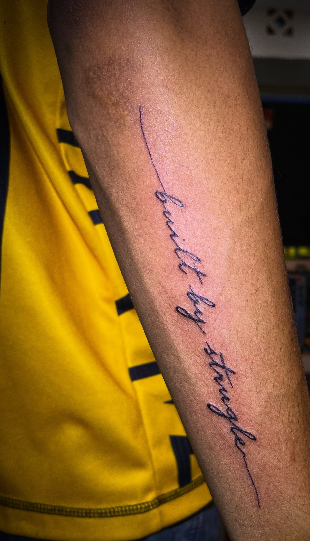
Cursive gives letters a smooth, connected flow that reads as personal rather than printed. The thin, elegant lines suit smaller placements like the wrist, forearm or collarbone, where detail stays legible as the tattoo ages.
Readable cursive needs enough height for shorter words; go smaller and the loops start to blur together after a few years. Script that leans slightly forward tends to read faster than vertical or back-slanted styles.
Single words or short phrases work best. Longer sentences in cursive can turn into a solid block of ink once the skin settles.
2. Old English Tattoo Lettering
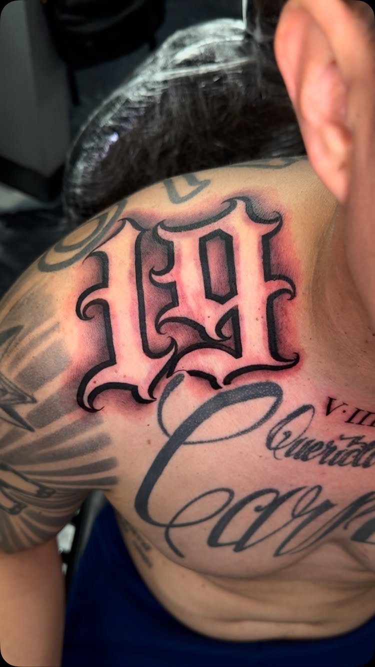
Old English lettering carries a bold, gothic weight that fills large spaces like the chest, back or shoulder.
The thick vertical strokes and sharp serifs give each letter a commanding presence, which is why you see it paired with numbers, initials or single words rather than full sentences.
Legibility drops fast when Old English letters sit too close together or when you size them down too far. I’d size this style for a spot where the tattoo can breathe.
The red shading visible here adds dimension and keeps the black from looking flat once it settles into the skin.
3. Script and Calligraphy Tattoo Lettering
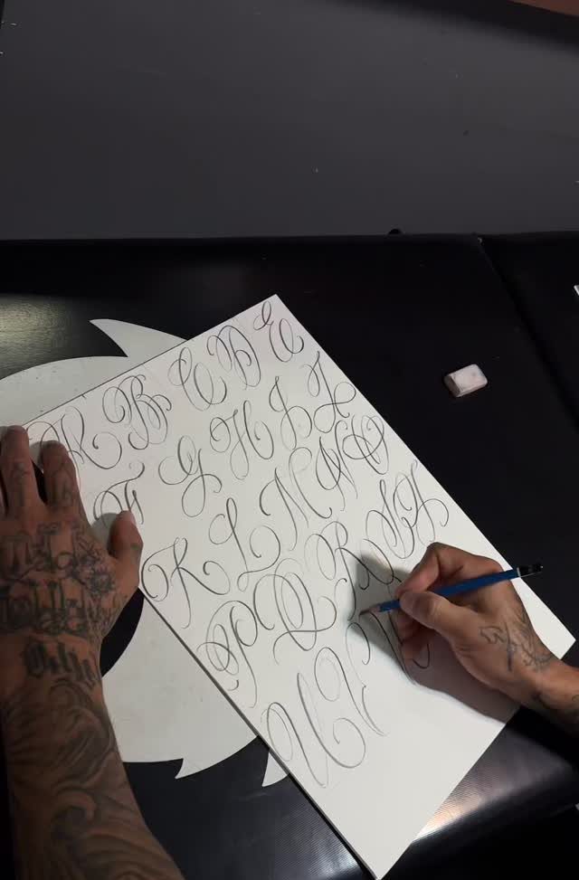
Script and calligraphy lettering draws from formal handwriting traditions, where each letter connects with a deliberate, flowing stroke. The style suits longer passages, quotes or names that benefit from that handwritten feel.
A full alphabet chart like this one gives your artist a reference for consistent letterforms across the entire piece.
If you’re working with a longer phrase, having the full set drawn out first keeps spacing and slant uniform from start to finish.
Script reads best at medium scale, where the thin strokes and loops stay distinct as the tattoo heals.
4. Alphabet Tattoo Lettering with Heart
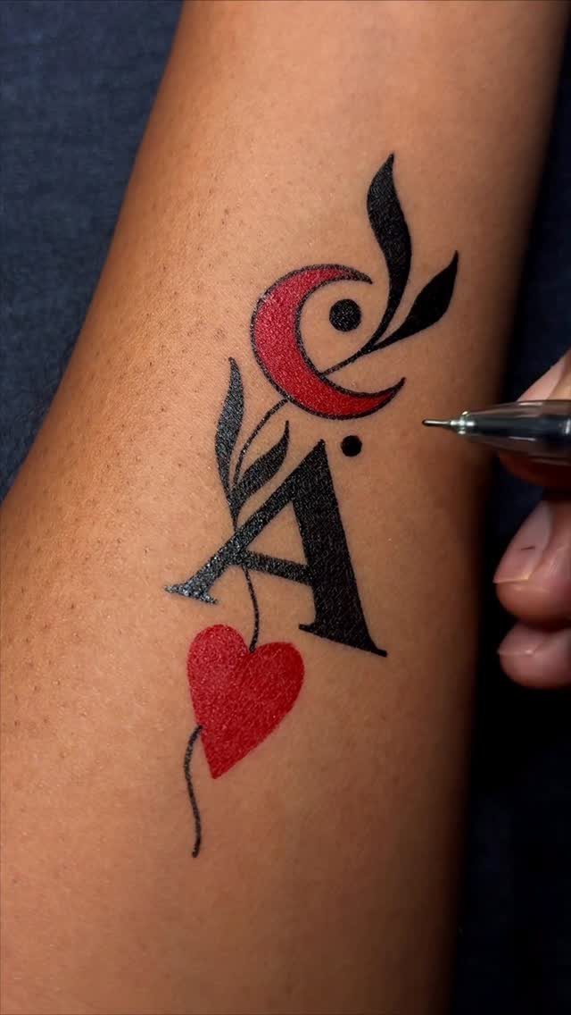
A single letter paired with a small symbol turns an initial into something more personal. The heart and crescent moon here add meaning without needing a full word or phrase, which keeps the design compact and legible.
This approach works well for memorial pieces, a child’s initial or a partner’s name reduced to just the first letter.
The symbol gives context, and the letter stays readable even when placed somewhere small like the wrist, ankle or behind the ear.
Black line work holds the sharpest over time; the red fill will fade faster and may need a touch-up after a few years.
5. Chicano Lettering Tattoos
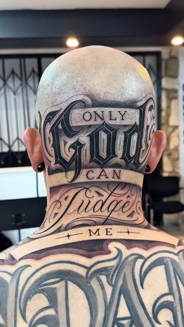
Chicano lettering is built on dense, flowing lines and heavy embellishment that turns each letter into its own focal point.
The style originated in Southern California tattoo culture and carries a strong visual weight, which makes it a natural fit for large placements like the back, chest or neck.
Legibility depends on spacing. Chicano script can pack a lot of detail into each letter, so words need room to breathe or they’ll blur into a single mass of ink once healed.
The ornate flourishes and drop shadows visible here add depth and keep the letters from reading flat. Plan for enough height if you’re going with a full phrase.
6. Gothic Tattoo Lettering Alphabet
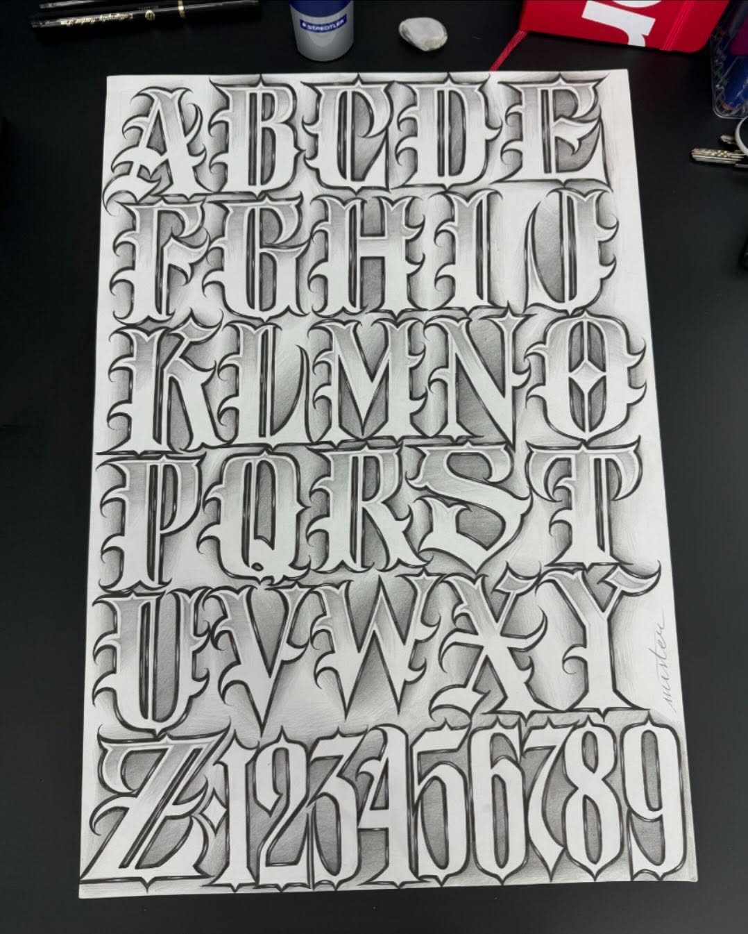
A full gothic alphabet sheet like this one gives you every letter and number in a single, consistent style, which is exactly what you need if you’re planning a longer phrase or want multiple pieces that match.
The shading and ornate details add dimension to each character, so the letters don’t sit flat on the skin.
Gothic fonts work best at larger sizes, where the thick verticals and sharp angles stay crisp. Smaller gothic letters lose definition fast, especially once they settle during healing.
Having the full set drawn out before your appointment lets your artist match spacing and weight across the entire tattoo.
7. Illustrated Gothic Alphabet Letters
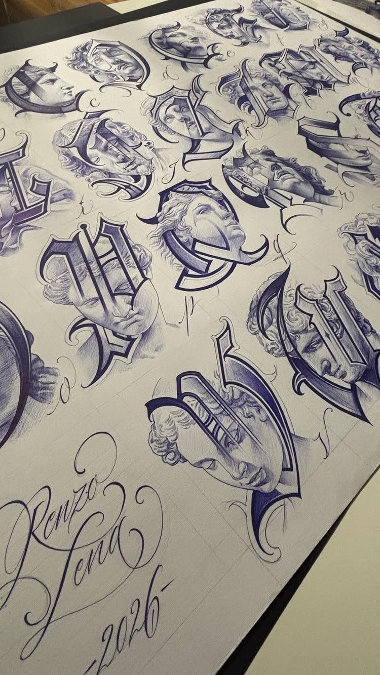
Gothic letters layered with portrait sketches turn a reference sheet into a finished design concept.
Each letter here wraps around or frames a face drawn in the same hand, so the piece reads as unified rather than text dropped over an image.
This approach suits anyone planning a larger custom piece where lettering and illustration both matter. Your artist can use the sheet as a starting point and adjust the portraits to match your reference photos or shift the style.
The sketches add depth that keeps the gothic forms from sitting flat once inked.
8. Ornate Tattoo Lettering Alphabet
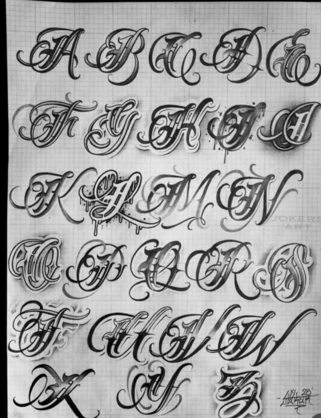
A hand-drawn alphabet with ornate flourishes gives your artist a custom reference that matches your style instead of pulling from a generic font library.
Each letter here carries its own shading and decorative strokes, so the final tattoo has personality built in from the start.
Lined paper keeps the proportions consistent across the alphabet, which matters when you’re inking a longer phrase. Spacing stays uniform, and the artist doesn’t have to guess how tall or wide each character should sit next to the others.
Bring this kind of chart to your consultation for lettering that feels handmade.
9. Calligraphic Alphabet Secret Chart
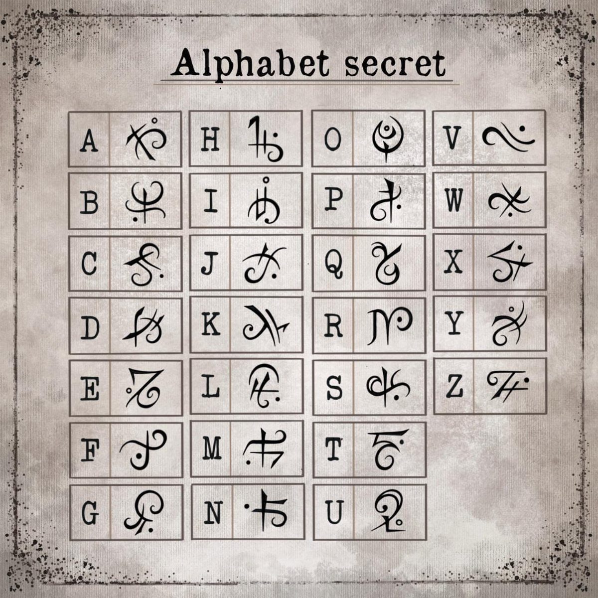
Pairing Latin letters with stylized cipher symbols turns a phrase into something only you and a few others can read. Each letter corresponds to a unique calligraphic mark, so the tattoo looks abstract until someone knows the key.
This style works for quotes or names you want visible but not immediately legible. The parchment background here is just presentation; the inked version would be the symbols alone, sized to fit wherever you place them.
Cipher tattoos stay compact because each symbol replaces a full letter, so a short word takes up less space than standard script.
Choosing the Right Font
The same phrase inked in delicate cursive versus heavy gothic blackletter lands completely differently. Gothic, by contrast, declares rather than whispers.
Script choice also carries cultural weight. Arabic calligraphy, Japanese kanji, Sanskrit or Hebrew all require an artist who knows those letterforms as a native system, not someone copying characters from a reference photo.
A beautifully composed Arabic piece needs an understanding of how those letters connect and flow, which means finding an artist with that specific training.
The font you pick shapes how the tattoo will be read, both literally and emotionally.
Aging and Maintenance
Lettering tattoos that rely on very thin lines need more attention as they age.
Fine script can blur or lose definition over time, especially if you’re not diligent about sun protection. UV exposure breaks down ink faster, and delicate strokes fade before bold ones do.
Bold styles hold up better with less maintenance. Thick verticals and strong contrast stay readable longer, and any softening that happens during healing or over the years won’t compromise the design as much.
If you go with fine script, plan for touch-ups down the road to keep the letters crisp.
Sunscreen on tattooed areas isn’t optional; it’s part of the upkeep. A well-maintained piece in delicate lettering can age gracefully, but it won’t take care of itself.
Placement Considerations
A line that looks straight on paper will warp and break up once it follows the curve of your ribs or shoulder.
The forearm, ribcage and collarbone all have natural curves, and lettering placed there needs to follow those lines instead of fighting them.
A skilled artist will compose the text so it flows with your body’s architecture rather than sitting flat like a printed label.
Longer quotes require more planning. Line breaks, letter spacing and size all affect how the tattoo reads once healed, and a phrase that looks balanced on paper can feel cramped or disjointed when wrapped around your ribs or shoulder.
Short phrases and single names give you more placement options because they don’t need as much real estate or careful line management. The longer the text, the more you’ll need to account for how it moves with you.
Frequently Asked Questions
What is the best lettering font for tattoos?
The best font depends on what feeling you want the tattoo to carry and where it’s going on your body. Gothic and Old English read bold and commanding, while cursive and script feel personal and handwritten.
Cultural styles like Chicano lettering or Arabic calligraphy require an artist trained in those specific traditions, not someone copying characters without understanding how they connect.
Is there a free tattoo font generator available?
Yes, online tattoo font generators let you preview different lettering styles before committing to ink.
They’re useful for comparing how the same phrase looks in script versus gothic or other fonts, but the final design should still go through your artist.
A skilled artist will tweak the spacing, angle and proportion to match the contours of your arm or ribs, not just copy a typed line.