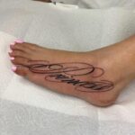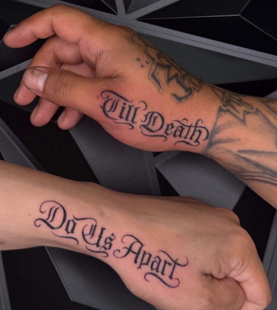
Lettering styles for tattoos range from the tall, flowing strokes of Chicano script to the stark mechanical spacing of typewriter fonts, and the choice comes down to how much ornament the text needs and where on the body it will sit.
Old English works for single initials on flat surfaces like the shin because the dense, angular strokes fill space without crowding, while fine line script stays legible on the inner forearm or collarbone if the line width accounts for ink spread.
1. Chicano Lettering
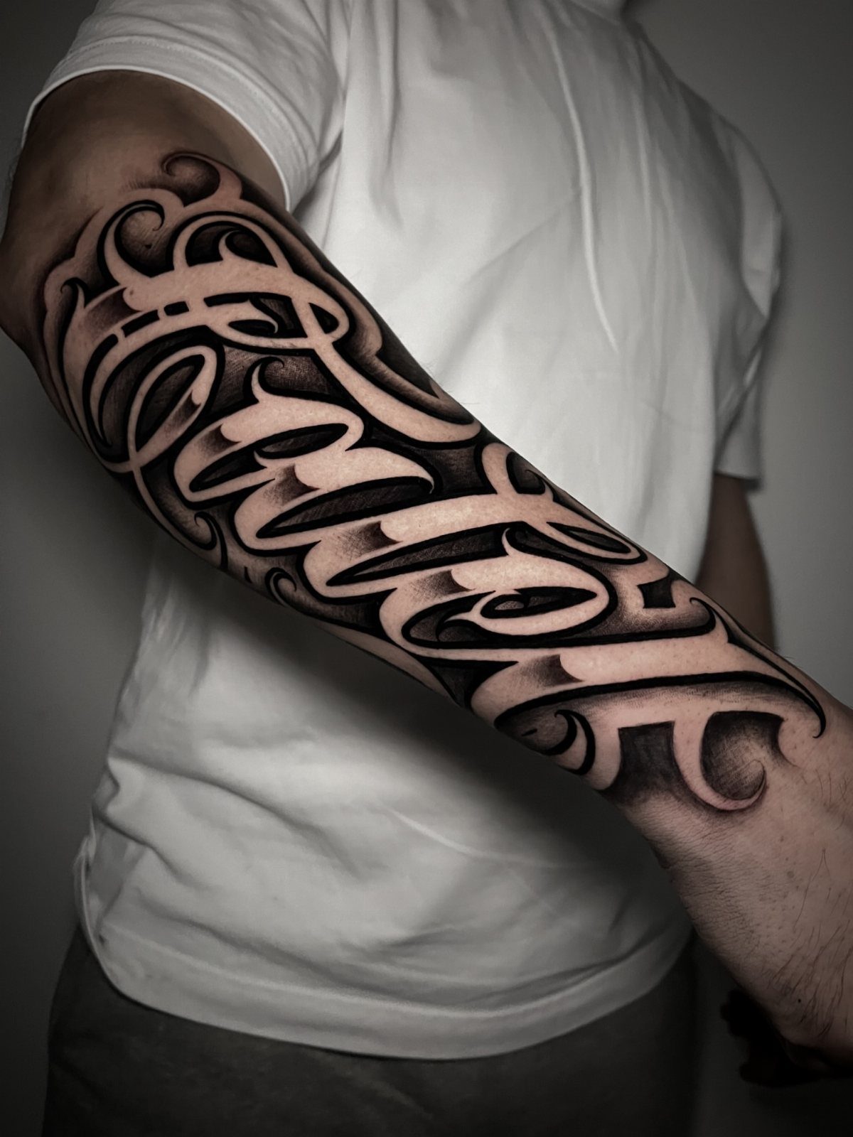
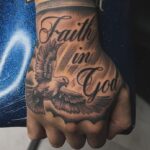
Chicano lettering grew out of the Chicano movement and the style is still recognizable today: tall, flowing script with dramatic serifs and ornamental flourishes.
The letterforms lean and arch, sometimes so stylized that legibility takes a back seat to visual weight.
I like this style for phrases or names that carry personal history.
Placement matters more here than with cleaner scripts because the ornate shapes need room to breathe. Forearm, upper arm and chest are the most common spots.
The shading is usually black and grey, which holds the detail without overwhelming the letters themselves.
2. Old English
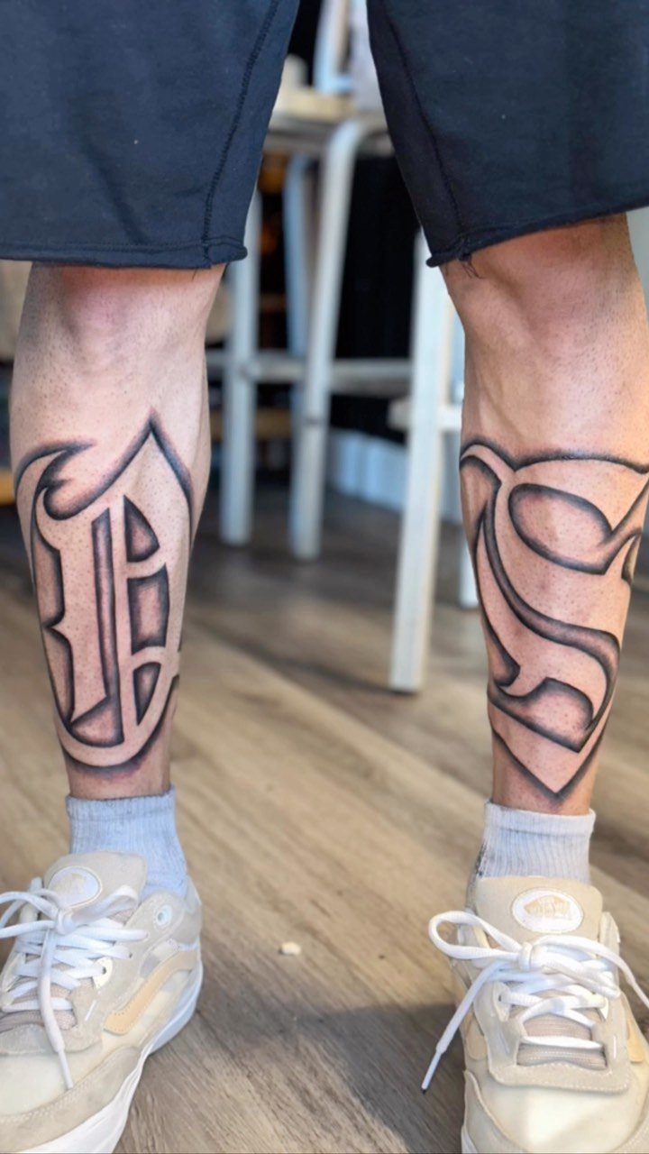
Old English script pulls straight from medieval manuscripts, and the letterforms are dense, angular and full of thick vertical strokes. Single letters work better than long phrases because the style is hard to read at a glance.
The example here puts one large letter on each shin, and that placement makes sense: the letters are bold enough to fill the space without crowding.
I see this style most often for initials, especially for maximum visual impact from one or two characters.
Black ink is standard. The thickness of the strokes means the tattoo ages well if the lines are placed cleanly from the start.
3. Tattoo Lettering
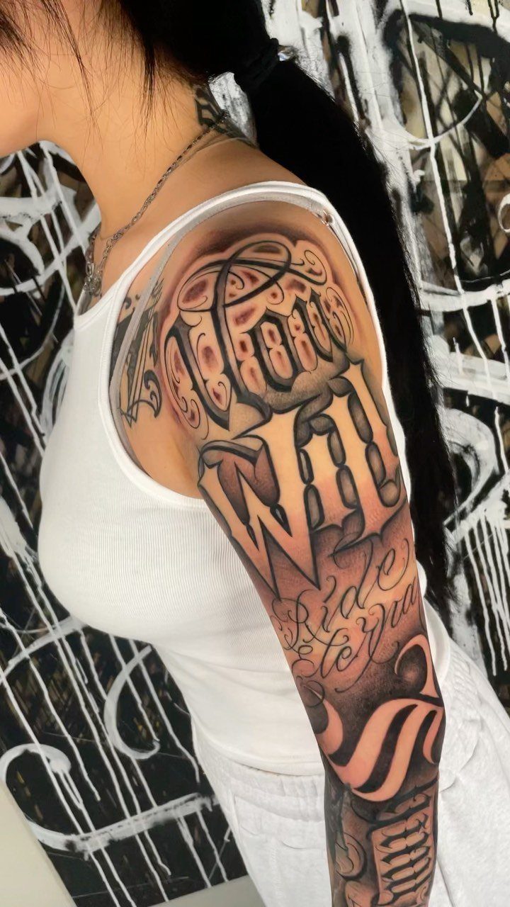
Lettering tattoos are wide open in terms of style, and that freedom is part of the appeal.
Script, block, geometric, hand-drawn: the category includes all of it, which means the design work and placement need to be dialed in before the session.
What makes lettering technically demanding is line quality. A shaky line in a portrait might disappear into shading; in a word, it stands out.
Placement also changes how the letters read. Curved surfaces like the shoulder or ribs will distort straight lines unless the artist maps the layout to follow the body.
I recommend bringing reference fonts and discussing sizing during the consultation.
4. Name Tattoo Designs
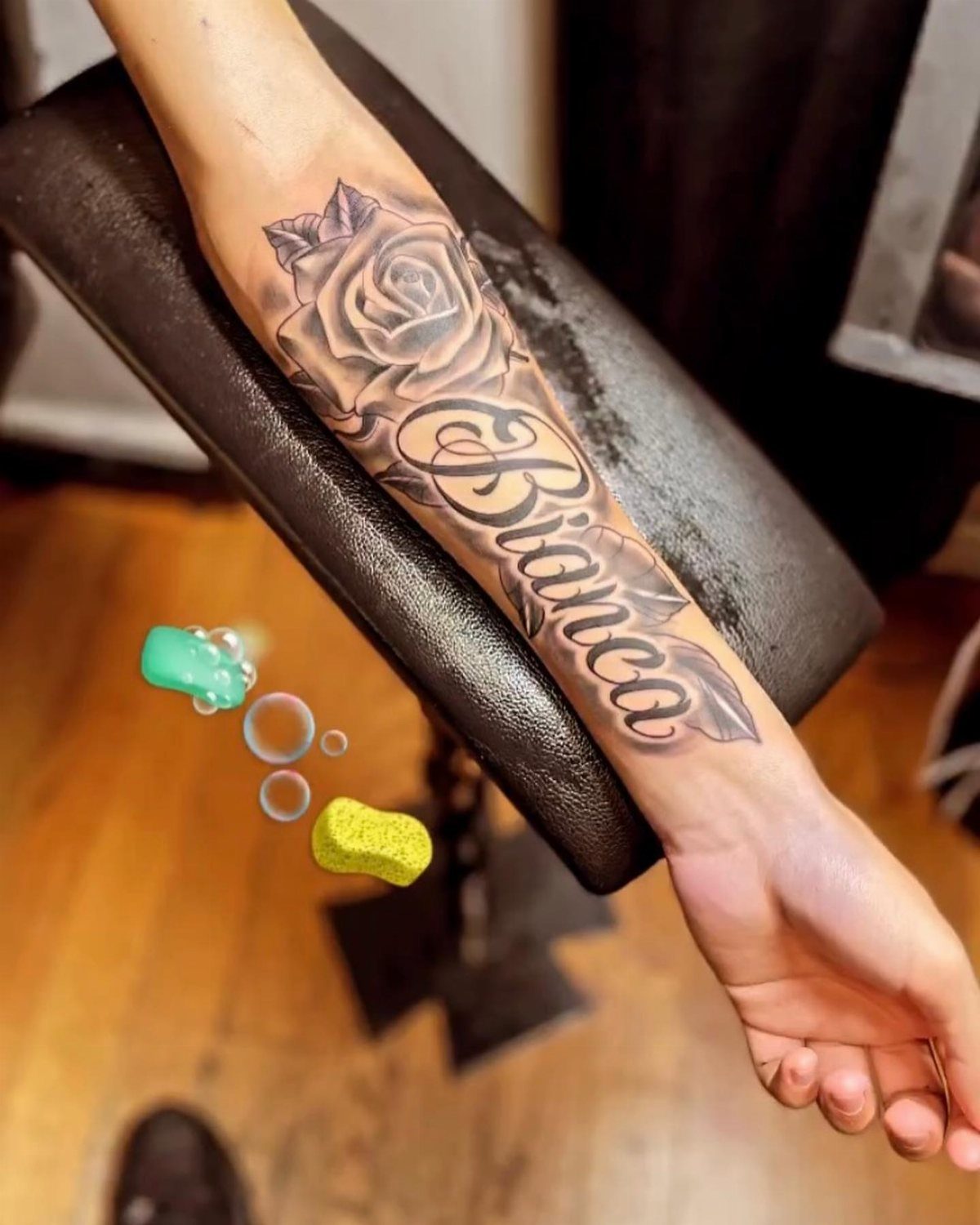
Name tattoos are straightforward in concept and tricky in execution. The script needs to stay legible as the tattoo ages, which means avoiding fonts that are too thin or too ornate.
Pairing a name with an image, like a rose, gives the design more visual balance and takes some pressure off the lettering alone.
Forearm placement is popular because it’s visible and the surface is relatively flat, so the letters hold their shape over time. I like name tattoos that include a date or a small symbol that adds context without cluttering the composition.
Script is the most common choice, but block letters age just as well if that suits the tone better.
5. Minimalist and Fine Line Lettering
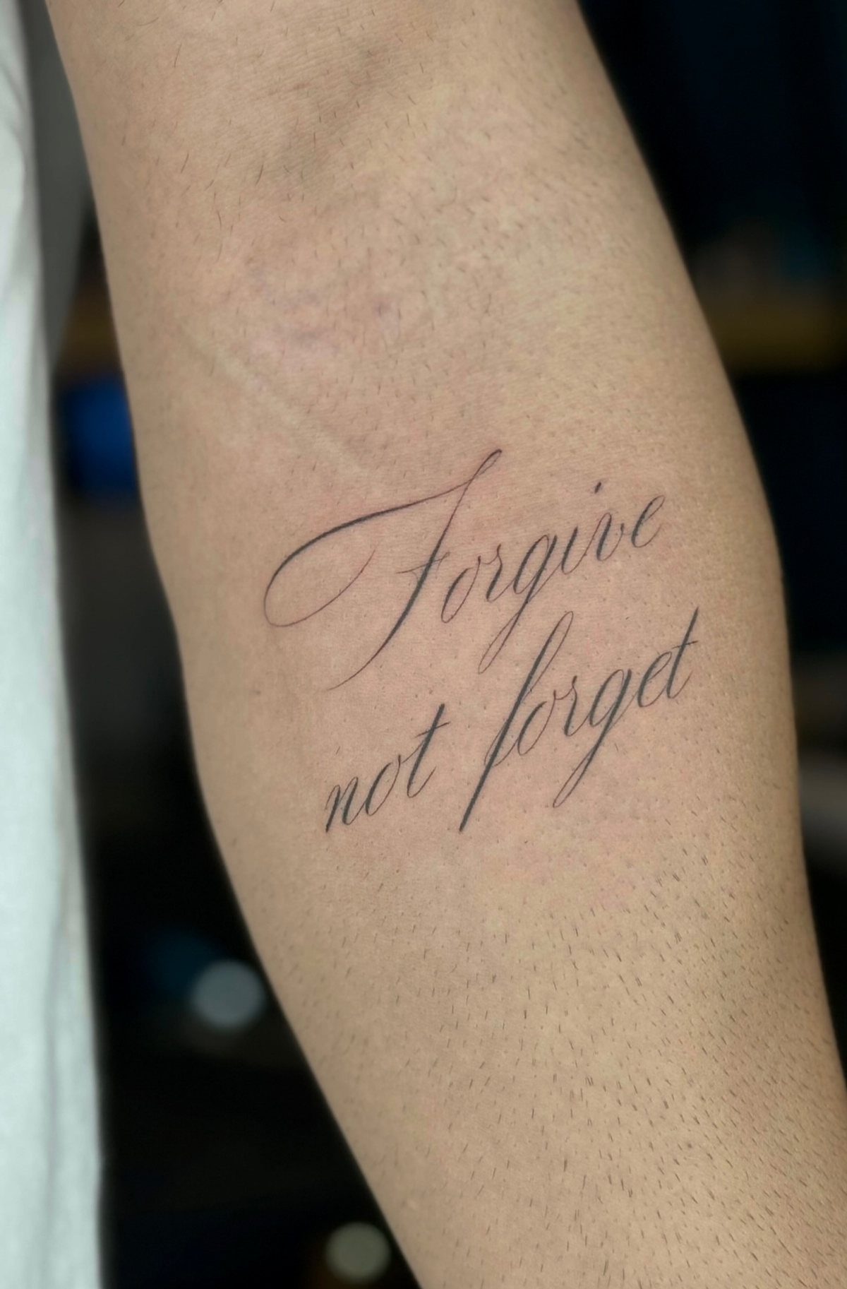
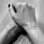
Fine line lettering strips away weight and ornament, leaving only the skeleton of the script.
The result reads as modern and understated, but the thin lines also mean the tattoo can blur over time if the artist doesn’t account for ink spread.
This style works best on flat areas where the skin doesn’t stretch much: inner forearm, collarbone, behind the ear. Curved scripts soften the look without adding bulk, and single-line quotes or short phrases suit the delicate weight of the style.
I prefer this approach for text that doesn’t need to shout. The simplicity is the point, and it holds up when the lettering is sized appropriately for the line width.
6. Tattoo Lettering Shading Styles
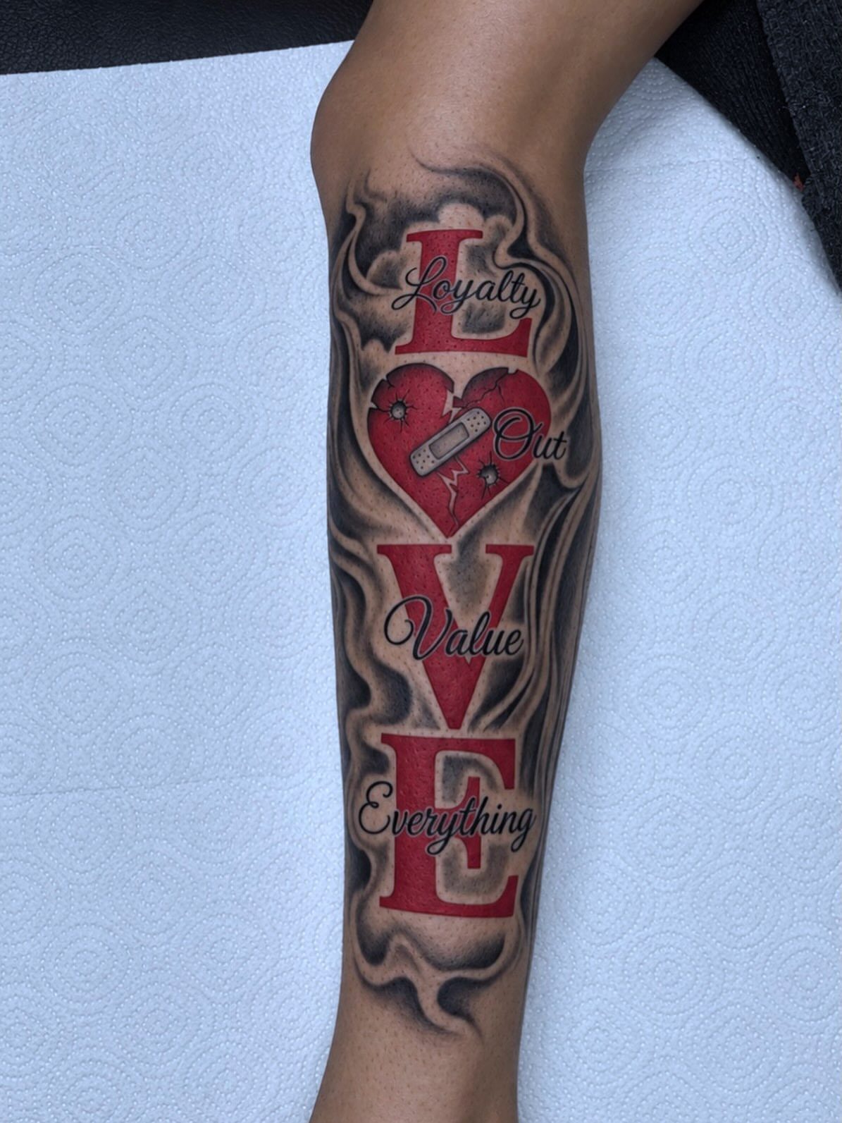
Shading gives lettering depth, and the technique changes how the text sits on the body. Drop shadows and gradient fills make letters look lifted or recessed, while background shading like smoke or clouds pushes the text forward.
A grey background sets off red 3D letters, and the effect is dimensional without relying on heavy black. Color holds differently than black and grey, so the shading needs to be bold enough to keep contrast as the tattoo settles.
I like shading for larger pieces where the letters are the main event. Small text doesn’t need it, and adding too much detail to a compact design just makes the tattoo harder to read.
7. Cursive Font
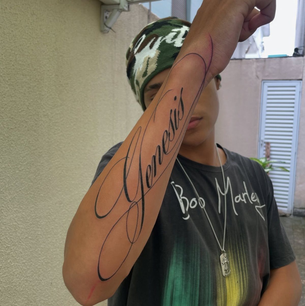
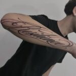
Cursive script connects each letter with a flowing stroke, and that continuity gives the text a softer, more personal feel than block letters.
Single words hold up better than long quotes because the connecting strokes blur together when you try to fit too much text.
Forearm is the natural choice here.
The flat surface keeps the letters readable, and the placement lets the script run horizontally without distortion. Black ink is standard, and the line weight needs to be thick enough that the curves don’t blur as the tattoo ages.
8. Typewriter Font
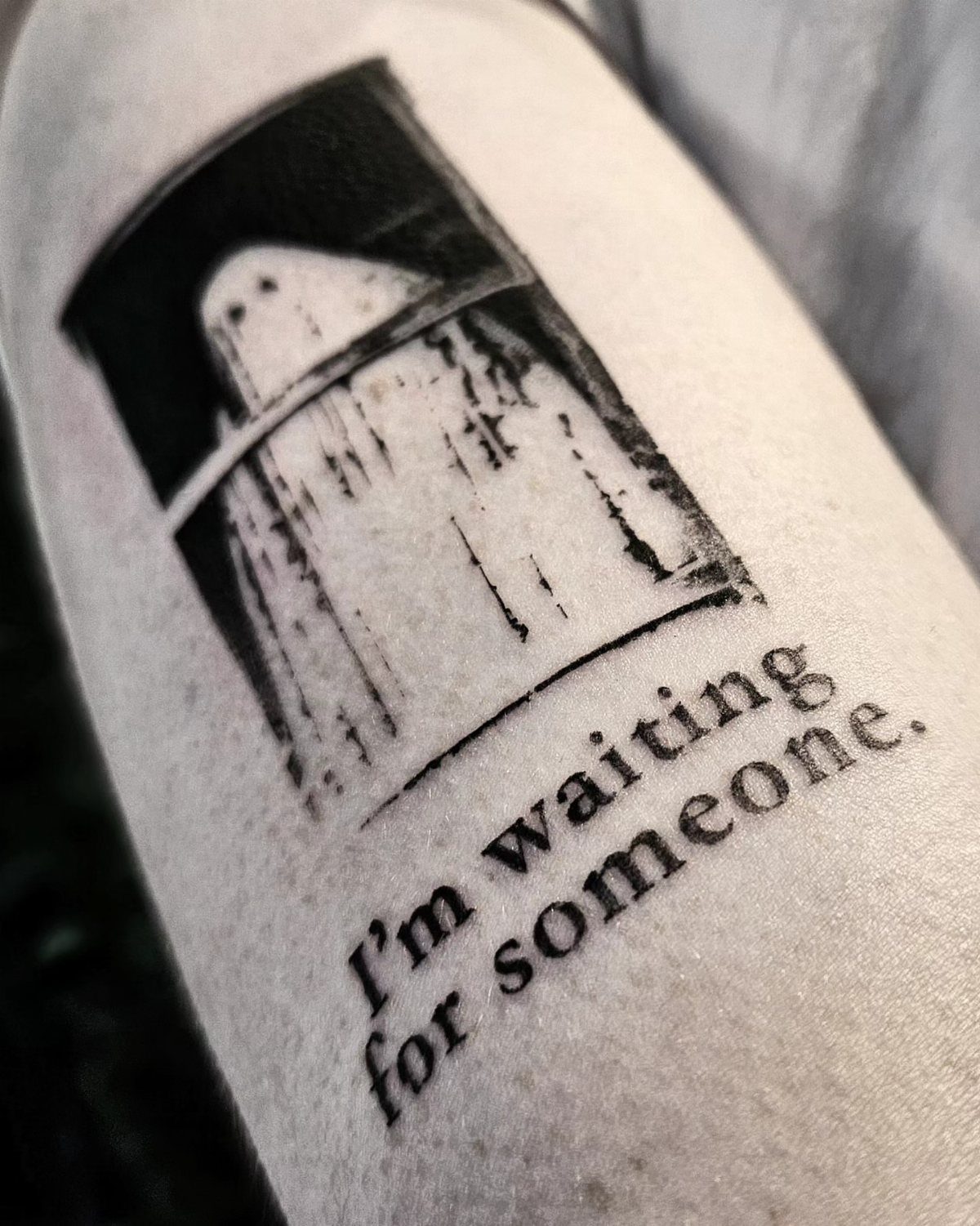
Typewriter fonts mimic the uneven, mechanical strike of vintage typing, and the imperfect spacing and alignment are part of the appeal.
The result reads as nostalgic without feeling overly decorative, and the irregular baseline gives the text a handmade quality that script can’t match.
Short phrases work better than single words because the style needs a few characters to establish the rhythm.
Black ink is the default, and the monospaced letterforms hold detail well if the sizing is right. The arm offers enough length for multi-word phrases and keeps the text easy to read.
9. Calligraphy Lettering
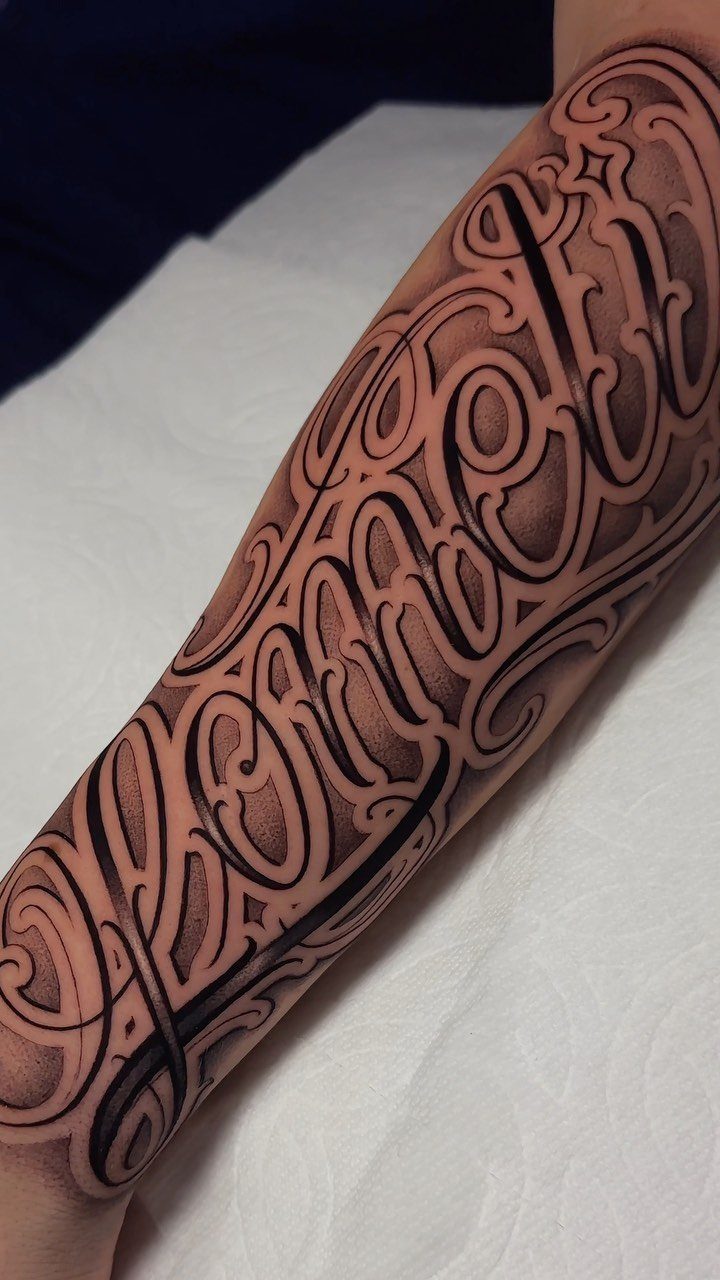
Calligraphy turns script into visual art, where the flourishes and loops carry as much weight as the letters themselves. The swirls read as ornamental, and that ornamentation can overtake legibility when the design leans too far into decoration.
This style suits single letters or very short words, and the placement needs space for the flourishes to land without crowding. Forearm works because the surface is flat and the tattoo stays visible.
10. Serif Font Tattoo
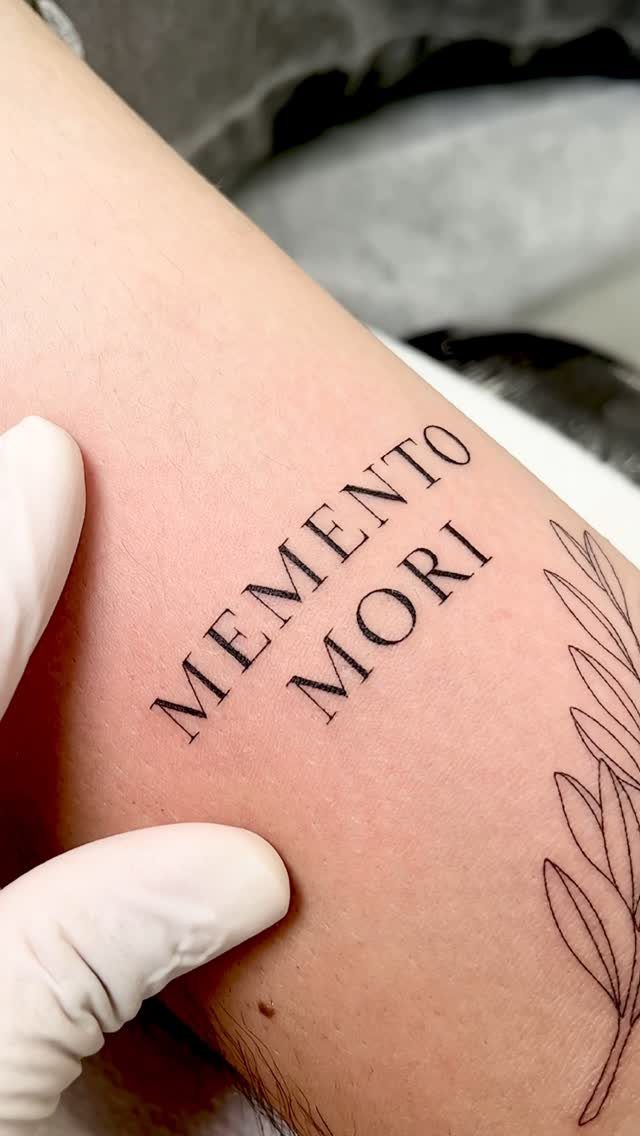
Serif fonts add small strokes to the ends of each letterform, and that detail gives the text a crisp, formal weight.
The example pairs the lettering with a thin botanical branch, and the bold capitals play off the delicate line work without competing for attention.
Short phrases in all caps hold the clean look better than mixed case, and the serifs stay sharp if the letters are sized appropriately.
Black ink is the standard choice, and flat placement like the forearm or shoulder keeps the letterforms from distorting.
Working with Tattoo Artists
The artist you choose will rework a reference font to fit the body. A straight baseline that looks clean on paper will read as warped when wrapped around a bicep or following the curve of a rib.
An experienced artist maps the layout so the letters hold their intended shape once the skin moves.
Combining elements from 2 styles can produce something that reads as yours alone: cursive flow with geometric terminals, or blackletter weight with simplified serifs. Those hybrids work when the artist understands how much detail the placement can support.
The conversation matters. Share what the text means and where you want it to sit, and let the artist adjust sizing, spacing and style to match the real estate.
Cultural Sensitivity
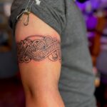
Some lettering styles carry cultural weight that goes beyond how they look. Tribal scripts and symbols come from specific communities, and wearing them without understanding their meaning can strip them of context or misrepresent their significance.
Fonts like tribal lettering carry cultural and spiritual significance from indigenous communities, so understanding their roots helps avoid unintentional disrespect.
Ask yourself whether the design resonates with your own story or whether you’re borrowing aesthetics that belong to someone else’s. A tattoo is permanent, and so is the statement it makes.
Respect starts with knowing what you’re putting on your body and why it exists in the first place.
Frequently Asked Questions
How to find different fonts for tattoos?
Browse different lettering styles like script, Old English, Chicano, calligraphy and geometric to see what fits the tone you want.
Bring reference fonts to your consultation and let the artist adjust the design to fit your body, since letterforms that look clean on paper often need mapping to hold their shape on curved skin.
Is lettering a tattoo style?
Yes, lettering is a distinct tattoo style that covers script, block, geometric and hand-drawn text.
The category is technically demanding because line quality matters more than in image-based work: a shaky line in a word stands out where it might disappear into shading elsewhere.
What should I write on my tattoo?
Pick something that matters to you: a person’s name, a milestone date, a single word or a line that shaped how you see things.
A few words fit almost anywhere and hold up in most fonts; long passages need more surface area and tighter planning if you want them readable 10 years out.
What are some creative script tattoo ideas?
Cursive, blackletter, serif or freehand lettering all fall under script, and the tattoos that last best are custom-drawn for your placement instead of traced from a computer font.
Pair script with a small symbol like a rose or botanical line work to add visual balance, or combine cursive flow with geometric terminals for a hybrid look that reads as your own.