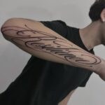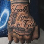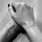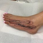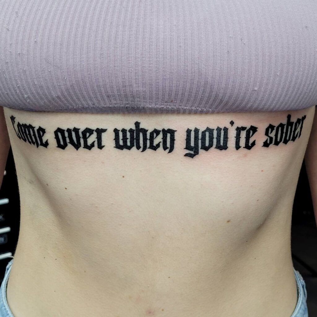
Script styles range from tight Chicano flourishes that need the size of a forearm to hold their shading, to Gothic capitals that live or die on contrast, to minimalist fine line that keeps a wrist subtle.
1. Script and Calligraphy
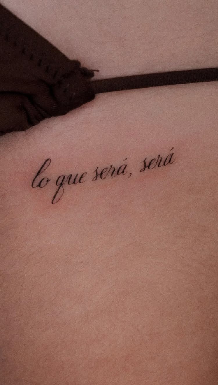
Cursive script gives you flowing, connected letters that read as one continuous motion. The style suits personal phrases and quotes because the letterforms carry the rhythm of handwriting.
I’d keep the text short.
Long passages in script can blur together as the tattoo settles, and cursive relies on contrast between thick and thin strokes that soften over time. A few words hold their clarity better than full sentences.
Place script where the skin stays relatively flat. Curves and stretching will distort the connections between letters, and once those break down the piece loses its readability.
2. Gothic and Blackletter
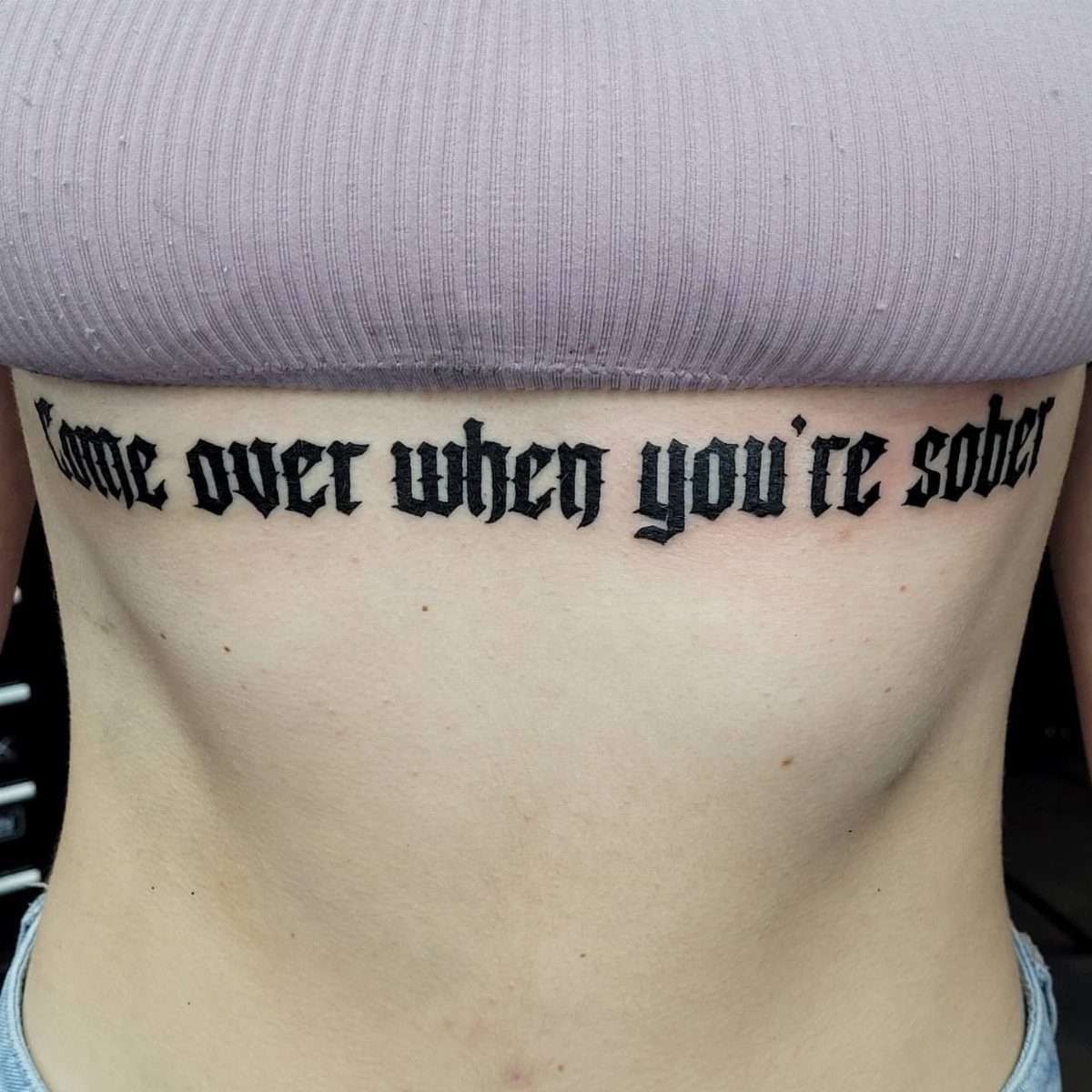
Blackletter brings dense, angular strokes that come from medieval manuscripts. The letters stack tight with sharp vertical lines and minimal curves, which gives text a bold, formal weight.
This style reads best in short bursts.
The letterforms are complex enough that full sentences become hard to scan, and blackletter demands high contrast to stay legible. I’d use it for a single word or short phrase where you want impact over ease.
Blackletter needs space. The heavy strokes bleed slightly as ink spreads under the skin, so tight spacing will eventually fill in and lose definition.
3. Chicano Lettering
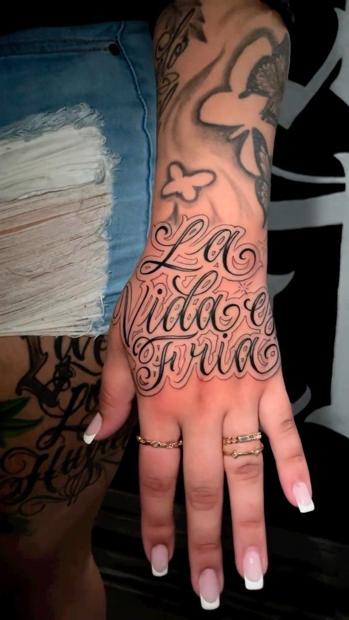
Chicano script layers ornate flourishes and stylized curves into each letter, often with drop shadows or dimensional shading. The style comes from Los Angeles tattoo culture and carries a specific visual identity.
Letters in Chicano script are built for display. The extra detail means you need size to keep the flourishes readable, so I’d plan for larger placement like a forearm or upper arm rather than a wrist or ankle.
The shading and line weight make this style hold up well over time. The bold structure keeps the letters intact even as fine details soften, and the dimensionality helps each character stay distinct.
4. Minimalist and Fine Line
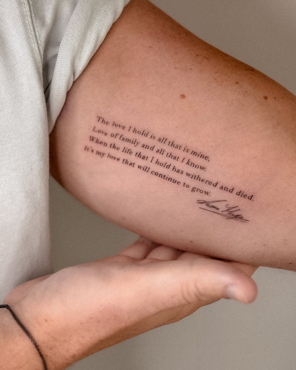
Fine line script uses thin, uniform strokes with minimal variation in weight. The letters stay clean and simple, which gives text a modern, understated look.
This style depends on precision.
A single shaky line or uneven spacing shows immediately, so I’d choose an artist with a portfolio of steady fine line work. The thin strokes also lose their sharpness sooner, and touch-ups are harder to match.
Fine line suits smaller placements where you want text to stay subtle. The lack of heavy shading or ornament means the words don’t compete with other tattoos or take over a large area.
5. Graffiti and Dripping Lettering
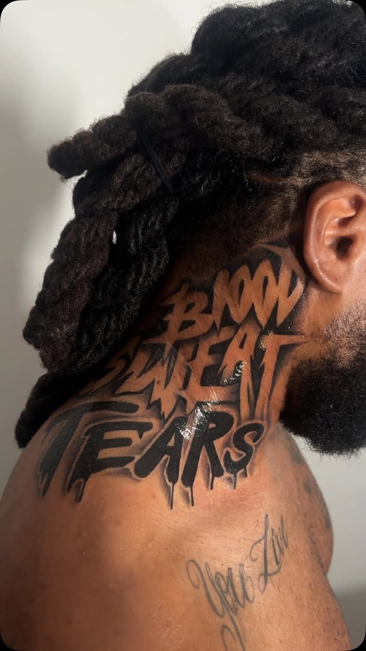
Graffiti lettering borrows from street art with bold, exaggerated letterforms and dripping ink effects that mimic spray paint running down a surface. The style reads as deliberate and raw.
Drips add movement but need contrast to work.
The effect relies on solid black fills with the drips breaking out from the main letters, so placement on an area with good visibility matters. A neck or upper arm gives the design room to spread.
I’d keep the text short and uppercase. Graffiti fonts are built for impact, not readability, and lowercase letters lose their punch in this style.
6. Classic Serif Font Lettering
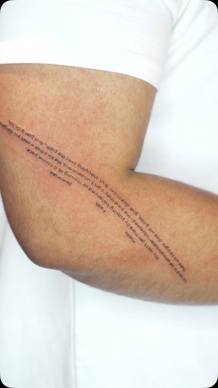
Serif fonts bring small finishing strokes at the ends of each letter, which makes text feel structured and formal. The style translates print typography directly to skin.
Serifs hold detail well because the added strokes give each letter more structure. The style reads clearly even at smaller sizes, which makes it practical for longer quotes or multiple lines of text.
I’d pick a weight that matches the placement.
Thin serifs need flat, stable skin to stay crisp, while heavier versions work on areas with more movement. Black holds its intensity longer as the tattoo ages.
Tattoo Aging and Maintenance
Friction from clothing or motion wears text faster in those spots.
Hands and feet take constant contact with clothing, shoes and surfaces, which pulls pigment and forces more frequent touch-ups. Fingers hold ink the least reliably and need the most maintenance over years.
Thinner strokes spread better than thick ones.
An artist working slightly under the final target weight gives the tattoo room to expand as skin ages without letters filling in or merging. Starting too bold leaves no margin once the body changes.
Fine line work demands the cleanest healing. A heavy scab over a single thin stroke can lift pigment and leave a gap that shows permanently.
Sun protection matters more for detail. UV exposure fades contrast faster in thin or lightly shaded work, and once the definition goes the text loses readability.
Font Selection Process
The font carries meaning as much as the words do. Choose one that matches what the text means to you, not just what looks good in a reference image.
Bring the text to the artist before you settle on a style. They’ll tell you whether your phrase works at the size and placement you want, and which fonts hold up in that spot.
A font that looks clean on your phone at 12-point can blur into nothing at a quarter inch on skin after 5 years.
First-timers often want smaller than what will last.
Photos of micro tattoos look clean fresh, but years later the detail is gone. If an artist says it needs to be bigger, that advice is based on how ink behaves long-term.
Legibility Issues
Ink spreads in skin over time. The edges of every line soften and expand slightly as years pass, which turns tightly spaced letters into blurred shapes.
Size and spacing decide whether text stays readable.
Letters sized too small have nowhere to go when they start spreading. Your artist will tell you the smallest size your font can hold up at, and it’s almost always bigger than you pictured.
The most common mistake is scaling down a screen reference.
Fine detail that looks elegant on a screen turns into a smudge in real skin before long. If your artist says to go bigger, go bigger.
Frequently Asked Questions
What are the styles of tattoos for lettering?
Lettering styles include script and calligraphy, gothic and blackletter, Chicano script, minimalist fine line, graffiti and dripping fonts, and classic serif. Script flows like handwriting and suits personal phrases, while gothic brings dense medieval strokes for formal weight.
Chicano layering adds ornate flourishes and dimension, fine line stays clean and subtle, graffiti mimics street art with bold exaggerated forms, and serif fonts translate structured print typography to skin.
What should I write on my tattoo?
Write something that matches the meaning you want the tattoo to carry.
A short phrase holds clarity better than long passages because cursive and fine detail blur as the tattoo settles, and complex letterforms become hard to scan when stacked into full sentences.
Run the wording past your artist before you book so they can flag sizing or spacing problems at the actual spot you picked.