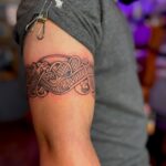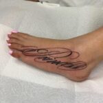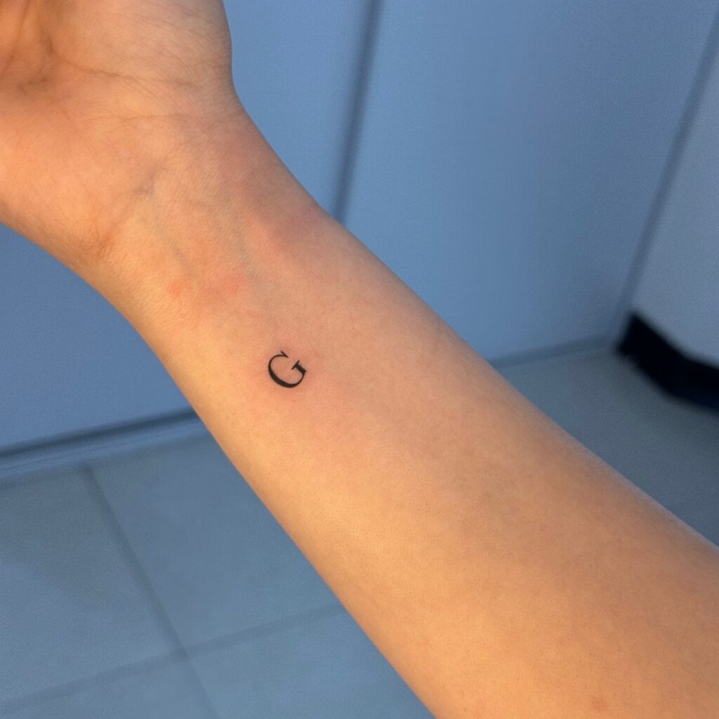
A minimal design can run as small as a single inch or stretch several inches, from botanical outlines and constellations to geometric shapes and single-line animals, with most covered in the sections below.
The choice comes down to whether the design holds its meaning in the simplest possible form: a constellation map, a single stem, a shape drawn without lifting the needle.
1. Botanical Tattoos
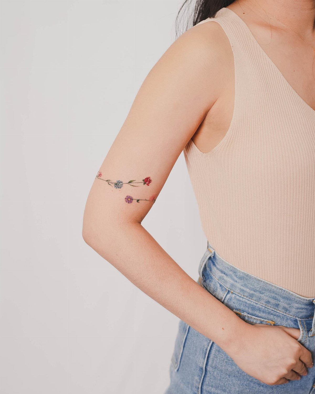
Botanical tattoos pare plants down to their cleanest shapes: a few leaves on a stem, a single bloom, or a sprig of something you recognize from the outline alone.
The simple line work means less chair time and lower cost if you are working with a set minimum.
Placement follows the natural line of the plant. A vertical stem wraps a forearm or follows the spine; a horizontal branch sits along a collarbone or the inside of a wrist.
Thin lines read best when the skin underneath stays smooth, so anywhere you stretch or bend a lot will blur the detail faster.
2. Celestial Tattoos
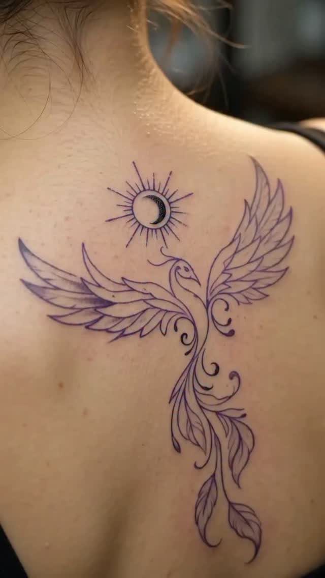
Stars, moons and suns work at almost any size because the shapes are instantly readable.
A crescent moon fits behind an ear, a sunburst sits on a shoulder, and a scattering of stars can fill a ribcage or run down the length of a forearm while leaving the composition open.
Color stays optional. Line weight matters more than shading here: thin lines look delicate up close but can fade into each other once you step back, so I lean toward medium-weight outlines that hold their separation as the ink settles.
3. Minimalist Symbol Tattoo Designs
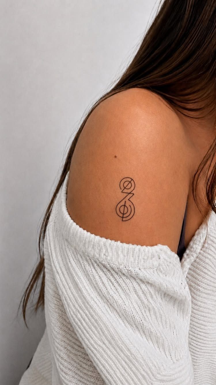
A small symbol carries meaning without text or decoration. Arrows, infinity loops, anchors and alchemical marks all fit into a single inch and read clearly from across a room.
The constraint is that the meaning has to be settled before you sit down; these designs do not offer much room to add or adjust later.
Black ink on pale skin gives the sharpest edge, but darker skin tones can carry the same design with slightly heavier line weight to keep the contrast strong.
Placement on flat areas like the shoulder blade or outer forearm keeps the symbol from distorting when you move. Most artists can knock one of these out quickly, so cost sits near shop minimums.
4. Animal Silhouettes
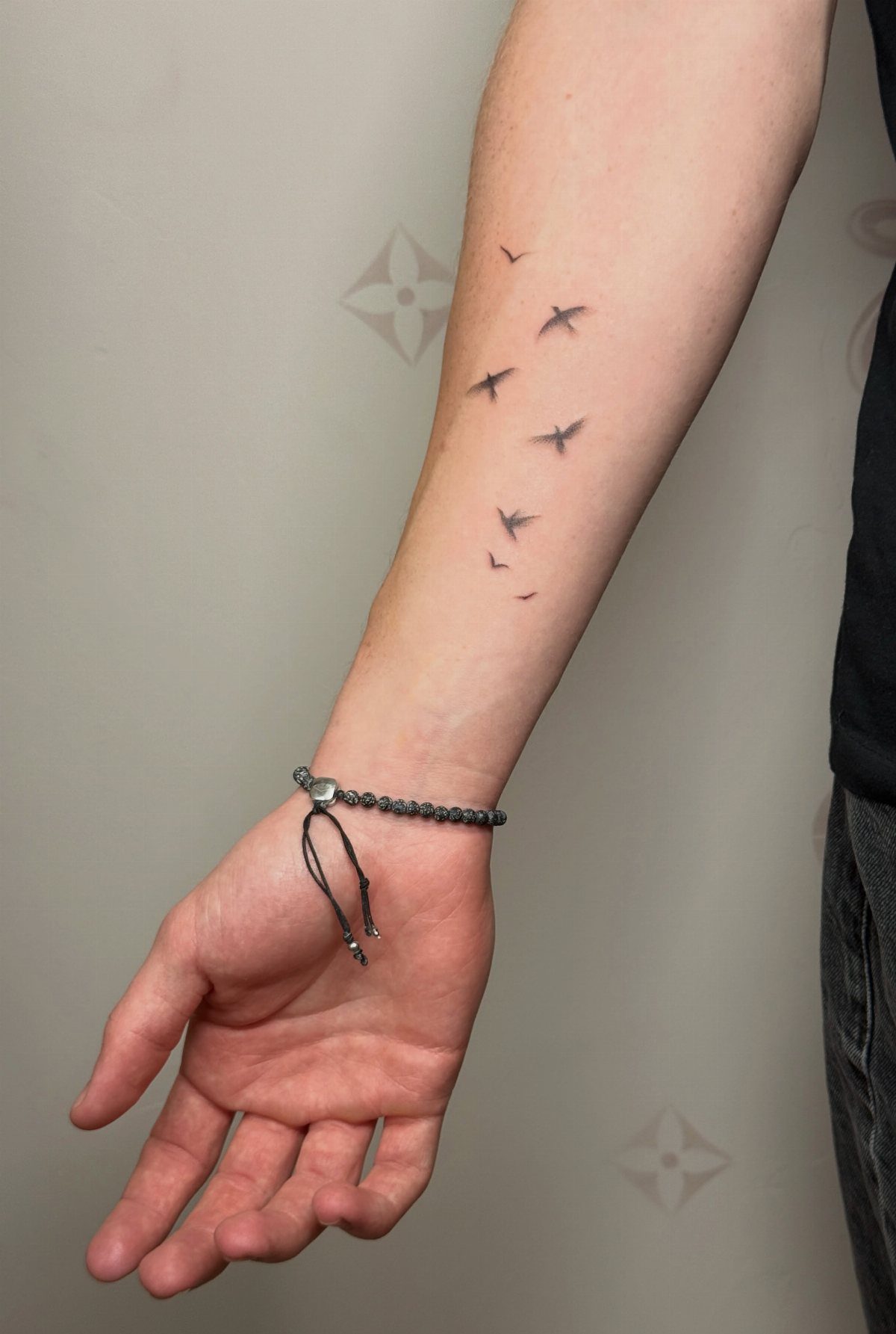
Animal silhouettes cut the form down to an outline you can recognize in profile: birds in flight, a cat mid-stretch, a running deer. The shape does all the work, so shading and texture stay out of it.
Birds are the most common choice because the wing shape gives you natural movement across the skin.
A line of them reads as a sequence, which lets you place them along a forearm, a collarbone or a ribcage where the curve of the body carries the direction.
Larger animals work better solo; a single wolf or horse can anchor a shoulder or calf without competing for space.
Solid black fills age better than outlines alone. The fill keeps the shape intact as the ink spreads slightly over the years, where a thin outline can lose definition and start to look fuzzy.
5. Tiny Minimal Tattoo Designs
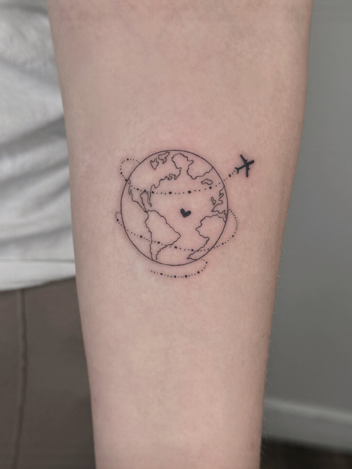
Tiny tattoos fit into spaces most designs cannot reach: the side of a finger, the inside of an ankle, behind an ear.
Detail has a floor. A design this small cannot hold fine shading or intricate line work; what you see is what you get, and anything more will blur into a smudge as the ink settles.
That limit also keeps the session short and the cost low, starting at whatever your shop’s minimum runs.
Placement on areas with less movement helps the design stay crisp. Fingers and toes flex constantly, which pushes the ink around faster, so a forearm or shoulder blade will hold the detail longer.
6. Minimalist Landscape Designs
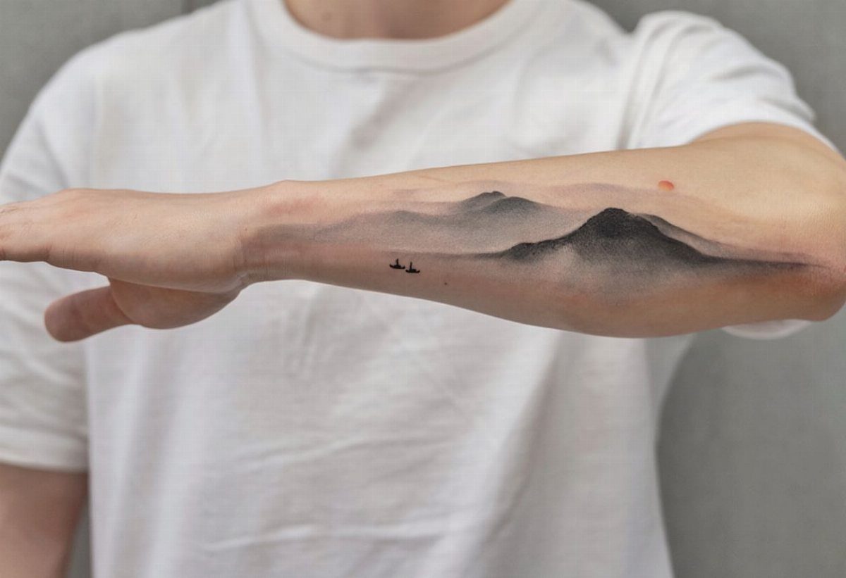
A minimalist landscape strips a scene down to its skyline: mountains, a tree line, or a shoreline reduced to a single continuous line. This piece holds 2 layers, the peaks and the birds, which gives depth without shading or color.
These designs scale well. A small version fits on an inner forearm or wrist; a wider piece can wrap around a bicep or sit across a shoulder blade.
The horizontal format works best when the skin itself is relatively flat, since curves will pull the horizon line out of shape.
Line weight decides how the piece reads once you step back.
Thin lines look delicate but can fade into skin tone over time, especially on lighter skin. Medium-weight lines hold their contrast longer and still read as minimal, so I favor them unless the design can support fine detail.
7. Flowers
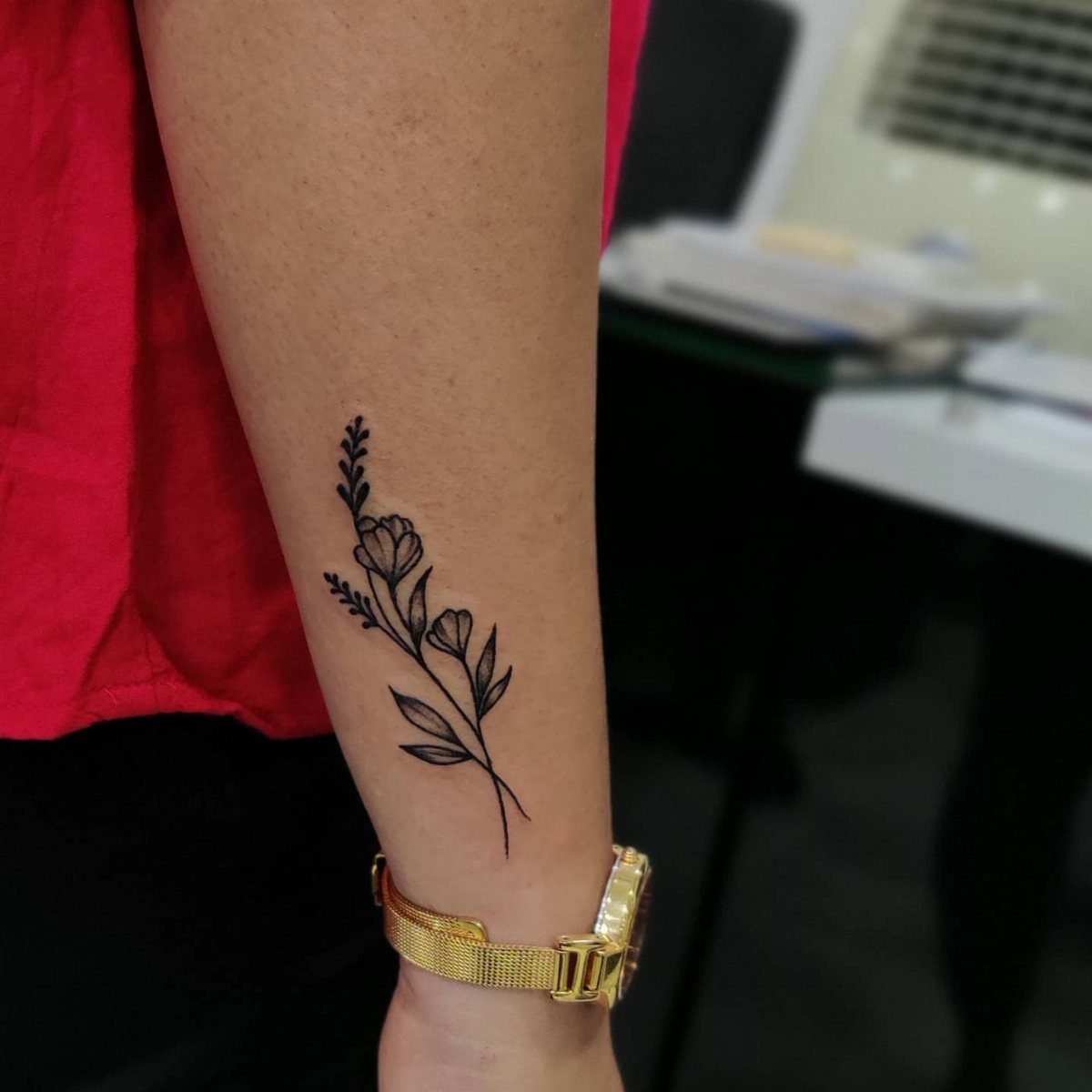
A flower reduced to a few petals and a stem reads clearly at nearly any size. The shape holds meaning without requiring shading or fill, which keeps the session short and the cost close to the shop minimum.
Placement follows the stem’s direction. You can orient a flower vertically along a forearm or spine, or lay it horizontally across a collarbone or around a wrist.
Petals with fine detail need flat skin to stay sharp, so inner forearm or shoulder blade will outlast areas that crease or fold often.
8. Minimalist Mountain Tattoo
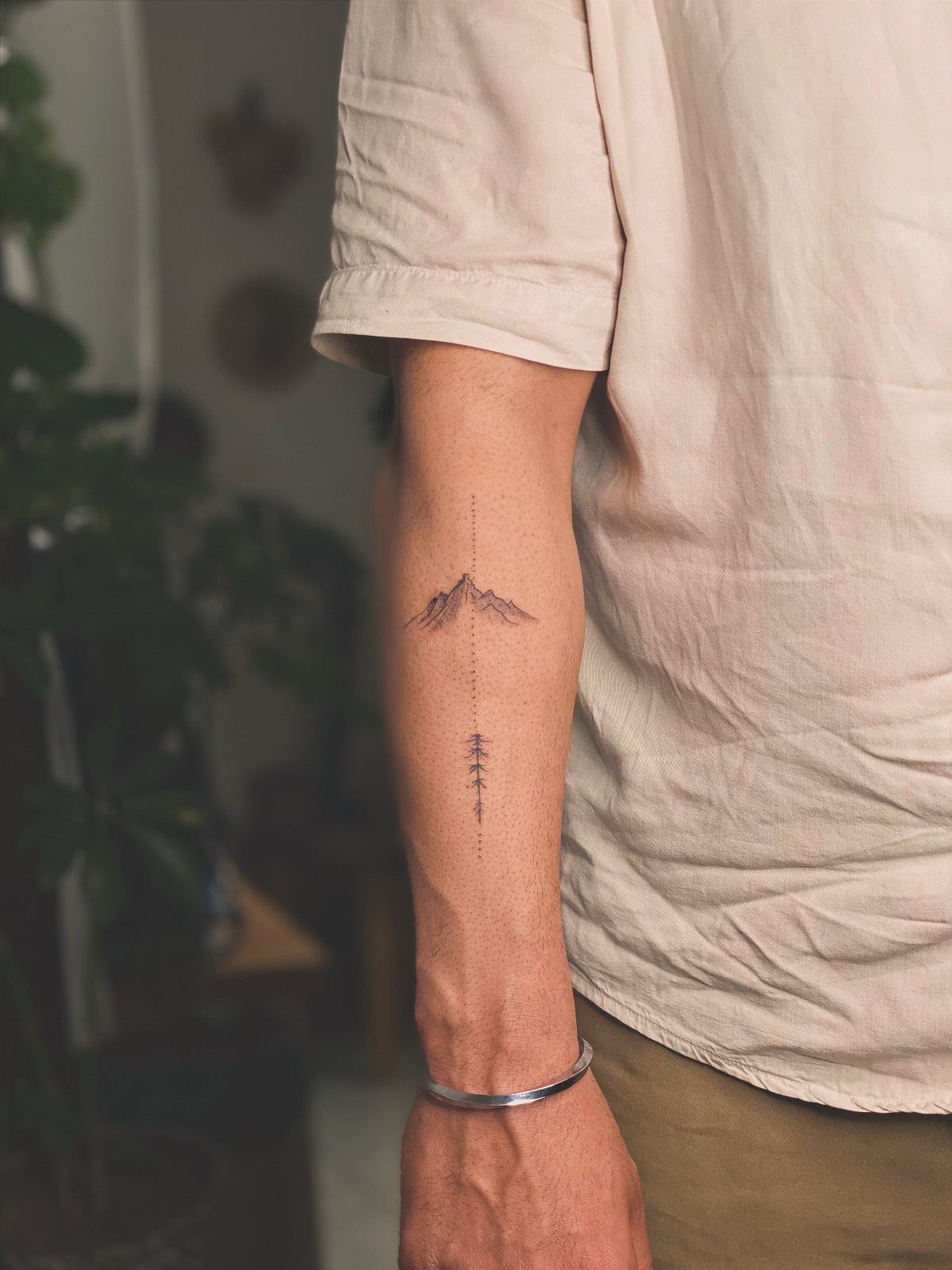
Mountain peaks in silhouette give you a shape that holds meaning without text.
The jagged line sits flat or wraps around a forearm, and adding a single tree or a dot for scale keeps the composition grounded without crowding the space.
Flat areas work best. A bicep or shoulder blade lets the horizon stay level, while placement on a wrist or ankle will distort the peaks when you bend.
The design scales down to an inch or stretches across several, so size follows the spot you have in mind.
9. Single Line Minimal Tattoo Designs
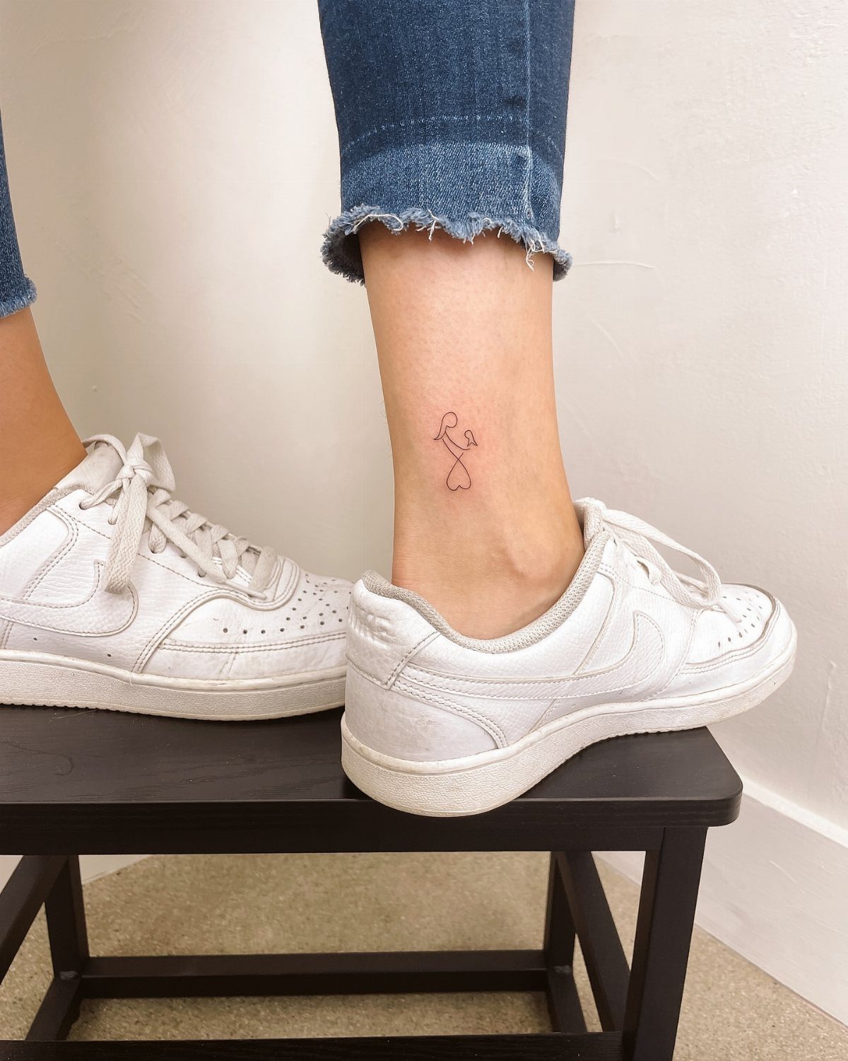
A continuous line that never lifts turns a shape into a puzzle the eye follows from start to finish.
Hearts, faces and simple figures all work, but the line has to close on itself or end somewhere intentional, or the piece looks unfinished.
The technique limits detail. Anything that needs texture or shading cannot happen here, so the shape has to carry the whole idea.
Placement on smooth skin keeps the line from breaking up; fingers and joints will blur it faster than a forearm or shoulder blade.
10. Geometric Tattoos
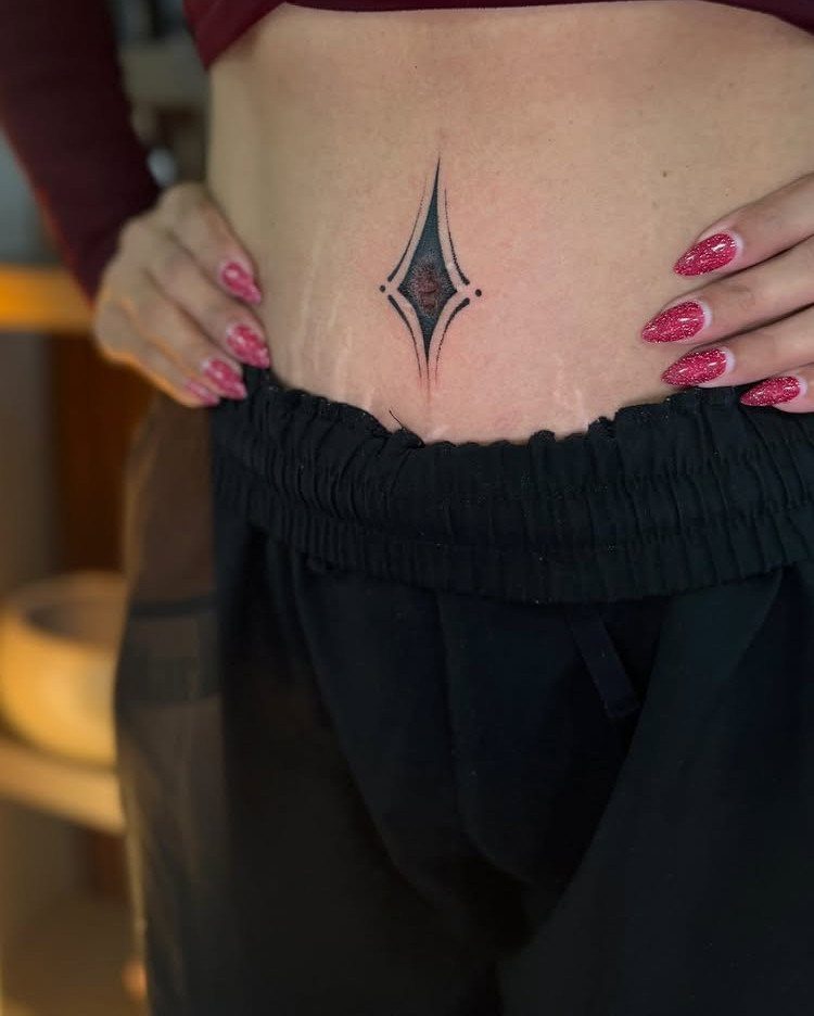
Circles, triangles and diamonds sit flat on the skin and read as deliberate rather than decorative.
Symmetry matters here: if the lines do not meet cleanly or the angles drift, the whole piece looks off, so this is where you check an artist’s precision before you book.
Placement on the sternum, lower abdomen or forearm gives you a flat canvas that does not stretch much.
Movement and weight changes will shift the skin over time, so a design that depends on perfect alignment may not hold that look forever.
Black ink holds the cleanest line, and most geometric pieces take less than an hour in the chair.
11. Fine Line Minimal Tattoo Designs
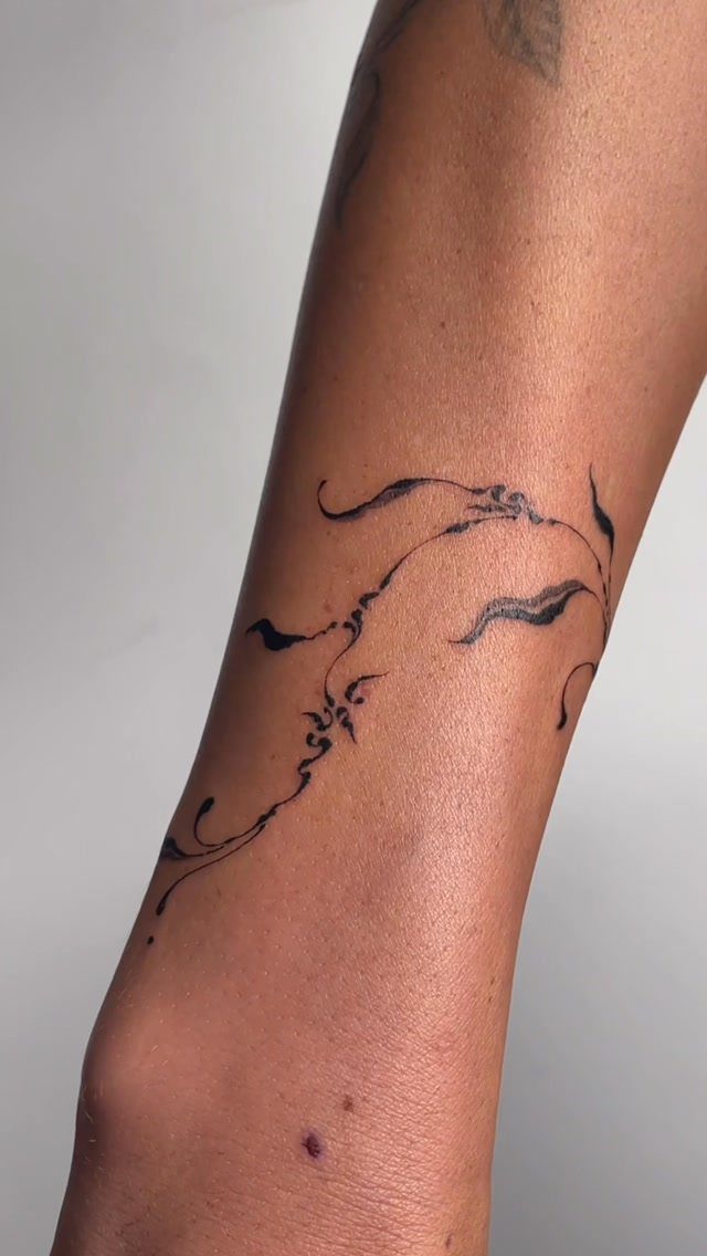
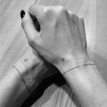
Fine line work uses needles that leave the thinnest mark possible, so the design sits close to the skin without heavy contrast.
These tattoos read as delicate up close but can vanish from a few feet away, especially on lighter skin.
Darker skin needs slightly heavier lines to keep the design readable, so fine line may not be the right fit there.
Placement on areas with less sun exposure helps the ink last, since UV fades thin lines faster than bold ones. The session is usually quick, but touch-ups come up more often than with thicker work.
Many minimalist tattoo artists are opting for single needles rather than multi-needle machines. This allows them to render ultra-delicate designs that often look like monochromic pencil sketches on the skin.
12. Abstract Line Compositions
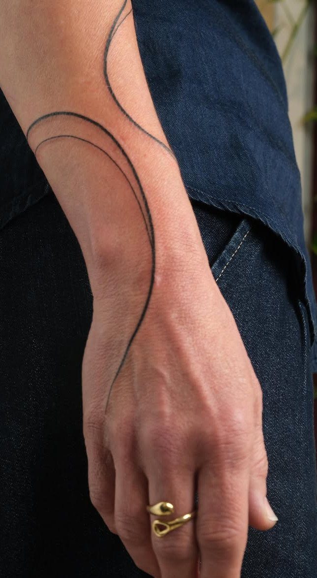
Lines that curve and cross without forming a literal shape give you a design that reads as art rather than symbol.
The composition can follow the contour of a wrist, wrap around a shoulder or sit flat on a forearm, and the lack of a defined subject means placement stays flexible.
These pieces rely on balance more than meaning. If the lines feel crowded or the spacing looks uneven, the design loses its flow, so I look for an artist who works loose rather than rigid.
Black ink keeps the focus on the line quality itself, and the piece can stretch or shrink to fit the space you have.
13. Word or Quote Tattoos
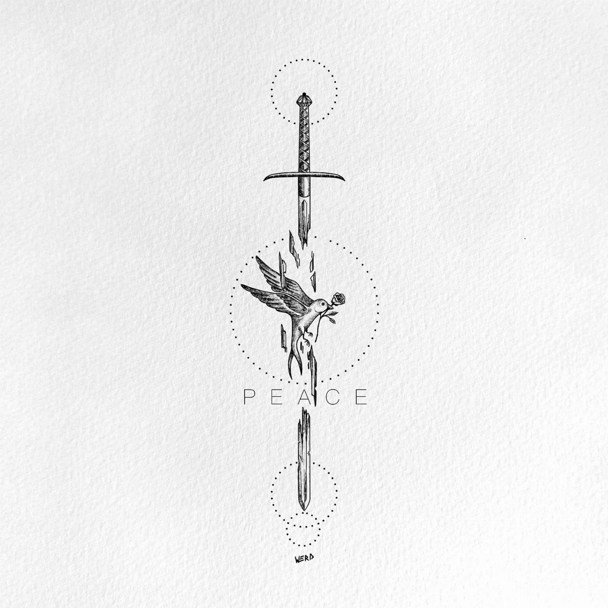
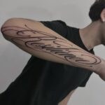
A word in clean capitals or a short phrase in script carries the meaning on its own, no imagery required.
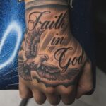
The text here sits across a visual element, but most word tattoos run solo, placed where you can read them straight on: inner forearm, ribcage, or along a collarbone.
Font choice matters more than you think. Script flows but can blur once the ink spreads; sans serif capitals stay readable longer.
Longer quotes need more space and more time in the chair, which raises cost. I keep it to a few words unless the phrase genuinely needs the full line to make sense.
Best Placements for Tattoos
The inner wrist and forearm give you flat, visible skin that holds fine lines and small shapes without distortion.
A collarbone placement lets a single line or short word sit where the bone itself guides the eye, and the ankle works for pieces you want to keep easy to cover.
Behind the ear and the back of the neck suit tiny symbols or single marks that stay private unless you pull your hair back.
Any of these spots can take a minimal design without needing extra space around it, though leaving some breathing room helps the piece read clearly.
Fingers, hands and feet blur faster than other placements.
Choosing a Tattoo Artist
An artist who works in minimalist styles regularly will have a portfolio that shows clean line weight, precise geometry and compositions that do not crowd the space.
Look for pieces where circles close evenly, where parallel lines stay parallel and where single-line work reads as intentional rather than sketchy.
Instagram gives you a direct view of an artist’s recent output, so scroll past the highlights and check the everyday posts for consistency. If the line quality shifts between pieces or the spacing looks uneven, keep looking.
Minimalist work depends on precision more than coverage or shading, so you are choosing someone whose hand stays steady and whose eye catches small errors before the stencil goes on.
A consultation lets you see whether they adjust a design to fit your skin or just shrink a flash sheet.
Frequently Asked Questions
What is a minimalist tattoo?
Minimalist tattoos strip design to its basics: fine lines, spare shapes and open space, with shading or fill used only when the design calls for it.
The approach strips an image down to its most recognizable form, whether that’s a single-line figure, a plant outline or a geometric shape. The restraint keeps chair time short and lets the design hold its clarity as the ink ages.
Do minimalist tattoos age well?
They can, if you plan for how ink spreads over time. Very thin lines will soften and may blur together after a few years, so a slightly heavier line weight holds the detail longer.
Flat skin that sees less sun and wear keeps the lines readable longer, and spacing them apart means they will not bleed together as the tattoo settles into your skin.
What are the top tattoos to avoid?
Designs with fine detail in areas that flex constantly will blur faster than the rest of your ink.
Fingers, hands and feet move too much to hold thin lines or small shapes cleanly, so a minimal design ages better on a forearm or shoulder blade.
Anything that needs perfect symmetry can look off once your skin shifts with weight or muscle changes.